Data Science for Sustainable Development Goals Book

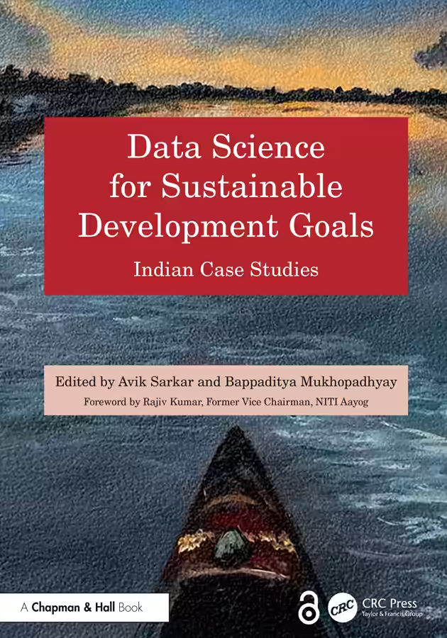
One of my goals this year is to publish 2 books. One got published. Sort of. Data Science for Sustainable Development Goals: India Case Studies is an open-access anthology and I’m the designated author of Chapter 10: Using Data Analytics to Improve Students’ Performance is about how Gramener worked with NCERT to analyze the National Achievement Survey data, discovering stuff like TV hurts maths but not reading scores, playing helps maths but not reading scores, fathers of West Bengal (not mothers) and mothers of Punjab (not fathers) influence their children’s scores the strongest, and so on. ...
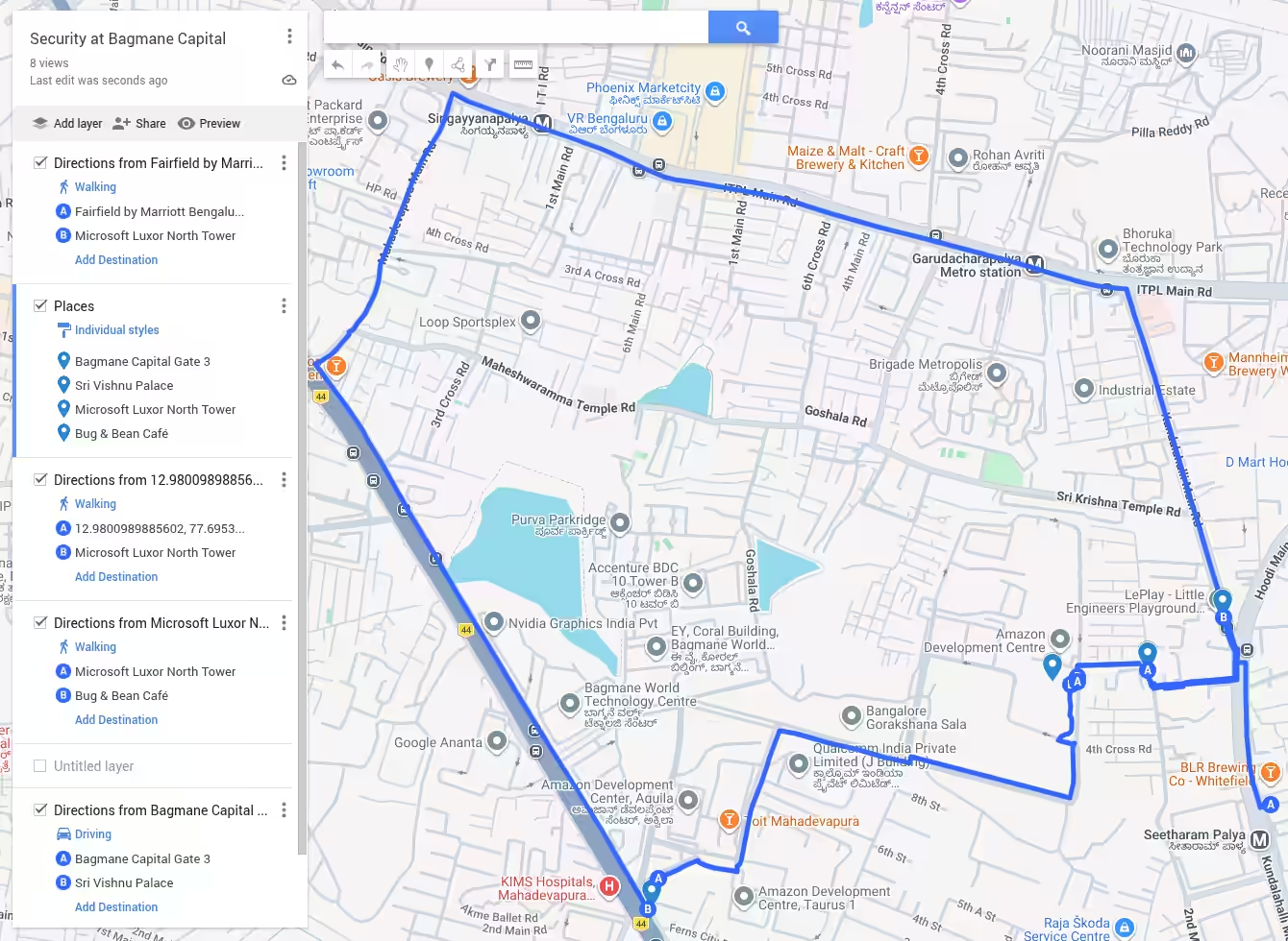
Creating a scrollytelling map

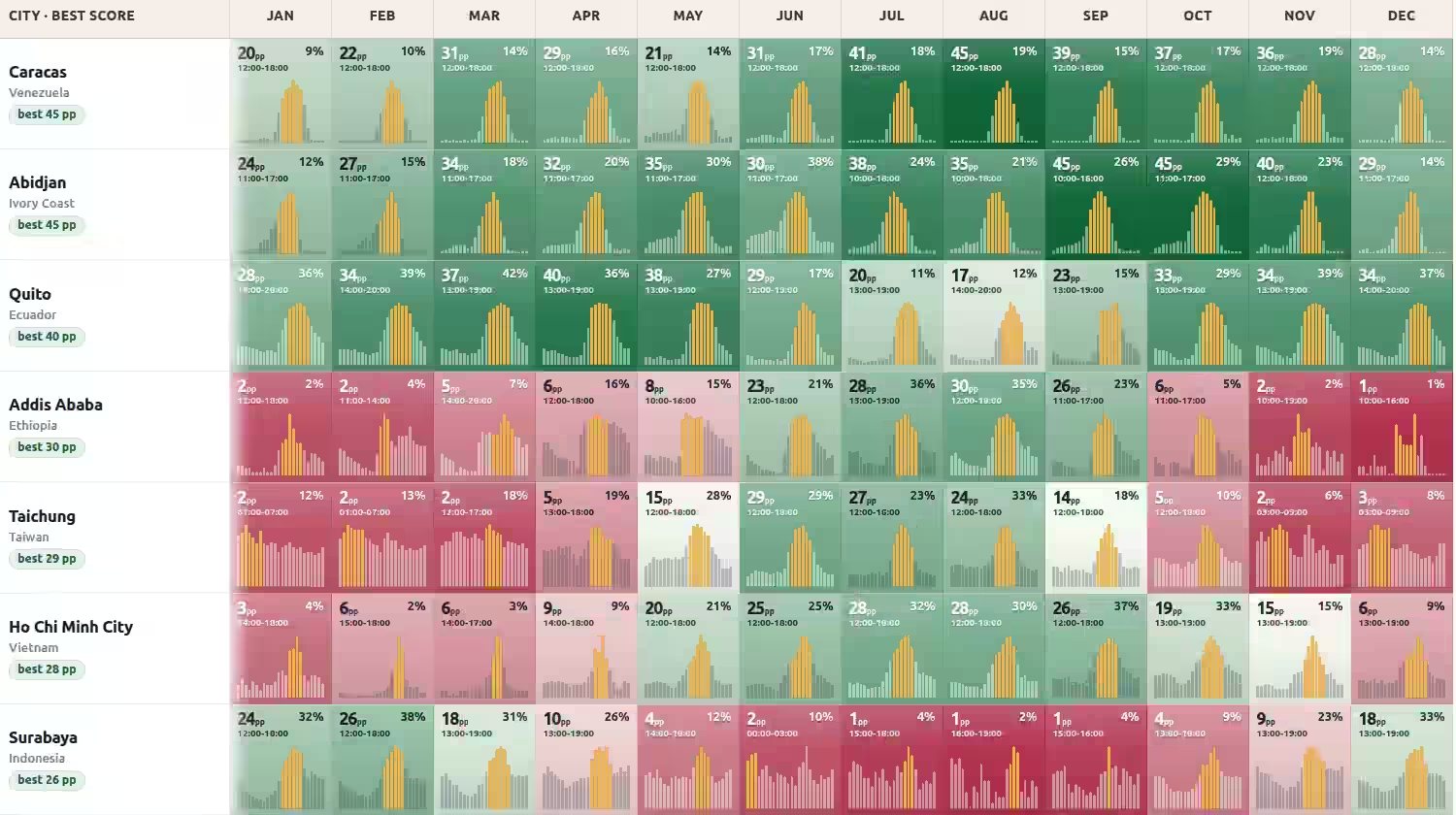
I had Claude Code with Fable create a small scrollytelling map for my 14-minute walk experience at Bagmane Capital in Bangalore. I used this as an opportunity to explore the current status of the technology. ChatGPT suggested: Try ArcGIS StoryMaps first for a polished scrollytelling story. Try Google Earth Projects if this is primarily something you will present live, like a map-based slide deck. Use MapLibre GL JS with a coding agent if you want precise choreography, animated routes, unusual visual effects, or an asset you can continually extend. None of these fit my requirements, which was: ...

The Curator's Dilemma - VizChitra 2026

Last week at VizChitra, I ran a “Dialogue” session. A new format for me. I usually speak 80% in my workshops. In this dialog, I spoke 20%. The group discussed. PART A I showed 6 charts and said, “Pick the best.” Then I shared the audience & purpose and asked: “For THIS audience and purpose, will you publish, fix, or kill it?” INSIGHT: almost no one said, “Ship”. That’s good – these were all drafts. ...

Discussion with Arvind Satyanarayan

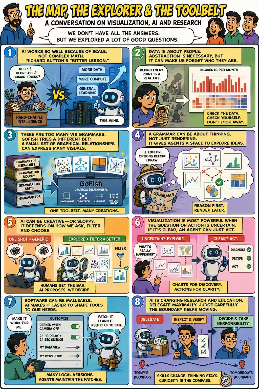
After Arvind Satyanarayan’s talk at VizChitra 2026, a group of us kept talking about machine learning, visualization grammars, creativity, software and education. The conversation began with a basic question. Why do modern AI systems work so well when the mathematics behind them can look surprisingly simple? The bitter lesson Arvind said that much of the mathematics behind machine learning is not especially complicated. What is unusual is the scale at which it is applied. ...

Rainy seasons on schedule

Karthik Sashidhar shared his AI-generated Bangalore weather blog, which is generated by Hermes listening on Telegram. “The data analysis and stuff is still fairly YOLO but … skill based on my 10 years of experience,” as he put it. That includes critique too. Arjun asked it: Does it rain at specific hours in the day during monsoons? In a few minutes, Pre-monsoon rain is an evening creature emerged. In short, it rains in the evenings: 5 - 6 pm is the peak. ...

Arvind Satyanarayan talk at VizChitra 2026

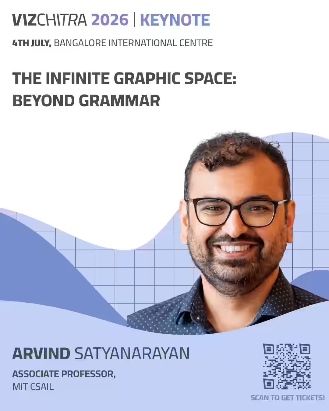
On Sat 4 July at Bangalore, Arvind Satyanarayan is speaking at VizChitra 2026 - a talk I’m keenly looking forward to. I’ve been following Arvind’s work since Vega-Lite. It’s a grammar of graphics - something that makes data visualizations (charts) more structured. I tried switching to it our default at Gramener - but most felt it was too much to learn (they already knew Excel/Power BI) or too limiting (D3 can do more). ...

How IMF mis-forecasts GDP growth

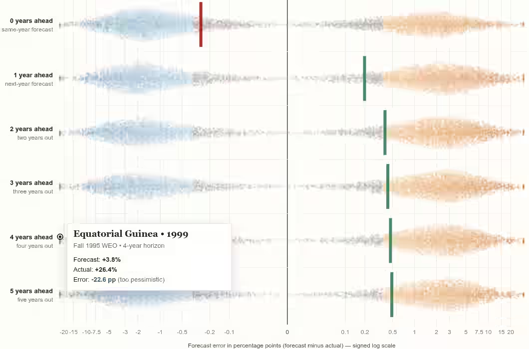
The IMF forecasts GDP growth every year. Their forecasts for the current year are slightly low. Their forecasts for the next year are slightly high. After that, it remains high. Some forecasts, like China, Singapore, UAE, Equatorial Guinea are consistently low. Other forecasts, like Japan, Congo, Mexico, Pakistan are consistently high. The interesting meta-pattern is how this sort of past-forecast analysis can be done for any topic. This emerged from an Ethan Mollick post and then I asked: ...

Data Stories with AI Workshop

On Sat 13 Jun 2026 at 3 pm, I conducted an online workshop on Data Stories with AI. Registration link: https://forms.gle/dNkUxtJ2PVqNMNcE9 In this workshop, the audience used ChatGPT and Claude, mostly, to: Find data Analyze it Extract insights Visualize as stories It’s a data visualization using AI workshop for journalists - but you don’t need to know data, visualization, journalism, or even technology. But this is a practical workshop. You’ll be doing stuff and sharing your results. ...