Prompt fragments useful to add to other prompts.
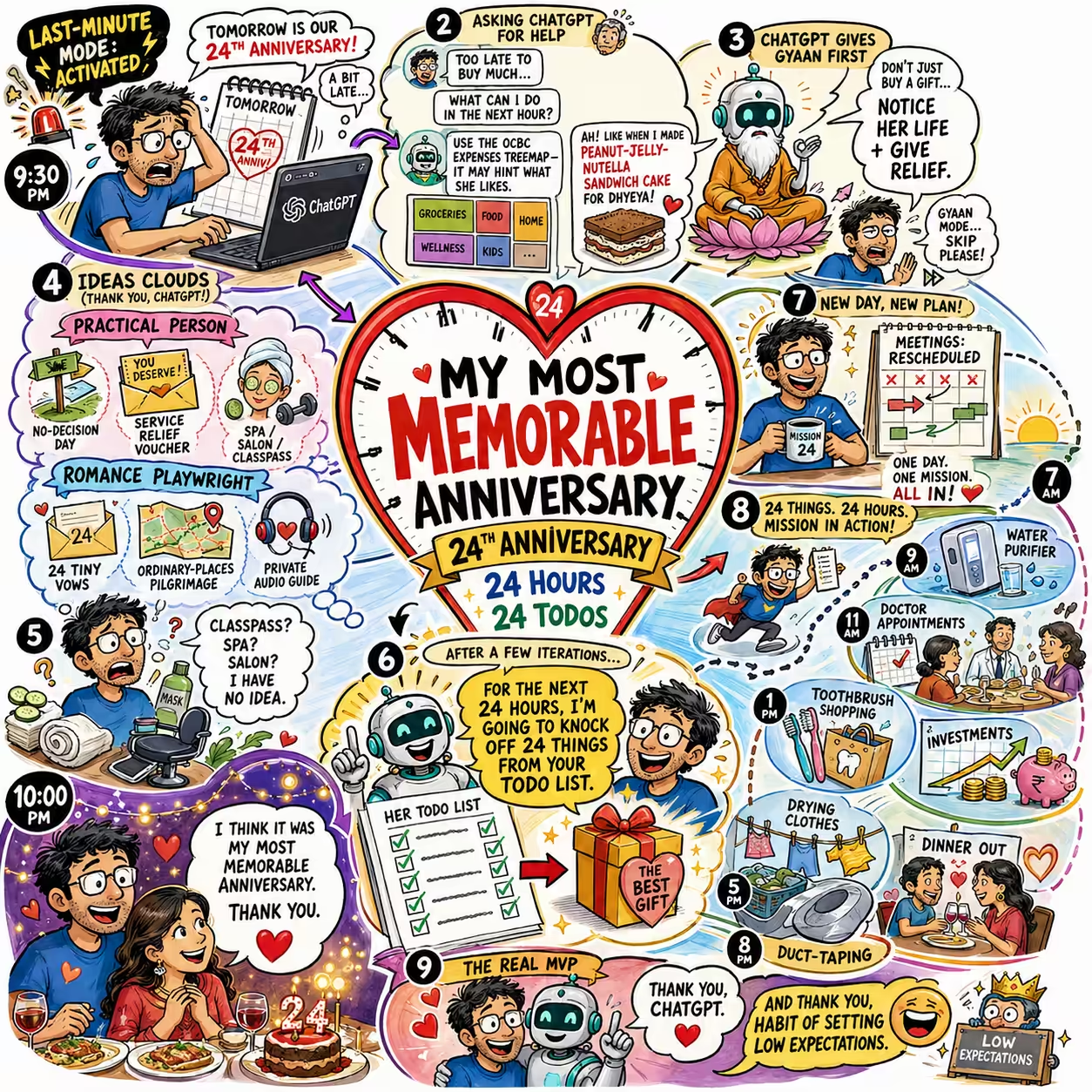
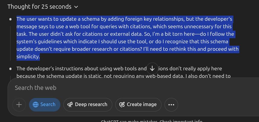
Analysis notes As you analyze, note any interesting findings (patterns, anomalies, alternate perspectives, future explorations) in notes-v1.md. Best practices and ancient wisdom Research best practices from modern research and ancient wisdom. Binding constraints and slow variables Identify the binding constraints and slow variables - what governs here regardless of improvements elsewhere? Blog post Write in a crisp first-person blog voice: conversational, curious, and slightly mischievous, describing exactly what you did and what happened. Be terse: short sentences, short punchy paragraphs, and occasional lists. Use simple words. Avoid corporate fluff and jargon. Max 300 words. Use bold sparingly for scannability and italics to emphasize key insights. Divide sections with `---`. Avoid headings. Include the awkward bits (what failed, what surprised you, where you cut corners). Parenthetical asides for dry humor. Pull out one non-obvious lesson. Admit uncertainty, and end with an insightful, practical recommendation. Include links wherever relevant to sources, tools, code, etc. Show key snippets of actual prompts & results verbatim in code blocks. Blog description and tags metadata Generate a description and tags as metadata for this blog post. Format: description: ... tags: [..., ..., ...] The description is a crisp one-sentence answer to: What is the main point or most useful takeaway here? 1 sentence, 20-40 words. Prefer concrete ideas over framing. Include distinctive methods, domains, tools, or concepts when central. Tags are the smallest set of canonical topics that would help an AI agent decide whether this content is relevant. 4-8 lower-case topic phrases. Avoid generic tags and redundant synonyms. No preamble, no markdown, no explanation. Blog illustration Pick an appropriate, impactful, illustration style for this blog post from the following list. Draw as a visually rich, intricately detailed, colorful, and funny, illustration. Think about the most important points, structure it logically so that the illustration is easy to follow. - Self-Demonstrating Diagrams. The diagram enacts its own content. A diagram about chunking IS chunked into four quadrants. A diagram about rhythm has visual beat. A diagram about faces has illustrated faces as axis labels. The meta-ness is the insight. Readers feel the concept _before_ they've read a word. This is the illustration equivalent of a self-referential sentence. - Experimental Audit Panels. The experiment rendered as a formal scientific plate - hypothesis, stimulus, output, verdict, all laid out like a forensic dossier. Input image top-left, AI response as a labeled specimen, your skeptical annotations as margin notes in red. Feels like a Nature paper designed by a detective. - Tension Posters. A single large typographic claim fills the top half. Below it, a minimal evidence structure simultaneously shows both the claim and its complication - like a debate card where both sides are revealed at once. The tension is the content. Feels like a Bloomberg Businessweek cover meets a campaign poster. Zero decoration; pure rhetorical geometry. - Actor Swimlanes. Three parallel horizontal tracks - e.g. Teacher / Student / AI - with moments, tools, and handoffs between them rendered as a modern process flow. Not the dreary enterprise BPMN kind, but the clean, editorial kind - like a New Yorker tech diagram. The visual makes explicit what text makes implicit: _who acts, when, and why._ - Lens Stack Diagrams. Multiple semi-transparent overlapping layers, each a different lens on the same object - physiology, psychology, philosophy. Each layer has its own color and label, and the overlaps are where things get interesting. Rooted in the "layered transparency" idea but applied specifically to competing worldviews. Makes pluralism _feel_ like pluralism. - Reframe Splits. A clean vertical or horizontal split composition: left panel shows the apparent frame (the trap, the wrong problem, the dilemma), right panel shows the reframe (the escape, the actual problem, the punchline). The split IS the argument - no prose needed. Derived from the "before/after" tradition but with the gap between panels carrying all the meaning. - Concept Genealogy Trees. Ideas rendered as an evolutionary tree - like a cladogram or phylogenetic diagram, but for concepts. "Taste" branches into kind-environment taste and wicked-environment taste, which further branch into practices. Clean, horizontal, left-to-right. Reads like a scientific taxonomy but feels alive and branchy. Unlike a mind map, it implies _descent_ - one thing came from another. - Found Document Illustrations. The actual artifact at the center - exam paper, AI screenshot, schema update - elevated into a formal illustration with clinical labels and annotations radiating out from it. Like a museum exhibit card for an ordinary object. The humor and insight come from treating something mundane with extreme rigor. Paul Sahre does this for book covers; you'd do it for AI weirdness. - Annotated Datascenes. One central, beautifully rendered data visualization - not a dashboard, a single _scene_ - with narrative annotations branching from it like footnotes made visual. The annotation lines are part of the composition. Feels like a NYT graphic where the words and the chart are inseparable. The annotation IS the analysis; the chart IS the evidence. - Character Atlas Quadrants. A 2\*2 - but instead of labeled boxes, each quadrant has an illustrated archetype: a small character in its natural habitat. The Scientist peering into a microscope. The Troll at a keyboard. The Intern wide-eyed. The Bureaucrat stamping papers. The quadrant structure gives you the intellectual frame; the characters give you the emotional handle. Readers remember the Troll long after they've forgotten "High Scepticism + Low Humility." - Exploded Diagrams. Like a Haynes manual or IKEA parts sheet - a concept pulled apart in 3D isometric space, every component floating and labeled. Originally industrial, but stunning when applied to abstract ideas ("the anatomy of a good argument"). - Alluvial / Flow Diagrams as Illustration. Sankey diagrams done with _texture and color_ - flows that look like rivers or silk fabric rather than engineering outputs. Manuel Lima territory. The width carries data; the beauty carries attention. - Layered Transparency Stack. Multiple semi-transparent planes stacked in 3D - each layer adds one variable or lens. Like Figma components or overhead projector acetates, but designed with intention. The _stack_ is the argument: alone each layer is incomplete, together they create the full picture. - Small Multiples Grid. The same visual form repeated dozens of times across a grid, each instance slightly different - Tufte's most powerful idea. Comparison becomes effortless because your eye does the work. Elegant when the repeated unit is itself beautifully designed. - Unit / Dot Charts. Every individual represented as one dot or icon - then arranged to show patterns. The Pudding's signature move ("film dialogue", "music by gender"). Feels democratic and humanizing. The magic is that you can _see_ every case while still seeing the aggregate shape. - Wayfinding System. Airport / transit signage logic applied to content - clean pictograms, bold zone colors, directional chevrons, consistent typographic scale. Massimo Vignelli's NYC subway map energy. Unusually good for showing _how to navigate_ a complex space of ideas or decisions. - Cross-Section Cutaways. Slice through a system and label what's inside - the NYT "how it works" graphic tradition. A submarine, a skyscraper, a workflow, an argument - all become readable when you cut them open. Technical but deeply human. The best ones feel like surgical kindness. - Storyboard Grids. Cinematic panels, each a moment - camera angles, cutaways, close-ups - but applied to ideas. Bergman planning a lecture. The format forces you to think in _scenes_ rather than bullets. Book summary Comprehensively and engagingly summarize and fact-check, writing in Malcolm Gladwell's style (ELI15), the book: Book cluster Comprehensively and engagingly summarize, compare and fact-check, writing in Malcolm Gladwell's style (ELI15), the books: Book implications Based on what you know of me, what are the implications for me? Use relevant skills. Browsing history Based on my browsing history below, summarize what I did, grouping into logical groups like: 10:00 - 12:30: What I did in 1-2 sentences 12:30 - 13:00: Next activity ... Ask me questions for whatever's unclear. Half-life fact check Review the notes below. Output only claims needing #ForNow (likely to change within months) or #Wrong (false, unsupported, or incorrect) tags, quoting the shortest identifying fragment. Skip claims that already have a #ForNow or #Wrong tag - or this is clearly implied by the context. For each #Wrong add a ≤6-word reason and correct obvious errors; omit everything else. Note: Stable things are likely governed by slow variables (regulation, cognitive limits, expertise pipelines, culture, infrastructure, coordination, fixed supply) or durable things (science, human nature). #ForNow things are true now but technology, fashion, geopolitics, popular opinions, etc. change quickly. Older version:
...