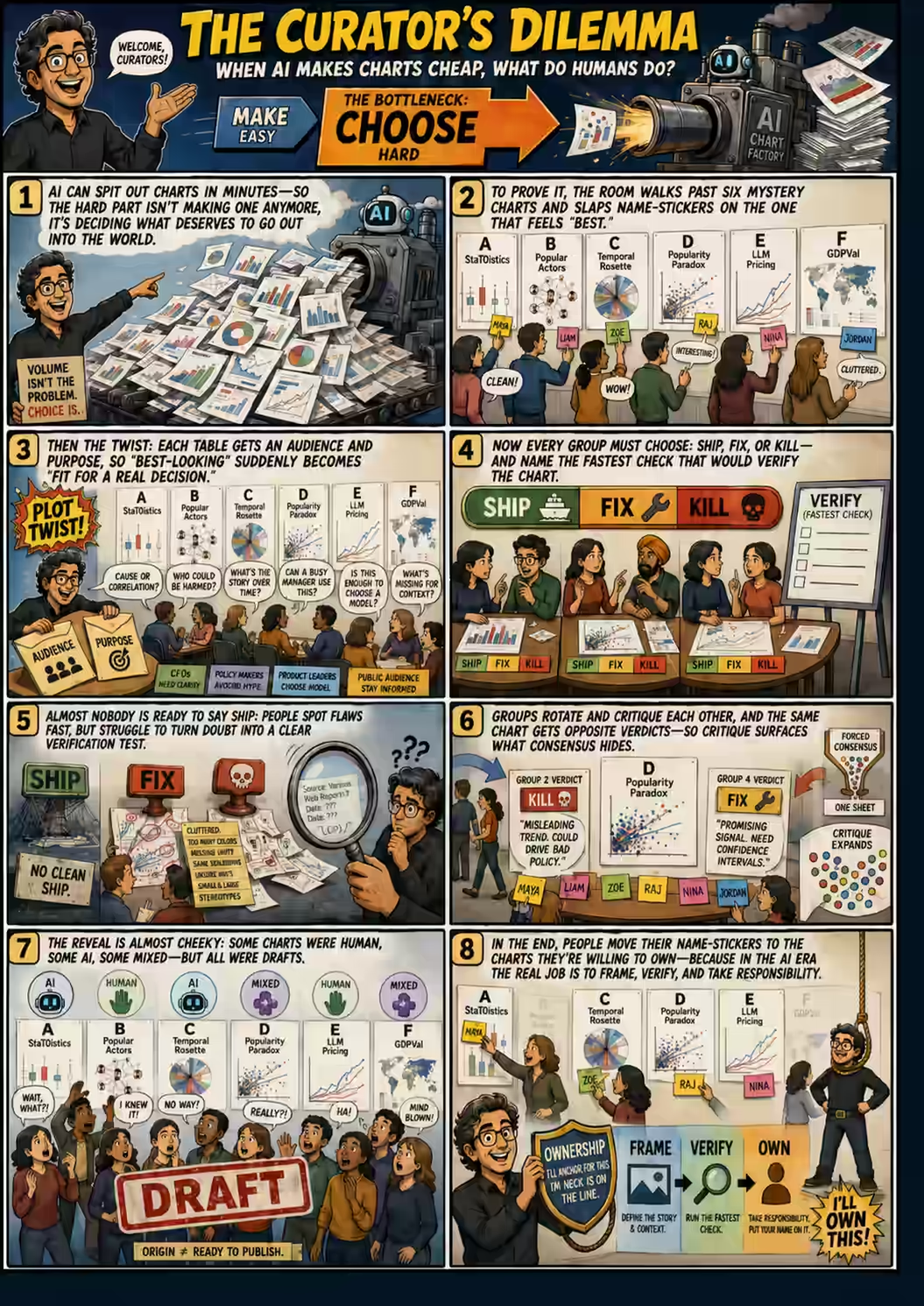
Last week at VizChitra, I ran a “Dialogue” session. A new format for me.
I usually speak 80% in my workshops.
In this dialog, I spoke 20%.
The group discussed.
PART A
I showed 6 charts and said, “Pick the best.”
Then I shared the audience & purpose and asked:
“For THIS audience and purpose, will you publish, fix, or kill it?”
INSIGHT: almost no one said, “Ship”. That’s good – these were all drafts.
I also asked, “How will you verify it?”
No one knew.
PART B
I rotated the groups and asked them to critique the other groups’ critique.
That’s when I learnt that even internally, groups were divided.
It didn’t come out when they could only share ONE verdict.
It DID come out when discussing across two groups.
That was my biggest surprise - AHA moment.
Independent verification matters!
I asked them to share their final verdict:
“Which chart will you put your name against?”
The top-voted chart chart was 100% AI generated.
It was, also, something the Times of India literally published.
My takeaways:
We don’t really know how to verify charts.
We don’t agree on whether a given chart fits a given purpose.
We don’t often see disagreement, especially since we often ask for ONE opinion.
Full story: https://talks.s-anand.net/2026-07-04-vizchitra-dialog-curators-dilemma/
PS: This post is 100% human generated. I mean, I wrote every word, without even consulting an LLM. Pangram declared it 100% human-generated. Still, I can’t shake that feeling… that it smells AI-generated. Does this have a name?