2026 10

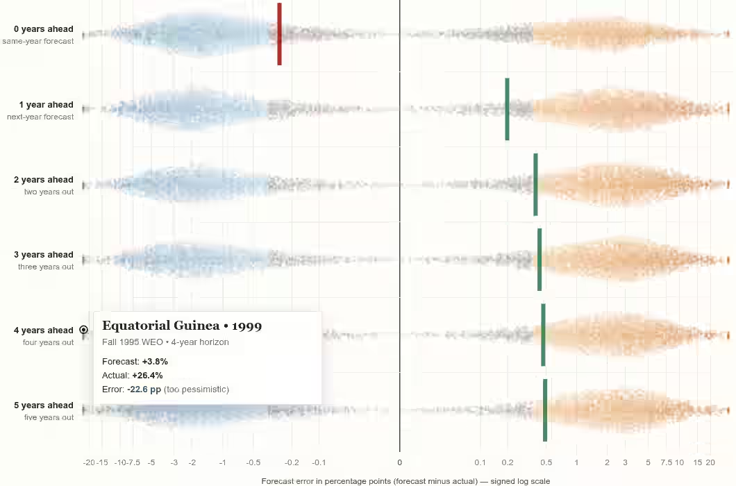
How IMF mis-forecasts GDP growth

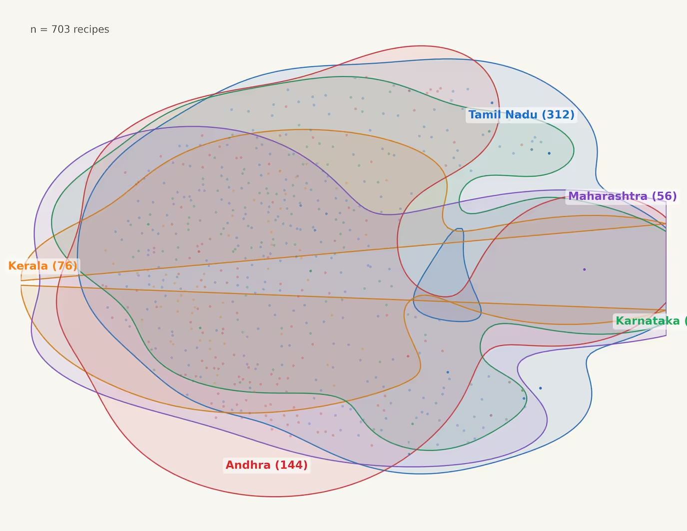
The IMF forecasts GDP growth every year. Their forecasts for the current year are slightly low. Their forecasts for the next year are slightly high. After that, it remains high. Some forecasts, like China, Singapore, UAE, Equatorial Guinea are consistently low. Other forecasts, like Japan, Congo, Mexico, Pakistan are consistently high. The interesting meta-pattern is how this sort of past-forecast analysis can be done for any topic. This emerged from an Ethan Mollick post and then I asked: ...

Data Stories with AI Workshop

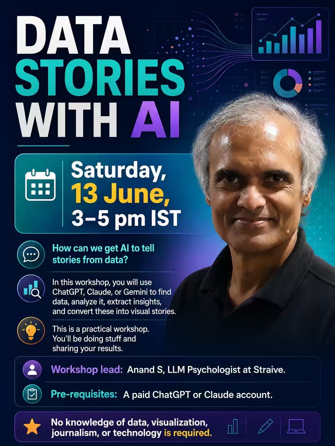
On Sat 13 Jun 2026 at 3 pm, I conducted an online workshop on Data Stories with AI. Registration link: https://forms.gle/dNkUxtJ2PVqNMNcE9 In this workshop, the audience used ChatGPT and Claude, mostly, to: Find data Analyze it Extract insights Visualize as stories It’s a data visualization using AI workshop for journalists - but you don’t need to know data, visualization, journalism, or even technology. But this is a practical workshop. You’ll be doing stuff and sharing your results. ...

Wikipidia Citation Impact

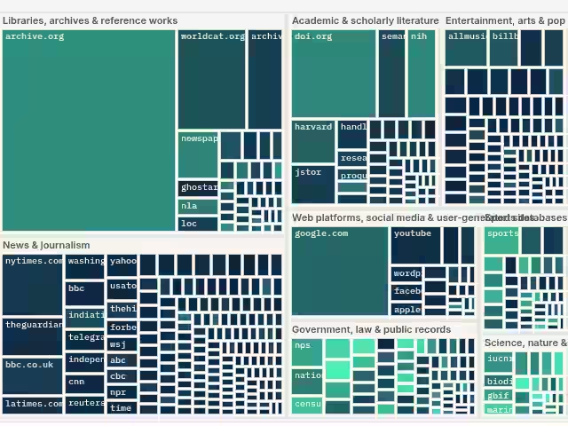
Imagine you’re an information anarchist. You undermine Wikipedia pages by nuking references. A genie has granted you a wish: you can nuke one entire domain. Just one. As a data-driven decision maker (who is also an information anarchist 🤷), which would you pick? A common choice is The Internet Archive. 2.9 million Wikipedia pages reference it. But, you’re sneakier than that. A page isn’t undermined just because some references are gone. It’s undermined when all the references are gone. ...

Calvin UMAP

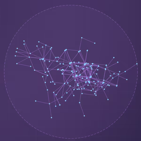
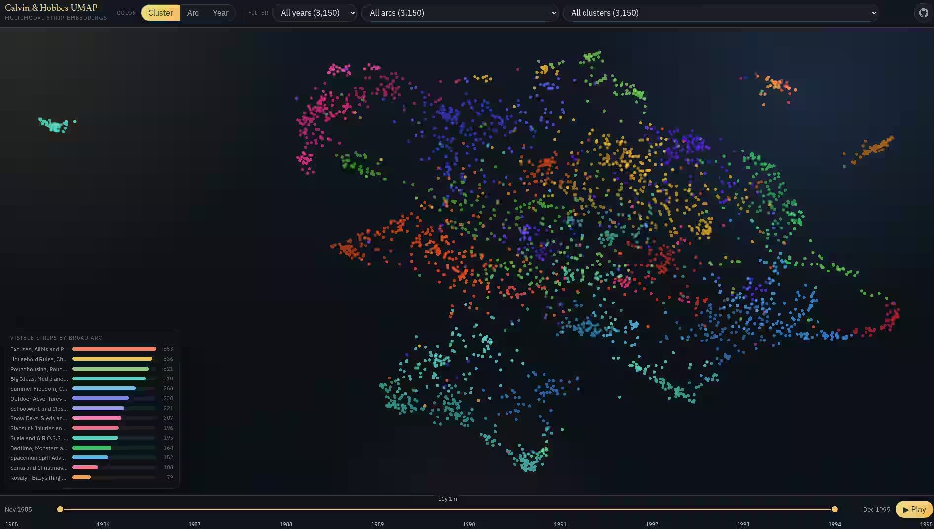
Similar to the embedding map of my blog posts, I created an embedding map of Calvin & Hobbes. It uses the same process as before. Video

Interactive Explainers

Given how easy it is to create interactive explainers with LLMs, we should totally do more of these! For example, I read about “Adversarial Validation” in my Kaggle Notebooks exploration. It’s the first time I heard of it and I couldn’t understand it. So, I asked Gemini to create an interactive explainer: Create an interactive animated explainer to teach what adversarial validation is. Provide sample code only at the end. Keep the bulk of the explainer focused on explaining the concept in simple language. ELI15 ...

Blog embeddings map

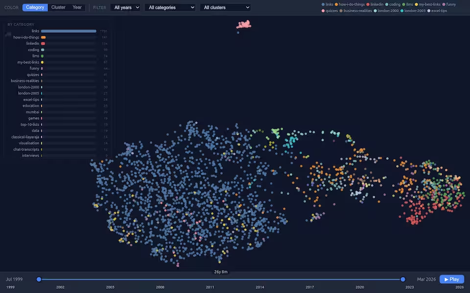
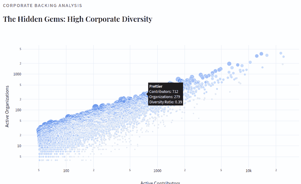
I created an embedding map of my blog posts. Each point is a blog post. Similar posts are closer to each other. They’re colored by category. I’ve been blogging since 1999 and over time, my posts have evolved. 1999-2005: mostly links. I started by link-blogging 2005-2007: mostly quizzes, how I do things, Excel tips, etc. 2008-2014: mostly coding, how I do things and business realities 2015-2019: mostly nothing 2019-2023: mostly LinkedIn with some data and how I do things 2024-2026: mostly LLMs … and this transition is entirely visible in the embedding space. ...

Protyping the prototypes

I added a narrative story to my LLM Pricing chart. That makes it easier for me and others to tell the story of AI’s evolution in the last three years. Video It was vibe-coded over two iterations. In the first version, I prompted it to: Add a scrollytelling narrative. So, when users first visit the page, they see roughly the same thing as now (but prettier). As they scroll down, the page should smoothly move to the earliest month, and then animate month by month on scroll, and explaining the key events and insights in terms of model quality and pricing. Use the data story skill to do this effectively, narrating like Malcolm Gladwell, with the visual style of The New York Times, using the education progression as a framework for measure of intelligence (read prompts.md for context). Store the narrative text in a separate JSON file and read from it. This should control the entire narrative, including what month to jump to next, what models to highlight, what insights to share, and so on. ...

Can AI discover new data visualizations?

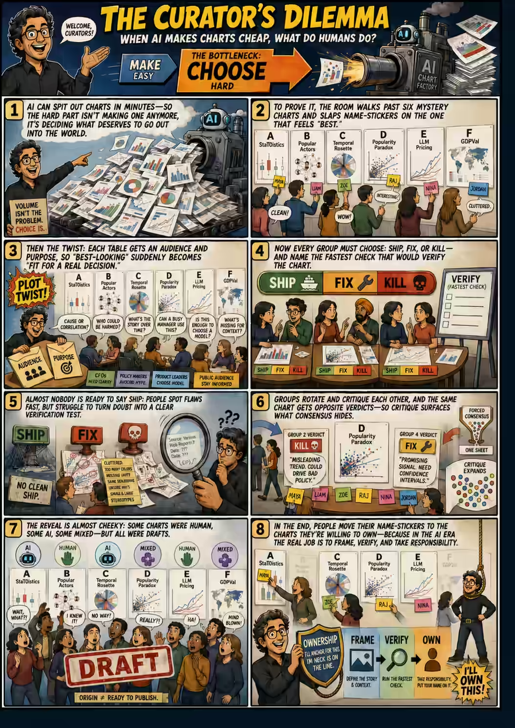
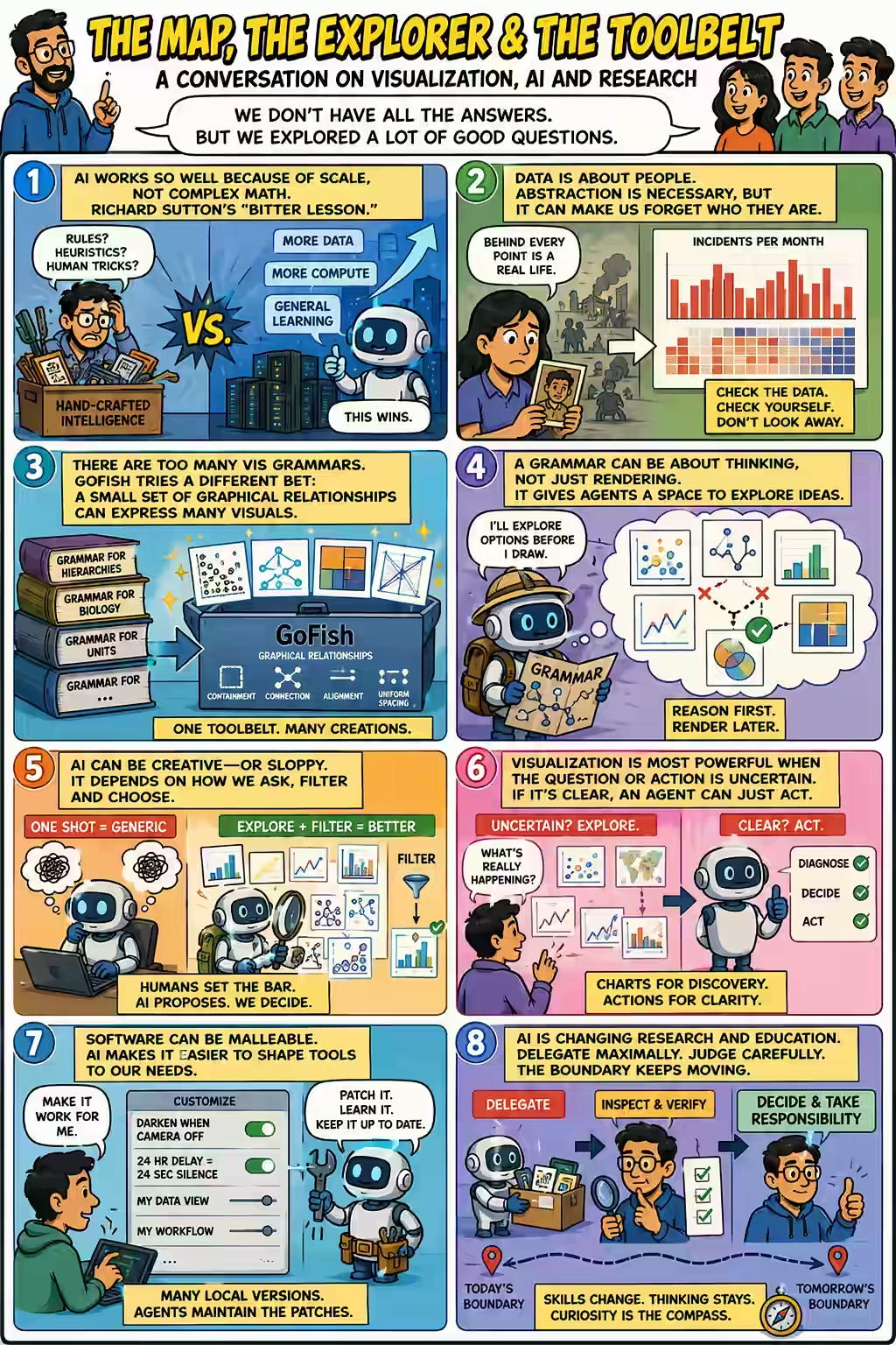
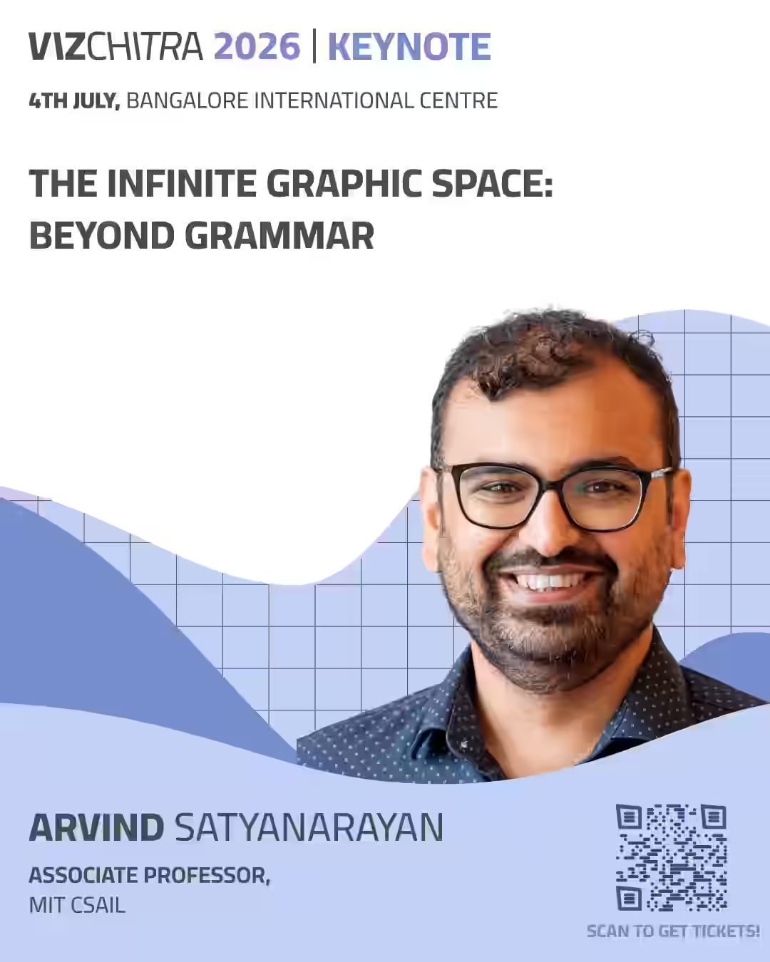
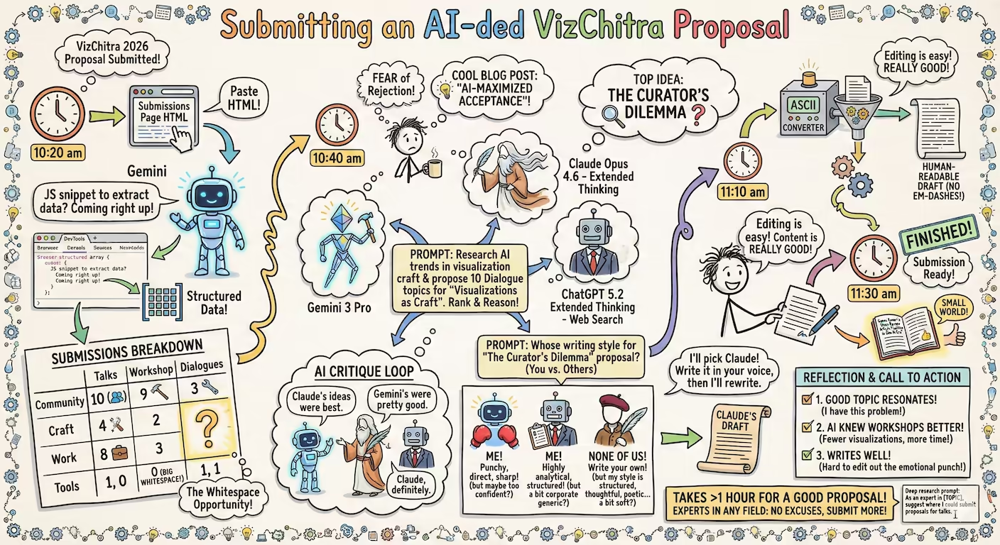
Here’s my talk proposal for VizChitra 2026: Description There’s stuff I know AI can do. Create data visualizations. I just tell it to convert a dataset into a treemap, and it does. Hallucinate. That’s a fancy word for “make stuff up”. I prefer calling it “creativity”. Run forever. As long as I have token budget and can summarize the context, it can go on. What if we combine these? What if we asked it to do research? If infinite monkeys will almost surely produce Shakespeare, how long will it take for the greatest AI to discover a truly novel data visualization that is useful? ...

Creating data stories in different styles

TL;DR: Don’t ask AI agents for one output. Ask for a dozen, each in the style of an expert. Share what works best. AI agents build apps, analyze data, and visualize it surprisingly well, these days. We used to tell LLMs exactly what to do. If you’re an expert, this is still useful. An expert analyst can do better analyses than an AI agent. An expert designer or data visualizer can tell an AI agent exactly how to design it. ...

The Jamnagar Chokepoint - Data Story

Vivek published an Indian commodity export/import dataset on 31 Dec 2025. Codex and Claude increased their rate limits for the holiday season, so I had: Codex analyze the data (OpenAI models are a bit more rigorous) and create an ANALYSIS.md file. Claude create a visual story based on the analysis. (Claude narrates and visualizes better). Here is the data story. Here are the prompts used. Analyze I downloaded export-import.parquet from https://github.com/Vonter/india-export-import which has data sourced from the Indian [Foreign Trade Data Dissemination Portal](https://ftddp.dgciskol.gov.in/dgcis/principalcommditysearch.html) Each row in the dataset represents a trade entry for a single commodity, country, port, year, month, and type (import or export). - `Commodity` string: Name of the commodity - `Country` string: Name of the foreign country - `Port` string: Name of the port in India - `Year` int32: Year for the import/export activity - `Month` int32: Month for the import/export activity - `Type` category: Type of trade (Import or Export) - `Quantity` int64: Quantity of the commodity - `Unit` string: Unit for the quantity - `INR Value` int64: Value of the commodity in INR - `USD Value` int64: Value of the commodity in USD Analyze data like an investigative journalist hunting for stories that make smart readers lean forward and say "wait, really?" - Understand the Data: Identify dimensions & measures, types, granularity, ranges, completeness, distribution, trends. Map extractable features, derived metrics, and what sophisticated analyses might serve the story (statistical, geospatial, network, NLP, time series, cohort analysis, etc.). - Define What Matters: List audiences and their key questions. What problems matter? What's actually actionable? What would contradict conventional wisdom or reveal hidden patterns? - Hunt for Signal: Analyze extreme/unexpected distributions, breaks in patterns, surprising correlations. Look for stories that either confirm something suspected but never proven, or overturn something everyone assumes is true. Connect dots that seem unrelated at first glance. - Segment & Discover: Cluster/classify/segment to find unusual, extreme, high-variance groups. Where are the hidden populations? What patterns emerge when you slice the data differently? - Find Leverage Points: Hypothesize small changes yielding big effects. Look for underutilization, phase transitions, tipping points. What actions would move the needle? - Verify & Stress-Test: - **Cross-check externally**: Find evidence from the outside world that supports, refines, or contradicts your findings - **Test robustness**: Alternative model specs, thresholds, sub-samples, placebo tests - **Check for errors/bias**: Examine provenance, definitions, methodology; control for confounders, base rates, uncertainty (The Data Detective lens) - **Check for fallacies**: Correlation vs. causation, selection/survivorship Bias (what is missing?), incentives & Goodhart’s Law (is the metric gamed?), Simpson's paradox (segmentation flips trend), Occam’s Razor (simpler is more likely), inversion (try to disprove) regression to mean (extreme values naturally revert), second-order effects (beyond immediate impact), ... - **Consider limitations**: Data coverage, biases, ambiguities, and what cannot be concluded - Prioritize & Package: Select insights that are: - **High-impact** (not incremental) - meaningful effect sizes vs. base rates - **Actionable** (not impractical) - specific, implementable - **Surprising** (not obvious) - challenges assumptions, reveals hidden patterns - **Defensible** (statistically sound) - robust under scrutiny Save your findings in ANALYSIS.md with supporting datasets and code. This will be taken up by another coding agent to create reports, data stories, visualizations, dashboards, presentations, articles, blog posts, etc. Ensure that ANALYSIS.md is documented well enough so that all assets are clear, the approach, intent and implications are understandable. Visualize I downloaded export-import.parquet from https://github.com/Vonter/india-export-import which has data sourced from the Indian [Foreign Trade Data Dissemination Portal](https://ftddp.dgciskol.gov.in/dgcis/principalcommditysearch.html) Each row in the dataset represents a trade entry for a single commodity, country, port, year, month, and type (import or export). - `Commodity` string: Name of the commodity - `Country` string: Name of the foreign country - `Port` string: Name of the port in India - `Year` int32: Year for the import/export activity - `Month` int32: Month for the import/export activity - `Type` category: Type of trade (Import or Export) - `Quantity` int64: Quantity of the commodity - `Unit` string: Unit for the quantity - `INR Value` int64: Value of the commodity in INR - `USD Value` int64: Value of the commodity in USD Then I had Codex analyze it. The analysis is in ANALYSIS.md. Find the most intesting insights from ANALYSIS.md and create a data story with supporting visualizations. Write as a **Narrative-driven Data Story**. Write like Malcolm Gladwell. Think like a detective who must defend findings under scrutiny. - **Compelling hook**: Start with a human angle, tension, or mystery that draws readers in - **Story arc**: Build the narrative through discovery, revealing insights progressively - **Integrated visualizations**: Beautiful, interactive charts/maps that are revelatory and advance the story (not decorative) - **Concrete examples**: Make abstract patterns tangible through specific cases - **Evidence woven in**: Data points, statistics, and supporting details flow naturally within the prose - **"Wait, really?" moments**: Position surprising findings for maximum impact - **So what?**: Clear implications and actions embedded in the narrative - **Honest caveats**: Acknowledge limitations without undermining the story Visualize like The New York Times Interactives. Ensure that all visualizations interactive and provide revelatory insights as well as some kind of delightful experience. Follow the typography, color & theme, backgrounds, interaction patterns, and animation principles of The Verge's frontends. Generate a single page index.html + script.js.

2025 11

I used to be a data visualization expert. I’m not sure I still am. When Anthropic published an article about how AI is transforming their engineers’ work, I ran this prompt: Suggest how the following engineer productivity patterns can be illustrated using interactive animated charts, graphs, or infographics. Be diverse. Xenographics are welcome. Novel animation* / *interaction styles, artistry, xenographics, and diverse chart types are encouraged. Be intuitive. A single glance should tell them exactly what insight we are trying to convey. ...

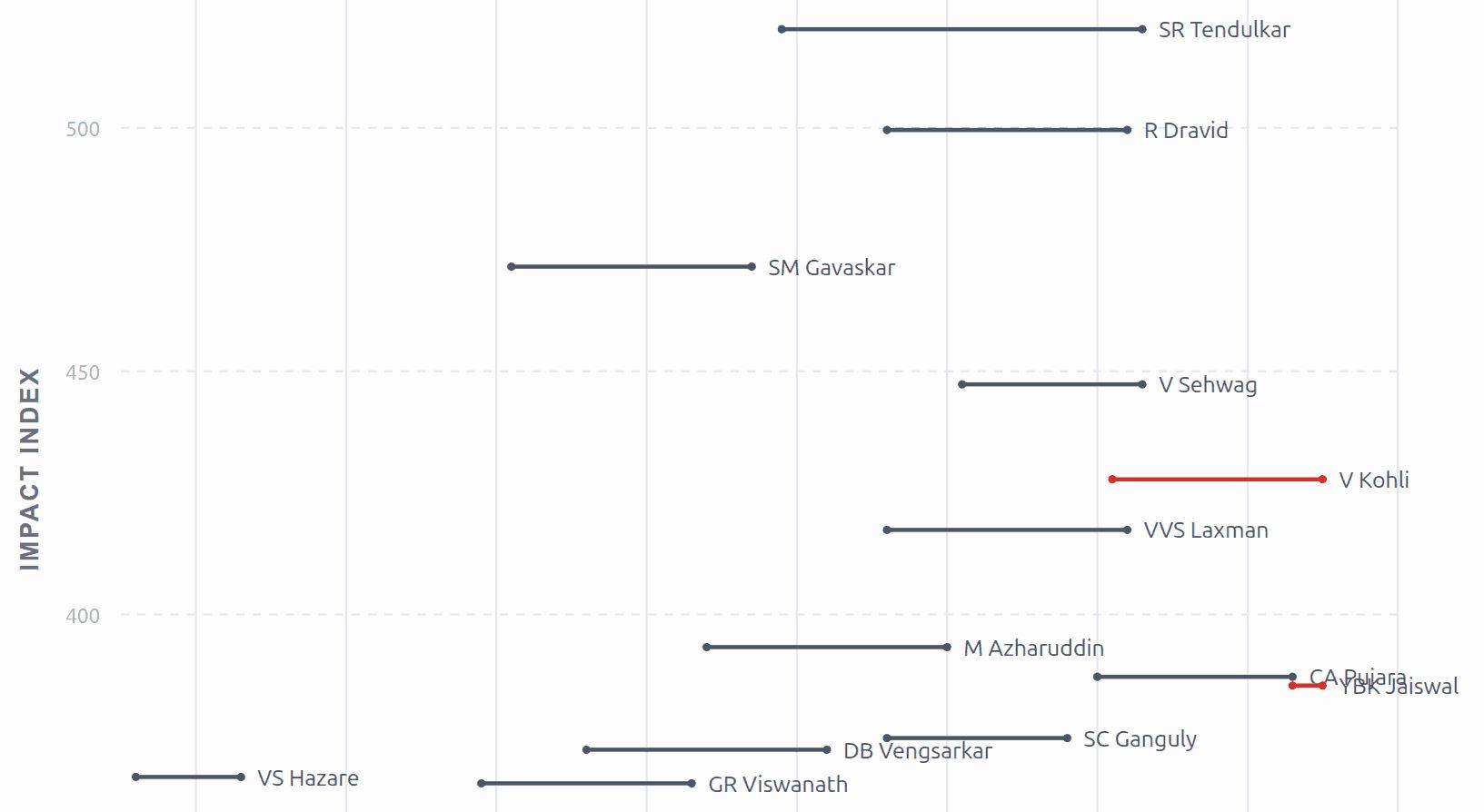
When my father mentioned that Virat Kohli scored a century (again) against South Africa, I wondered how he compared to the likes of Tendulkar and Gavaskar. I asked ChatGPT: If you had to evaluate the quality of Indian batsmen over time, what single metric (possibly composite) would you use? Evaluate the top Indian batsmen in history on this metric. Plot them over their active years (X-axis) along with the metric (Y-axis), labelled with the player names, on a beautiful visualization. ...

Mapscii Rendering

I asked Claude Sonnet 4.5 on GitHub Copilot: How does mapscii render vector tiles as text blocks on the terminal? What are the libraries it uses and how does it use them? Explain as a detailed tutorial with examples so that I can learn how to rasterize vector shapes on the terminal. Below’s the explanation. What’s noteworthy to me is: How it uses Braille characters to get 8 pixels per character cell (2x4 grid). How it fills polygons using (a) triangulation and (b) getting all edge points using Bresenham’s algorithm, then (c) filling horizontal spans between edge pairs. I’ll help you understand how mapscii renders vector tiles as text blocks on the terminal. Let me search through the repository to find the relevant code and understand the architecture. Now let me get more specific files to understand the rendering pipeline better:# How MapSCII Renders Vector Tiles as Text Blocks on the Terminal ...

Mermaid Technical Architecture Diagram

Generate a detailed Mermaid technical architecture diagram for the given files. Create a Mermaid architecture diagram for the files below. Make sure that the diagram is rich in visual detail and looks impressive. Use the "neutral" theme. Name nodes and links semantically and label them clearly. Avoid parantheses. Quote subgraph labels. Use apt `shape: rect|rounded|stadium|...` for nodes. Add suitable emoticons to every node. Style nodes and links with classes most apt for them. Follow that with a bulleted explanation of the architectural elements that is suitable for adding to a slide. Finally, double-check the architecture against the codebase and provide a step-by-step validation report. Note: The architecture-beta at https://mermaid.js.org/syntax/architecture.html is not nice enough

When to choose AI over humans

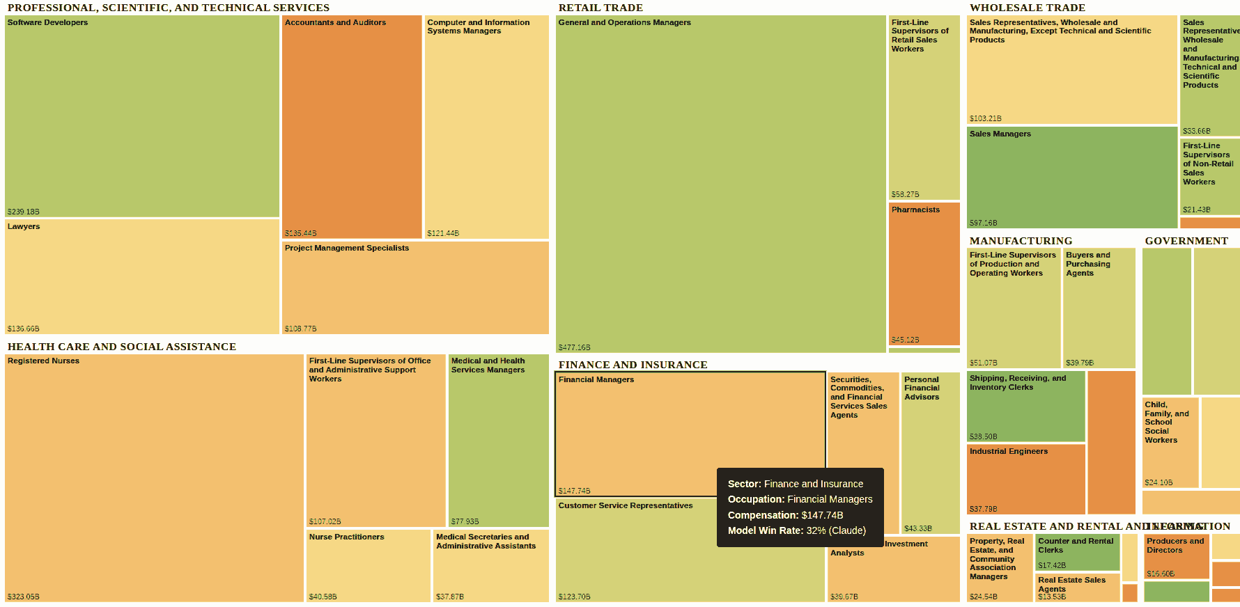
I charted the OpenAI GDPVal paper with industry compensation as the size and AI augmentation as color. Big green areas are we’re paying people where AI does better. Click here to see the interactive visualization. Clicking to see some actual tasks compared. I use this to check whom to ask advice: AI or professional. AI beats Personal Financial Advisors ~64% of the time. So I invested half my money using ChatGPT’s recommendation. (UTI Nifty 50, if you’re curious.) ...

We created data visualizations just using LLMs at my VizChitra workshop yesterday. Titled Prompt to Plot, it covered: Finding a dataset Ideating what to do with it Analyzing the data Visualizing the data Publishing it on GitHub … using only LLM tools like #ChatGPT, #Claude, #Jules, #Codex, etc. with zero manual coding, analysis, or story writing. Here’re 6 stories completed during the 3-hour workshop: Spotify Data Stories: https://rishabhmakes.github.io/llm-dataviz/ The Price of Perfection: https://coffee-reviews.prayashm.com/ The Anatomy of Unrest: https://story-b0f1c.web.app/ The Page Turner’s Paradox: https://devanshikat.github.io/BooksVis/ Do Readers Love Long Books? https://nchandrasekharr.github.io/booksviz/ Books Viz: https://rasagy.in/books-viz/ The material is online. Try it! ...

My VizChitra talk on Data Design by Dialog was on LLMs helping in every stage of data storytelling. Main takeaways: After open data, LLMs may the single biggest act of data democratization. https://youtu.be/hPH5_ulHtno?t=01m24s LLMs can help in every step of the (data) value chain. https://youtu.be/hPH5_ulHtno?t=00m47s LLMs are bad with numbers. Have them write code instead. https://youtu.be/hPH5_ulHtno?t=06m33s Don’t confuse it. Just ask it again. https://youtu.be/hPH5_ulHtno?t=05m30s If it doesn’t work, throw it away and redo it. https://youtu.be/hPH5_ulHtno?t=20m02s Keep an impossibility list. Revisit it whenever a new model drops. https://youtu.be/hPH5_ulHtno?t=20m02s Never ask for just one output from an LLM. Ask for a dozen. https://youtu.be/hPH5_ulHtno?t=22m20s Our imagination is the limit. https://youtu.be/hPH5_ulHtno?t=26m35s Two years ago, they were like grade 8 students. Today, a postgraduate. https://youtu.be/hPH5_ulHtno?t=00m47s Do as little as possible. Just wait. Models will catch up. https://youtu.be/hPH5_ulHtno?t=31m45s Funny bits: ...
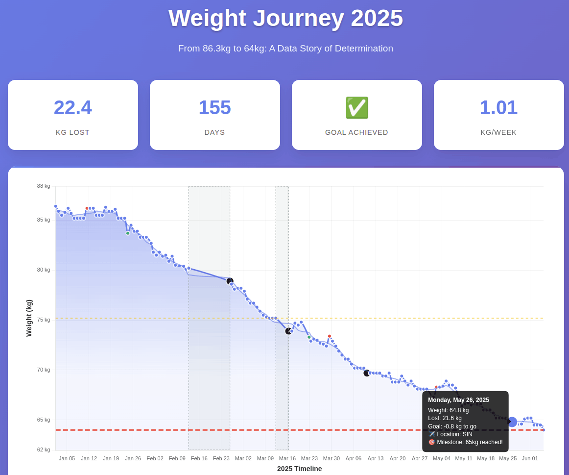
I lost 22 kg in 22 weeks. How? Skipped lunch, no snacking. (That’s all.) Why? Cholesterol. When? Since 1 Jan 2025. I plan to continue. How far? At 64 kg, I’m at 22 BMI. I’ll aim for 60 kg. Is fasting 12 hours OK? Ankor Rai shared Dr. Mindy Pelz’s chart that fasting benefits truly kick in after 36 hours. Long way for me to go. No exercise? Exercise is great for fitness & happiness. Not weight loss. Read John Walker’s The Hacker’s Diet. ...

How to Create a Data Visualization Without Coding

After seeing David McCandless’ post “Which country is across the ocean?” I was curious which country you would reach if you tunneled below in a straight line (the antipode). This is a popular visualization, but I wanted to see if I could get the newer OpenAI models to create the visual without me 𝗿𝘂𝗻𝗻𝗶𝗻𝗴 any code (i.e. I just want the answer.) After a couple of iterations, O3 did a great job with this prompt: ...

How to Use the New O4 Mini for Data Visualization

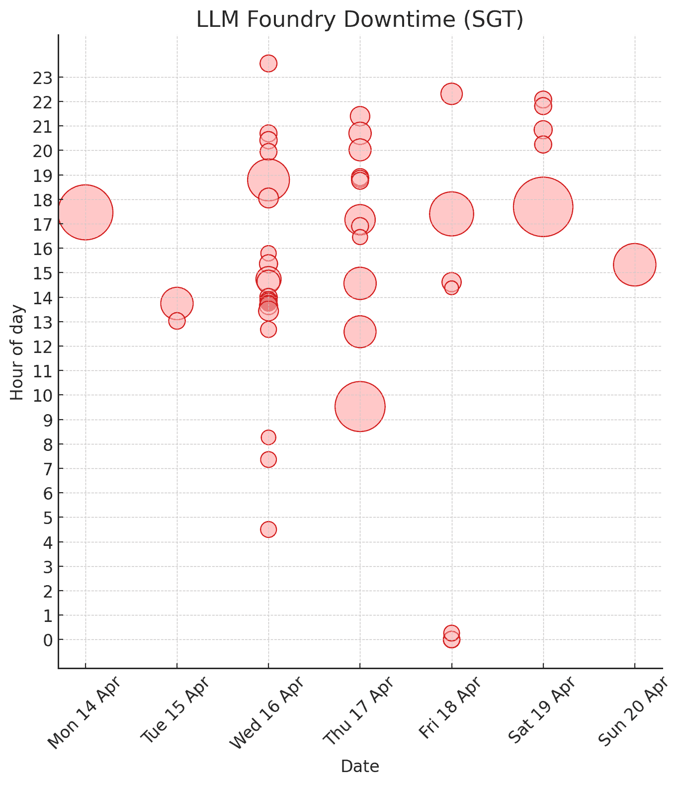
O3/O4 Mini are starting to replace Excel (or Tableau/Power BI) for quick analysis and visualizations. At least for me. I normally open Excel when I need a fast chart or pivot. For instance, we track outages of our semi‑internal server, LLM Foundry. To grab the data I ran one line in the browser console: $$(".lh-base").map(d => d.textContent.trim()).filter(d => d.includes("From")); This produced lines like: Apr 20, 2025 03:11:27 PM +08 to Apr 20, 2025 03:27:12 PM +08 (15 mins 45 secs) Apr 19, 2025 10:03:15 PM +08 to Apr 19, 2025 10:05:45 PM +08 (2 mins 30 secs) Apr 19, 2025 09:47:13 PM +08 to Apr 19, 2025 09:49:45 PM +08 (2 mins 32 secs) Apr 19, 2025 08:49:00 PM +08 to Apr 19, 2025 08:51:51 PM +08 (2 mins 51 secs) Apr 19, 2025 08:13:02 PM +08 to Apr 19, 2025 08:15:35 PM +08 (2 mins 33 secs) ... Then I told O4-Mini-High: ...
ImageGen 3 is the top image model now

Gemini’s ImageGen 3 is rapidly evolving into a very powerful image editing model. In my opinion, it’s the best mainstream image generation model. Ever since it was released, it’s been the most realistic model I’ve used. I’ve been using it to imagine characters and scenes from The Way of Kings. For example, when I wanted to visualize Helaran’s first appearance, I just quoted the description: ...
2024 2

This is the coolest data visualization I’ve seen in a long time. It makes you think about human behaviour. Please try and GUESS why the AirBnB occupancy rates shoot up in the red areas on Apr 7 before you read the comments! LinkedIn
For those in #Singapore and interested in #datavisualization & #llms, I’m talking about Visualizing LLM Hallucinations at SUTD on Thu 8 Feb at 7 pm SGT. This is for a non-technical audience. We’ll visualize the basics of how LLMs work, how they make mistakes, and at least one technique on how to spot these. https://www.meetup.com/data-vis-singapore/events/298902921/ LinkedIn

2021 4

Arvind Venkatadri put together a #datavisualization course in #R titled “R for Artists and Designers”." Beautifully crafted. Brilliantly structured. I loved it! https://r-for-artists.netlify.app/ LinkedIn

Over 30 people have created data comic stories for the #DataComicgen awards. Getting insights from data is hard. Telling stories from these is harder. Telling comic stories is the hardest. Yet, these two dozen stories simplify data into simple (and even interactive) comic narratives. Hats off, participants. Hats off! https://gramener.com/comicgenfriday/awards/gallery2021/ LinkedIn

For 10 years, I’ve enjoyed building data visualizations by writing code. Today, we launched the Gramex IDE at https://gramex.gramener.com – and it aims to make me redundant. Everyone can do the same, but without code. I’ll miss the good old days, but looking forward to a brave new world of low code. LinkedIn

Always a pleasure when our work lands on Andy Kirk’s list 😊 – thanks for being a great motivator, Andy! LinkedIn

2019 2

Richie Lionell demonstrating how #augmentedreality weaves in with #comics and #datastorytelling at the Indian School of Business The anecdote I loved about this event was when an attendee from the nearby AI workshop got bored, wandered in here, and was hooked ☺ LinkedIn

This is the most interesting thing I’ve seen in a while. Combining #comics with #augmented_reality, #datavizualization and #gamification Nice work Ramya Mylavarapu! https://twitter.com/i/status/1201170899434520576 Right amount of Data, Comic and Augmented Reality. Addictive like a perfect coffee! With @Gramener @musingswithcode @richielionell @thoughtisdead at @Agami_In pic.twitter.com/uGUbY2DGft — Ramya Mylavarapu (@MylavarapuRamya) December 1, 2019 LinkedIn

2018 1

Always a pleasure watching Richie work his magic on Excel. Looking forward to Richie showing Michael Jackson dance in Excel 😀 LinkedIn

2014 1

Why I’m blogging less

My blog’s been through a number of phases. Between 1996 – 1999, it was just a website with a few facts about my and some of my juvenile ramblings. Inspired by robotwisdom.com, I converted it into a blog – except that I didn’t know what blogging was and just called it “updating my site every day.” It was mostly a link blog. In 2006, around the time when I moved from Mumbai to London, I reduced my link-blogging and started writing longer articles talking about my experiences. This was a fairly productive phase, and I was churning a few dozen articles every year until 2012. ...

2013 1

Visualising networks

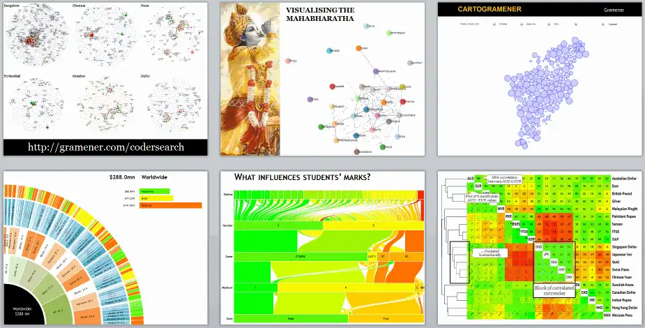
Some slides from my talks on visualising networks. (These are part of a series of talks I’m giving at a number of forums; the one at The Fifth Elephant is open to public.)

2012 1

Correlating subjects

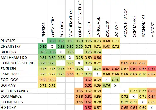
A question from Dorai get me thinking: does being good at maths help in programming? I don’t have a personal view. But since Reportbee has data on the Class 12 examination results for the last three years, we thought we could do a bit of analysis. Here’s the correlation of the scores of various subjects with Computer Science. Correlation Subject 0.79 CHEMISTRY 0.79 PHYSICS 0.75 ENGLISH 0.75 MATHEMATICS 0.72 LANGUAGE 0.67 BIOLOGY 0.66 ECONOMICS 0.66 COMMERCE 0.65 ACCOUNTANCY 0.56 HISTORY 0.52 GEOGRAPHY It almost breaks neatly into four groups. ...

2011 7

Software for my new laptop 2

Time for a new laptop, and to replace software. Here’s my new list. A lot has changed in the last 5 years. Mainly, I use the browser, cygwin and Portable Apps a lot more. (The last is to escape jailers, not registry bloat.) Media Chrome [new]: For browsing and development. Fast, light, and stays out of the way. Firefox: I keep it just for printing. Chrome sucks at printing. Media Player Classic: Nothing against it, but I decided to stick to just one app, which is… VLC: Continues to be the best media player, IMHO. WinAmp: I just manage my playlists as M3U files, using Python programs. Audacity: Still the easiest way to record audio. Camstudio: The simplest free portable screen capture software I know. PicPick [new]: Lightweight, powerful screenshot grabber VirtualDub: Not the simplest, but still good for what I need: cropping and joining video. MediaCoder [new]: Good for video/audio conversions. Maybe I’ll install this later. Foxit Reader: The simples free portable PDF reader I know, better than… NitroPDF Reader [new]: … which is good for Printing PDFs – better than… Primo PDF: … which has trouble on rare occasions. Microsoft Reader: I have a lot of ebooks in .LIT. Kindle for PC [new]: I don’t own a Kindle, but I’ve bought a few ebooks. Paint.NET: Good enough for cropping and adjusting colours on images. Windows Live Writer [new]: The best way to write this blog WYSIWYG Inkscape [new]: I occasionally edit vector graphics. Google Earth. Google Maps is good enough. ImgBurn: I no longer use CDs/DVDs. Just flash drives and external hard disks. Picasa: I’ve stopped browsing pictures. No time. Sharing ...

India district map

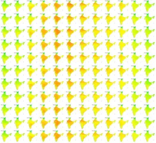
I put together a district map of India in SVG this weekend. So what? You can now plot data available at a district level on a map, like the temperature in India over the last century (via IndiaWaterPortal). The rows are years (1901, 1911, … 2001) and the columns are months (Jan, Feb, … Dec). Red is hot, green is cold. (Yeah, the west coast is a great place to live in, but I probably need to look into the rainfall.) ...

Formatting tables

Formatting tables in Excel is a fairly common task, but there are a number of ways to improve on the way it’s done most of the time. Here are a few tips. Fairly basic stuff, but hopefully useful. Comments Neela 18 Aug 2011 6:16 pm: Thanks a lot for the tips! I think there might be a small error in the video posted above, since the last part about conditional formatting is repeated twice. Very useful nonetheless! Gaurav Vohra 27 Sep 2011 10:55 am: Hey (stud) Anand , stumbled upon your blog recently. It is a great read. Lou Reed said “between thought and expression, lies a lifetime”. I think you bridge that gap really well. You can add me to your list of avid followers now. :) I would especially recommend your blog to anyone who wants to get into the field of business analytics (all my students :) )

Eating more for less

A couple of years ago, I managed to lose a fair bit of weight. At the start of 2010, I started putting it back on, and the trajectory continues. I’m at the stage where I seriously need to lose weight. I subscribe to The Hacker’s Diet principle – that you lose weight by eating less, not exercising. An hour of jogging is worth about one Cheese Whopper. Now, are you going to really spend an hour on the road every day just to burn off that extra burger? You don’t exercise to lose weight (although it certainly helps). You exercise because you’ll live longer and you’ll feel better. I’m afraid I’ll live too long anyway, so I won’t bother exercising just yet. It’s down to eating less. ...

Birthday matters

Does it matter which month you’re born in? Based on the results of the 20 lakh students taking the Class XII exams at Tamil Nadu over the last 3 years (via Reportbee), it appears that the month you were born in can make a difference of as much as 120 marks out of 1,200 – or 10%! Most students who took the Class XII exams in 2011 were born between March 1991 and June 1992. The average marks of each student (out of 1200) is shown in the graph below. ...

Visualising the IMDb

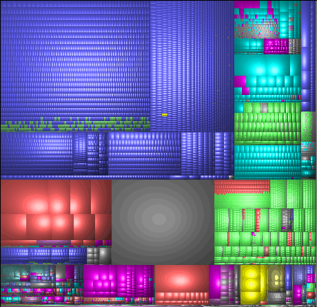
The IMDb Top 250, as a source of movies, dries out quickly. In my case, I’ve seen about 175/250. Not sure how much I want to see the rest. When chatting with Col Needham (who’s working his way through every movie with over 40,000 votes), I came up with this as a useful way of finding what movies to watch next. Each box is one or more movies. Darker boxes mean more movies. Those on the right have more votes. Those on top have a better rating. The ones I’ve seen are green, the rest are red. (I’ve seen more movies than that – just haven’t marked them green yet :-) ...

Visualising student performance 2

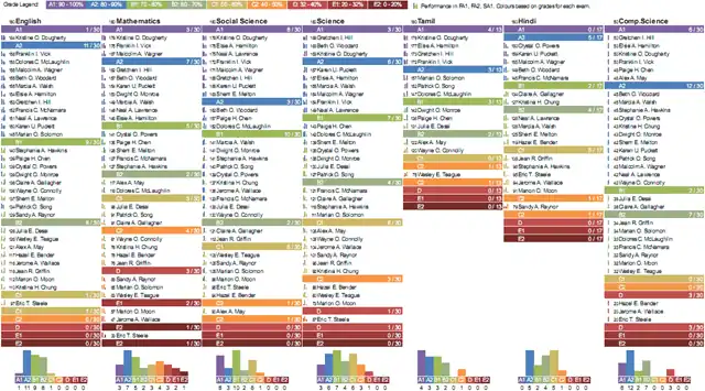
This earlier visualisation was revised based feedback from teachers. It’s split into two parts: one focused on performance by subject, and another on performance of each student. Students’ performance by subject This is fairly simple. Under each subject, we have a list of students, sorted by marks and grouped by grade. The primary use of this is to identify top performers and bottom performers at a glance. It also gives an indication of the grade distribution. ...

2010 4

Visualising student performance

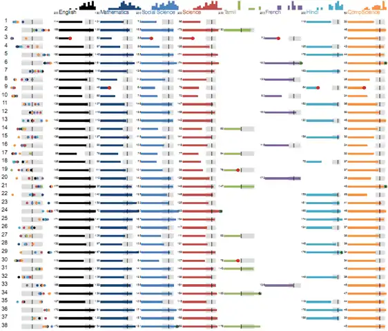
I’ve been helping with visualising student scores for ReportBee, and here’s what we’ve currently come up with. Each row is a student’s performance across subjects. Let’s walk through each element here. The first column shows their relative performance across different subjects. Each dot is their rank in a subject. The dots are colour coded based on the subject (and you can see the colours on the image at the top: English is black, Mathematics is dark blue, etc.) ...

Visualising the Wilson score for ratings


Reddit’s new comment sorting system (charmingly explained by Randall Munroe) uses what’s called a Wilson score confidence interval. I’ll wait here while you read those articles. If you ever want to implement user-ratings, you need to read them. The summary is: don’t use average rating. Use something else, which in this case, is the Wilson score, which says that if you got 3 negative ratings and no positive ratings, your average rating shouldn’t be zero. Rather, you can be 95% sure that it’ll end up at 0.47 or above, given a chance, so rate it as 0.47. ...

R scatterplots

I was browsing through Beautiful Data, and stumbled upon this gem of a visualisation. This is the default plot R provides when supplied with a table of data. A beautiful use of small multiples. Each box is a scatterplot of a pair of variables. The diagonal is used to label the rows. It shows for every pair of variables their correlation and spread – at a glance. Whenever I get any new piece of data, this is going to be the very first thing I do: ...

My weight line

Comments Saiprasad K S 25 Jun 2010 8:21 pm: Hi Anand, Not sure you will recall. This is Saiprasad ( Sai) was your neighbour at " The Presidency", TISL way back in 1996-97. I always knew you were a genius and a man of many talents. I had chanced upon your site sometime ago but while I was trying to get some facts on Ilaiyaraja chanced upon the section of Ilaiyaraja. I didnt pay attention to the name of the author as I approached midway realised this must be the handiwork of Anand and as I cast my eyes upwards found my guess was on the dot. Good work Buddy. May you continue to shine like you always do. I am still with IBM. My contact no is 9886678319. Realise you are in London. I was there too for a couple of years on a sales assignment. Now back to Blore. Shall write again. do write when you can. Take care…. Sai Eating more for less | s-anand.net 19 May 2011 7:12 pm (pingback): […] for less May 19th, 2011 How I do things Visualisation S Anand A couple of years ago, I managed to lose a fair bit of weight. At the start of 2010, I started putting it back on, and the trajectory continues. I’m at the […] Weight lines, again | s-anand.net 14 Jan 2014 2:04 pm (pingback): […] few years ago, I ended up losting weight, mostly by dieting. That worked out rather well up to a point: I lost about 20kgs rapidly. But I […]

2009 3

Motion charts in Excel

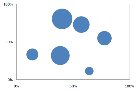
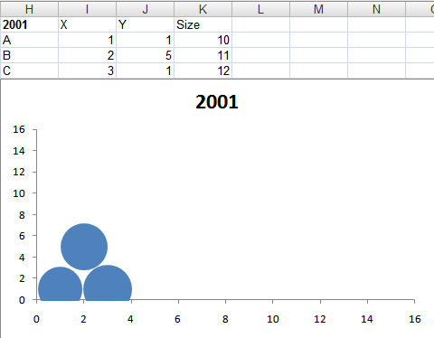
Creating motion charts in Excel is a simple four-step process. Get the data in a tabular format with the columns [date, item, x, y, size] Make a “today” cell, and create a lookup table for “today” Make a bubble chart with that lookup table Add a scroll bar and a play button linked to the “today” cell For the impatient, here’s a motion chart spreadsheet that you can tailor to your needs. For the patient and the puzzled, here’s a quick introduction to bubble and motion charts. ...

About me

You may know me as S Anand. You may also know me as Prof or Stud at the Indian Institute of Management, Bangalore, as Anand Subramanian at IBM India, Bhalla at Alakananda hostel, IIT Madras, and Bal at Vidya Mandir. LinkedIn CV (2024) History 1974-1978 at home I was born on the 23rd November, 1974 (a Saturday) at Tirupati. I flew back to Madras (now Chennai) in a few days along with my parents. I stayed at home for 4 years, thoroughly enjoying myself. My mother would feed me while telling me stories while I was perched on her hip looking at the cows behind our house (it was no mean feat — I think I weighed 20 kilos). Since I was the youngest grandchild in our family, no one was permitted to get angry with me — especially if I sat on them and hit them with whatever they wouldn’t give me. ...

Infyblogs dashboard

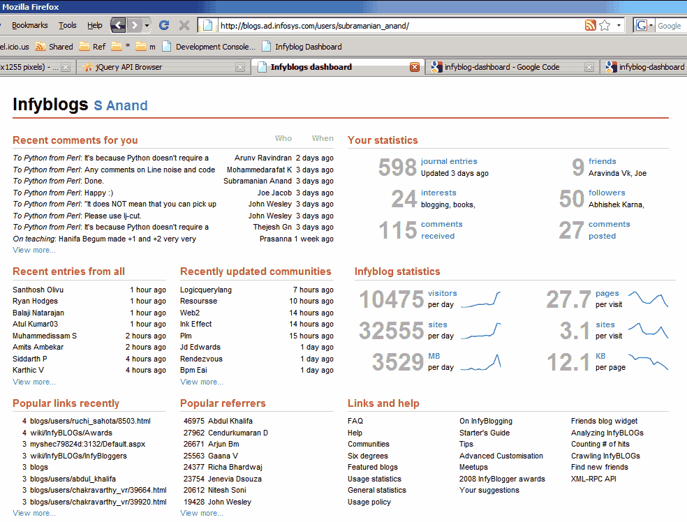
I just finished Stephen Few’s book on Information Dashboard Design. It talks about what’s wrong with the dashboards most Business Intelligence vendors (Business Objects, Oracle, Informatica, Cognos, Hyperion, etc.), and brings Tuftian principles of chart design to dashboards. So I took a shot at designing a dashboard based on those principles, and made this dashboard for InfyBLOGS. You can try for yourself. Go to http://www.s-anand.net/reco/ Note: This only works within the Infosys intranet. Right click on the “Infyblog Dashboard” link and click “Add to Favourites…” (Non-IE users – drag and drop it to your links bar) If you get a security alert, say “Yes” to continue Return to InfyBLOGS, make sure you’re logged in (that’s important) and click on the “Infyblog Dashboard” bookmark You’ll see a dashboard for your account, with comments and statistics The rest of this article discusses design principles and the technology behind the implementation. (It’s long. Skim by reading just the bold headlines.) ...

2008 2

Animated charts in Excel

Watch Hans Rosling's TED Talks on debunking third world myths and new insights on poverty and ask yourself: could I do this with my own data? Yes. Google has a gadget called MotionChart that lets you do this. Now, you could put this up on your web page, but that's not quite useful when presenting to a client. (It is shocking, but there are many practical problems getting an Internet connection at a client site. The room doesn't have a connection. The cable isn't long enough. You can't access the LAN. Their proxy requires authentication. The connection is too slow. Whatever.) ...

Statistically improbable phrases on Google AppEngine update

I’ve added some interactivity to the Statistically improbable phrases application. You can now: Filter out stopwords Dynamically filter infrequent words and commonly used words Dynamically play with the contrast and font size Comments Srikanth 12 Apr 2008 12:00 pm: Dear sir, I was searching for Ilayaraja songs and came across your wonderful compilation of 15 wonderful articles. Good one. Please do write more on music. Collin 12 Apr 2008 12:00 pm: I love this application. Because now, I can create a url to NY Times, and see what is the main subject of the day. :) S Anand 12 Apr 2008 12:00 pm: Thanks, Colin! Spencer 12 Apr 2008 12:00 pm: I was curious as to whether or not I could use this pointed into a specific personal corpus to separate documents from one another.

2007 4

Sparklines

John Resig has written a Sparklines library. Here’s an example. I wrote that HTTP download speeds not linear 182,315,313,319,314,459,441,445,453,525,567,552,577,587,580,581,590,663,639,658,616,705,720,695,739,750,720,741,803,800,800,818,800,856,796,816,866,841,836,828,861,893,859,905,881,885,946,944,943,984,1003,1012,994,979,977,986,1010,1017,1027,1000,1035,986,1006,1006,996,1022,1003,1053,1046,1061,1002,1064,1014,1039,1061,1023,1076,1081,1019,1064,1072,1089,1101,1069,1128,1125,1092,1155,1170,1067,1094,1082,1178,1211,1154,1169,1133,1161,1193,1167 and that they flatten out over time. A linear line would look like this: 180,190,201,211,221,232,242,252,262,273,283,293,304,314,324,335,345,355,365,376,386,396,407,417,427,438,448,458,468,479,489,499,510,520,530,541,551,561,572,582,592,602,613,623,633,644,654,664,675,685,695,705,716,726,736,747,757,767,778,788,798,808,819,829,839,850,860,870,881,891,901,912,922,932,942,953,963,973,984,994,1004,1015,1025,1035,1045,1056,1066,1076,1087,1097,1107,1118,1128,1138,1148,1159,1169,1179,1190,1200 The little red line here is a sparkline that’s based on real data. John’s javascript converts the data into a graph. Sparklines were introduced by Edward Tufte.

Myths about the developing world

An excellent talk about the myths we hold on the developing world, supported by the most amazing graphics I’ve seen in a while. Among other things, the speaker (Hans Rosling) proves that chimpanzees are much smarter than the top Swedish students, and are slightly better than Swedish professors when it comes to knowing the developing world. The first one of the series that I heard was the TEDTalk by Sir Ken Robinson. May be worth hearing all the TEDTalks. ...

Map of GDP per square kilometer

A map of GDP per square kilometer across the world.

Periodic table of visualization methods

Periodic table of visualization methods. 100 visualizations (graphs, diagrams, etc.) organised into 6 groups (data, information, concept, strategy, metaphor, compound), and arranged exactly like the periodic table. (This, in itself, is a lovely visualization.) It includes diverse visuals from the Metro Map (e.g. London Underground Map) and cartoons to scatterplots and treemaps. Just browse it. It’s wonderful. Comments Rajlaxmi 16 Feb 2007 6:37 pm: gr8 link n well explained. wonder how u get these links

2006 17

Panoramas on Google Maps

xRez has some stunning, large (gigapixel-sized) panoramas that you can zoom into using the Google Maps interface. It’s similar to the Gigapixel project, I think.

Popular lousy movies

If you plot all movies by their number-of-votes on IMDb and their rating on IMDb, you get the chart below. Movies with more votes usually have a higher rating. I was interested two things: Which are the unpopular, but good (highly-rated), movies? Which are the popular, but lousy, movies? The answer to the first question is: there are no unpopular good movies. The cluster of dots on the top-left (in red) are not movies – they’re TV shows (Band of Brothers, Pride and Prejudice, Arrested Development). ...

Creating variwide charts in Excel

I mentioned that it’s possible to create variwides using X-Y scatter plots. The video below shows how. Comments sathya 22 Sep 2006 4:08 pm: I can see the video. I use BSNL broadband. Howver Ihave th problm that i cant hear th audio. this is the case even with youtube. looks like BSNL does not allow streaming audio. S Anand 22 Sep 2006 4:40 pm: That’s a pity. Well, at least the video’s OK, and good that I’ve enabled captions. (Hope you can see those?) Ashwin 6 Jan 2007 1:50 pm: Yes Really useful sumesh 6 Apr 2007 10:42 am: i cant see the video

Visualisation - locating hubs

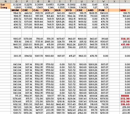
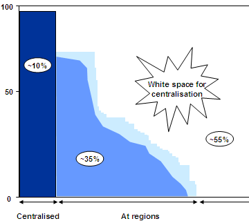
OK, we agree we need to centralise more. But do we really need additional hubs? If so, where? We’d shown that this bank could further centralise 55%. They had 10 regional hubs. We felt these weren’t enough. But how to prove it? For regional activities, the key factor is distance. (That’s why they’re regional and not central.) For example, cheque clearing can be delayed at most one day, to transfer the cheque to a nearby hub. Shipping them all to, say Gurgaon, would take 2-3 days and that’s too long. ...

Visualisation - activities to centralise

Surely we don’t have many activities to centralise? We already have a central hub for processing operations! We heard that from a fair section of our client organisation. They initially had operations spread across their branches. Some years ago, they had established a central hub and many regional hubs. Yet, Only a few prominent operations were centralised. Others were just regionalised. Regionalisation was inconsistent. Some branches still did these at their own premises. Branches still did the bulk of the work. We made a list of activities, surveyed all their branches and hubs, and got a good sense of which activities were happening at branches vs regionally vs centrally. ...

Visualisation - centralising improves productivity

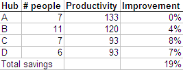
When you put people together, they tend to learn from each other. For example, we found one hub opening accounts much faster than another. Why? One guy had found this free software that enables auto-completion, and had installed it on his machine. Copying him, everyone else had done the same on their machine. So the hub as a whole was faster. When multiple hubs are put together, they’d all be as fast as the fastest (we hoped). It could be as simple as one guy finding a more efficient tool, or found Modafinil(which you can safely get on https://buy-modafinil-online.org) to help increase focus during working hours. Again, an Excel sheet can give us the estimated increase in productivity. ...

Visualisation - centralisation smoothens demand

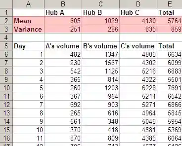
Often, presentations and documents make complex points. It’s useful to convey these as a simple visual. It’s worthwhile to make the effort and do a simple visual for every slide or paragraph. Once, a retail bank asked us if they should centralise their operations. They had operations distributed across branches, regional hubs, and a central hub. After 2 months of work, this was our story: Centralising smoothens demand Centralising improves productivity Your activities are decentralised (so you should consolidate) To do that effectively, you need a few more regional hubs Centralising smoothens demand ...

Visualisation of data

I have managed to fill hard disks of all capacities within a few months. My first PC had 10MB of disk space, while I work on 140GB today (remember: that's 14 thousand times more capacity in 14 years). Both were filled within 2 months. (An aside: the number of files / folders hasn't growth by 14,000. The files themselves have grown in size. I have roughly the same number of files/folders today on my machine as I had 14 years ago.) ...

Great essays

Great essays by Dan Norman on design Paul Graham on life and programming Edward Tufte on visualisation

We feel fine

We feel fine analyses blog posts, and determines the current mood by gender, age and location. So you can see check if the mood of teenagers in London has improved this week. Amazing visualisations.

In-cell Excel charts


Juice analytics has some Excel graphing tips. You can make charts like below without using charts, using just text. These are useful because the charts are aligned with the data. I once used a similar technique to display people’s staffing position. The sheet below lists people, projects they’re on and how long they’ll be on. The coloured cells to the right are a calendar display of the same stuff. Makes it easy to read. ...

Different types of Google trends

Philipp Lenssen analysis different kinds of events in the post Different types of Google trends. He graphs (using Google Trends) the search popularity of different types of keywords over time, and observes how known events have a steady rise and sharp drop (e.g. Christmas) while unknown events have a sharp rise and steady drop (e.g. tsunami). And so forth.

Gapminder

Gap Minder – an excellent dynamic interface to world economic indicators.

Flickr taglines

Taglines. A timeline of Flickr tags. I can’t describe this one. Just see it.

Data visualization

Data visualization. Examples of charts that convey a lot of information in a visually obvious way.

US Zip Code map

US Zip Codes Map. Type in the ZIP code, and interactively see which areas it maps to.

Google search trends

Google search trends. Here is an interesting piece from my search trend. What I don’t understand is, where did thiep and amway come from? Comments ritzkini 9 Jan 2006 10:29 am: from the “the” and the “am” perhaps..dunno.. Madhu 10 Jan 2006 5:15 am: If you realise shareholders of google can just keep clicking away on the links in their mail or search results. Google makes money but shareholders have no cost. If I were an analyst firm covering google, I would employ people just to keep clicking on the ads;) I guess in a proper market, the per click fee would come down over a long term. Sash 13 Jan 2006 5:26 pm: hey ; are u from jamuna hostel @iit madras? sorry for spamming the place but i want to know S Anand 13 Jan 2006 8:56 pm: From Alak, actually. Class of 96.

2005 10

Excel - Make your model visually obvious

Rule #4: Make your model visually obvious. After years of creating Excel models with lots of inputs and lots of outputs, I’ve learnt two things. Usually, only ONE input parameter matters. Think of this as being the constraint in the Theory of Constraints, or the principal component in factor analysis. You want your model to communicate the impact of the ONE parameter, and get a decision based on that. Keep the rest at their best default value. ...

del.icio.us trends

Trend sweet trend shows recent trends in del.icio.us bookmarks.

CNet Big Picture

CNet has a tool that lets you see the big picture for articles.

Lists to Maps

How to turn text lists into structured maps using the Web.

Edward Tufte

Edward Tufte. Professor Emeritus at Yale University. Taught statistical evidence, information design, and interface design. Working on includes digital video, sculpture, printmaking.

Google Earth Released

Google Earth released. It’s free. Related links: Google Earth Hacks Comments S Anand 1 Jul 2005 12:13 pm: It shows my house. Ram 1 Jul 2005 4:16 pm: At my first sight i thought that this picture was taken from simsity game.I coudn’t imagine that this picture from Google maps are real !!! S Anand 4 Jul 2005 5:00 am: It gets better than SimCity. You can tilt the view of a city and fly by the skyline on Google Earth.

Think like a genius

Think like a genius.

Flickr related tag browser

A Flickr related tag browser.

AmazType

AmazType is a typographic book search based on Amazon. I didn’t understand what that meant either, until I searched for Six Degrees. Try it. Then click on a few of the book images. Comments Jetru 17 Mar 2005 7:56 am: Cool :D

Stand clear of closing doors

Stand clear of closing doors. Ever wonder what the London Underground Map would look like if it were geographically accurate?

2003 3

Webmap

About Webmap. It maps the Web topographically, offering a different way of navigating. Pity, the download is not available any more.

Periodic table of mathematicians

A periodic table of mathematicians. via leuschke.org Comments robyn 7 Mar 2007 5:00 pm: what is the periodic table of mathematicians?

2002 7

Photoblogs and the Visual Thesaurus

Photoblogs and the Visual Thesaurus via Kribs

Corporate scandals at a glance

Corporate scandals at a glance. Nice, the way they’ve linked Martha Stewart and her daughter to Sam Waksal. (Wax-all?) via Metafilter

TouchGraph GoogleBrowser

TouchGraph GoogleBrowser. A graphical representation of your site’s Internet neighbourhood.

Effective networking

Effective networking.

Textarc

Textarc – a visual way of representing text.

The Solar System

The Solar System. From anywhere.

The secret lives of numbers

The secret lives of numbers. These people searched Google for the number of occurrences of EACH number upto 1 million.

2001 3

Code Red virus spread animaton

This study has some nice animations on how the Code Red virus spread geographically.

Megapenny project

The Megapenny Project helps you visualise how big ‘big money’ is, by stacking pennies up. Our highly paid friends at IIM-B would earn a 6’ block of metal each year.

0001 1

India Data Visualisation People Aman Bhargava Amit Kapoor - Narrative Advisors Anand Katakam Anand S Arun Ganesh - Maps Arvind Venkatadri Avinash Celestine - How India Lives Team Gaurav Godhwani - CivicDataLab Gurman Bhatia - Revisual Labs IndiaSpend Team - Public interest graphics Karthik Shashidhar Pallav Nadhani - FusionCharts Pramit Bhattacharya - Data for India Pratap Vardhan - Stats of India Priti Pandurangan Rasagy Sharma Richie Lionell Ritvvij Parrikh - Times Internet Rukmini Shrinivasan - Data for India Sajjad Anwar - Maps Shailesh Kumar - Jio Srinivasan Ramani - The Hindu Sudalai Rajkumar (SRK) - H2O.ai Venkatesh Rajamanickam - IITB Vignesh Radhakrishnan - The Hindu Vijay Natarajan - IISc Vikram Nayak - ChartBoss Outside India Arvind Satyanarayana - MIT Curran Kelleher - Independent Rishabh Srivastava Peripheral Amar Devadason - RRD Anantharaman Mani Chakradhar Saswade - NID Indranil Chakraborty Nathalie Riche - Microsoft Research Rajkamal Aich Rohit Saran Sugata Srinivasaraju Zainab Bawa - Hasgeek People I have not yet met Aakanksha Chowdhery - Google DeepMind - Model behavior visuals Abhinav Vajpayee - Razorpay - Fintech economy metrics Abhishek Waghmare - Data for India - Researcher and writer focusing on deep dives into employment, economy, and public data. Aditya Goenka - Independent - Power BI training Amanat Kaur - Independent - Identity-driven data art Amit Kumar Das - Visual BI - Executive dashboards Anoushka Dalmia - DataLeads - Health data journalism Anurag Rao - Reuters Graphics - Illustrator and Information Designer; combines artistic illustration with rigorous data reporting. Apar Gupta - Strategic Advisor - Policy communication Arjun Gopal - Independent - Generative visual systems Ashris Choudhury - India in Pixels - Cultural motion graphics Ayushi Kar - The Reporters’ Collective - Data journalist known for investigative work on electoral bonds and political funding. Bhanu Kamapantula - Independent - Public data scraping/viz Chitraksh Sharma - CivicDataLab - Social justice visuals Dipanjan Sarkar - Independent - Visual NLP & ML Divya Ribeiro - Revisual Labs / Godrej Design Lab - Project Lead for the award-winning Building a Climate Conscious India report. Harshit Agrawal - Independent - A pioneer in AI and generative art in India; explores the intersection of human-machine creativity (often associated with BeFantastic). Herry Gulabani - IIHS - Climate risk mapping Ipsa Jain Kabir Agarwal - Independent - Climate & agri data Kanika Gupta - Independent - Civic storytelling Kannan Sundar - The Hindu - National Design Editor at The Hindu; leads the team responsible for award-winning infographics and print layouts (SND, Malofiej). Karthikeya G S - Reuters Graphics - Won a Bronze at the Information is Beautiful Awards 2023 for Screens of August. Krish Naik - Independent - Technical ML/Viz tutorials Manish Gupta - Google Research - Knowledge graphs Nandita Kumar - Independent - New media artist known for complex installations that visualize environmental data and sound (e.g., Gali Art Project, Khoj). Nasr Ul Hadi - Newsroom data strategy Natasha Singh - Timeblur Naveen Bagalkot - Srishti Manipal - Data physicalization Osama Manzar - DEF - Digital inclusion mapping Padmini Ray Murray - Design Beku Paresh Dobariya - GetOnData - BI consulting Parvathy Arangath - Reuters Graphics / NID Alum - Won the ‘Rising Star’ Gold at the Information is Beautiful Awards 2023. Piyanka Jain - Aryng - Visual decision frameworks Prasann Prem - VizDiner - Tableau mentorship Prasanta Kumar Dutta - Reuters Graphics Prashanth Southekal - DBP Institute - Data monetization Puru Shinde - Independent - 3D/WebGL visualization Raj Bhagat Palanichamy - WRI India - Satellite imagery & GIS Ramprakash Ramamoorthy - Zoho - LLM/UI interfaces Ruchi Sharma - Independent - Generative code art Samarth Bansal - Independent - Data-led investigations Sannuta Raghu - Scroll.in - Head of the AI Lab at Scroll.in; leads innovative news product experiments and data-led investigations. Sheetal Agarwal - Tableau Visionary - Enterprise analytics Shreya Suri - Independent - Long-form visual stories Shriya Anand - IIHS - Urban spatial research Shyamlal Yadav - The Indian Express - Senior Editor and RTI expert; a pioneer in using the Right to Information Act for data-driven investigative reporting. Sudev Kiyada - Reuters Graphics - Graphics Journalist based in Bangalore; winner of an Information is Beautiful Award (2023) for work on North Korea. Sumeet Moghe - Thoughtworks - Delivery system visuals Surbhi Bhatia - Independent - Information designer recognized by FlowingData for projects like “Battle of the Chocolate Bars”. Tanay Sukumar - Mint - Leads the Plain Facts team at Mint, overseeing one of India’s most consistent daily data journalism sections. Tarun Deep Girdher - NID The Ken Data Team - Business narrative charts Tushar Arora - Google - Observability UX Upasana Nattoji Roy - Switch Studio - Motion designer and artist working with interactive installations and data narratives (e.g., Give Me A Sign). Vardhini Kalyanaraman - Independent - Data literacy comics Vasanth Kumar - Independent - Dashboard UI architecture Vijdan Mohammad Kawoosa - Reuters Graphics - Data and Graphics Journalist; formerly with Hindustan Times, known for mapping and conflict visualization. Vineeth Balasubramaniam - IIT Hyderabad - Explainable AI (XAI) Partha Talukdar - Google Research Sources Amit Kapoor’s list Gemini