Maps, Delimitation, and Gerrymandering
I delivered a talk at PyCon India 2019. My slides are on Github.
This is a transcript of that talk.
What I’m going to be talking about is how you can get insights by joining two maps but before we go there, just some basic bookkeeping things.

In case you’re tweeting, these are the hashtags, you probably want to be using the #PyconIndia, my hashtag my IDs, #SANAND0, you don’t need to worry about the slides, they are online. I’ve already posted on Twitter, the link to the slide deck, the slide deck that you’re using but if you desperately do want to take notes, then one small suggestion. Research has shown that taking notes on pen and paper is much better than taking notes on laptops if you want to remember stuff or on mobile phones. So this was a discovery for me. In fact, it was my discovery of the year and I’m following it diligently. Do give it a shot if you want to take notes. Let’s dive in.
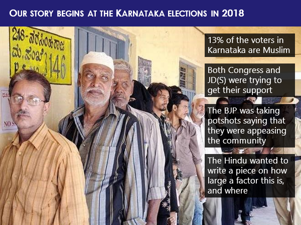
The story begins at the Karnataka elections in 2018. Say about one-eighth of the voters are Muslim, and both the Congress as well as the JD(S), were trying to get their support while on the other hand, BJP was taking potshots saying both of them are just trying to appease the community. The Hindu newspaper wanted to write a piece about how large a factor this is, and where all the Muslim vote is strong. You see, here we have a problem.
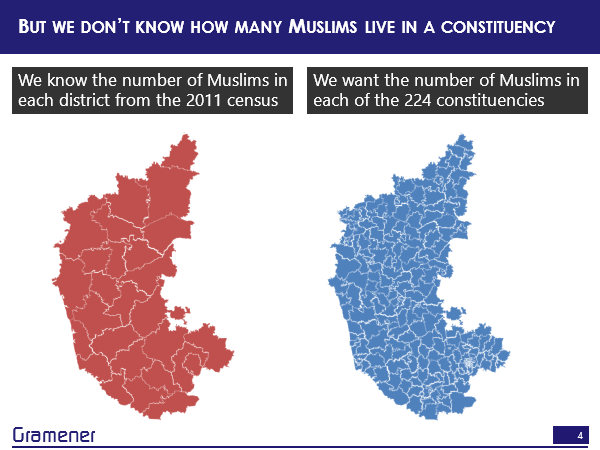
The thing is that the proportion of the population by religion is available only at the district level or the village level, depending on where you get the data from and this is from the census. Unfortunately, elections are not conducted by the district, elections are conducted by constituency and these are two very different maps. So, I have data in one map, which shows me how many Muslims exists in a particular region and I want to see how many Muslims live in a different region on another map and even though they overlap, there really is no direct way of getting the data from one layer on to the other. So, we literally don’t know how many Muslims live in a constituency.
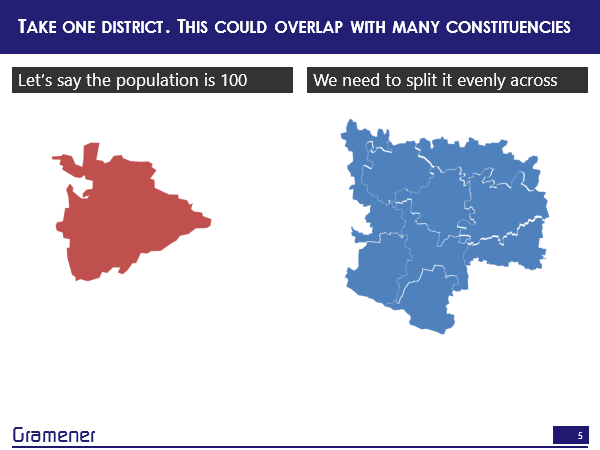
So, how do we solve this problem? Well, the logical way is you could take one district and a constituency or a set of constituencies, and let’s say the district has a population of 100, out of which we know that 13% are Muslims and we want to split it evenly across a bunch of constituencies.
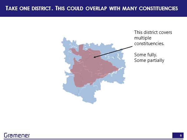
We could just overlay them. So one district could cover multiple constituencies, one constituency could cover multiple districts, and there is a many to many mapping between these there is sometimes full coverage, sometimes partial coverage.
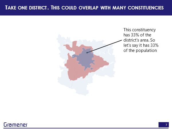
So this district, for instance, covers at least one constituency fully and maybe this takes up about 1/3 of the total area. So I can say approximately 1/3 of the district’s population, which is that red area lives in this constituency.
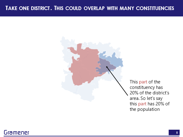
Or let’s take another constituency that overlaps with this district. So, now only a portion of this constituency overlaps with this district. So in this area, which takes up maybe about 1/5, or about 20% of that district population, I can say that population lives here. In other words, we are simply making an assumption that within a district, which is the lowest level of data that you have, or if you have village data that’s far more granular, the population is uniformly distributed. That’s the basic assumption.
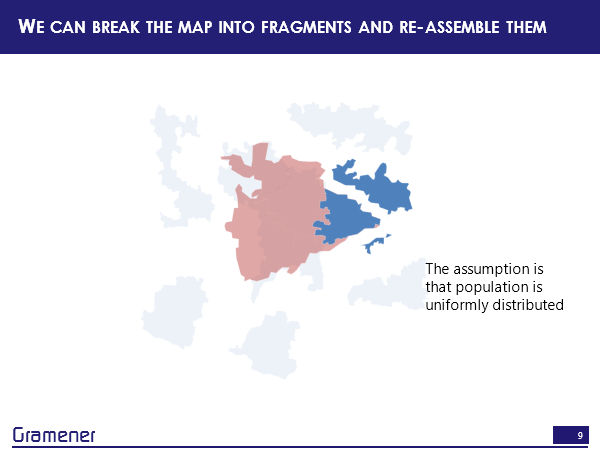
Now, what we can do is fragment each of these districts and constituencies by overlaying them and creating an intersection out of those, and reassembling those and this is a process that I call reshaping the map.

How much of this can we do in Python? There is a library called reshaper that we put together. The reshaper Library is something that’s very work in progress by the way. You can find it github.com/gramener/reshaper. It does exactly what I’m about to show you right now.
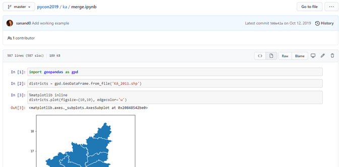
So let’s give it a shot. I’m going to open up the IPython notebook. The library that we are going to be using for this primarily, the core library is Geopandas. For those of you who have been working with data, Pandas is pretty much the de-facto library to use for any kind of data processing. Geopandas is becoming that kind of a standard for any shapefile. So if you have any shapefile and you want to do any kind of geospatial processing, an easy way of doing it is Geopandas and an easy way of installing it is through Conda using Anaconda. Rather than trying to do a pip install by yourself. It’s a little more efficient on most machines. So let’s import Geopandas. Now I have a shapefile that has the Karnataka census data which will eventually appear. I’m going to load it once it appears on the screen. (Just taking a long time. Okay, there we are back again.)
So GPD, which is the abbreviation for Geopandas, has a from_file function that lets you load any shapefile. Now, the other question you’ll have is where am I going to get these shapefiles from? We’ll come to that in a bit. It’s not as difficult as you might think. Let’s say you’ve downloaded the shapefiles. This particularly is the Karnataka census shapefile and what does this look like? Geopandas has a plotting function, which lets you see what the map looks like. So if you look at these districts, this is a pretty large district, this is Bangalore.
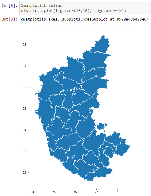
Let’s take the area for these. Geopandas offers an attribute called .geometry, which has an attribute called .area, which gets you the overall area of each of these regions, and if you want to look at what that data frame looks like, each of these regions corresponds to one row. So the Bagalkot district is one row, Bangalore rural district is one row and so on. All of the data in the shapefile also comes in here, you have a column called geometry, which has the additional geometry details, this is a pretty large column, which you probably won’t be going into the details of it. We’ve just now added one column called area, and this has the area of each of these regions and at the very least, you can figure out which are the larger regions, which are the smaller regions.
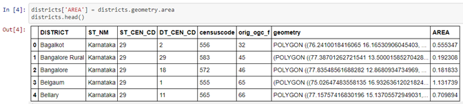
Let’s do the same for the constituencies data set. So here we have the constituencies that are more, these are parliamentary constituencies, by the way, not assembly constituencies. The difference being if you’re electing someone for the parliament, it’s or an MP, then it’s a parliamentary constituency. If you’re electing them for the assembly, which is an MLA, then it’s the assembly constituency. Parliamentary constituencies are bigger. So you’ll notice that out here, there are multiple parliamentary constituencies that sit in the same region that this district sits in, but it’s not a perfect match. Again, let’s take the area and see what this looks like. We have a bunch of these parliamentary constituencies like Gulbarga, Bijapur, etc, and their respective areas.
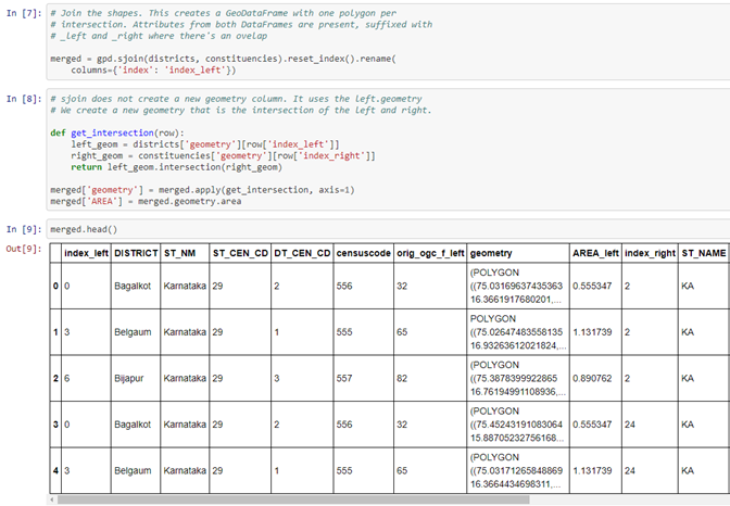
Now, Geopandas has a function called sjoin, which lets you take two shapefiles and create all the intersections around those shapefiles the fragments that I just showed you out here. So yeah, creating all these fragments is what the sjoin function does. So, if we do that, then what it’s now done is created a new data frame called merged and that has all these shapes. Let’s validate that. So there are 30 districts and 28 constituencies, but when you overlay them, it turns out that there are 147 fragments, each of which represents an intersection of a district and a constituency. Now, given this, it should be possible to just take any metric, like the percentage of Muslim voters or the number of Muslims, the size of the Muslim population, from the district data into the data that you have on the constituencies.

But it turns out that it’s a little trickier than that. So, you have to do a little more calculation and that’s what’s available in the reshaper library, you can take a look at the code, what it does is moves the metrics from one layer to another in a way that is seamless.
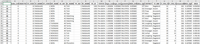
Once we have this, the result is an Excel sheet that kind of looks like this. It has all the attributes from both layers.
So, it says, for instance, that this particular assembly constituency is broken up into three regions, each of which maps to different districts. So some of it overlaps with more and some of it with shift saagar some of it with data and in fact, these are across different states and what is the area of each of these, along with a variety of other metrics that you can calculate and the proportion of area that is overlapping. Once you have this kind of data set, what can we do with it? So let’s revert back to our story.

What actually happened to the Muslim vote?
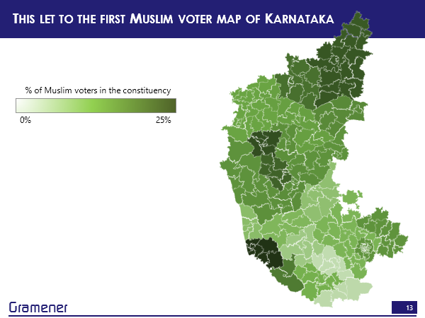
Well, this is the constituency-wise Muslim voter population in Karnataka.
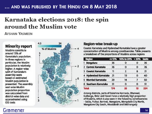
This was used by the Hindu to publish an article around where exactly the bulk of the voters are concentrated. So, there is a chunk here, there’s a chunk here, there’s a chunk here.
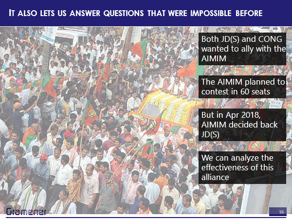
Now, what was happening at this particular point was there was a fight for an alliance. The AIMIM, which is a Muslim party whose name is very long, and I can’t even say it fully. But they had won a number of seats in Telangana, and were looking to also participate in the Karnataka elections. They plan to contest in 60 seats. Now, to make sure that they get the Muslim vote, both JD(S) and the Congress were vying for an alliance with the party and in April 2018, AMIM decided that they will not be directly contesting in the elections, but instead would be supporting JD(S). Now, we have the results of the elections by constituency, we know the voter population by constituency. Let us see what happened to JD(S).
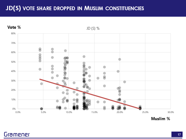
Turns out that where there were more Muslim populations, JD(S) actually got lower votes. So you can see the net result of this election and the alliance.
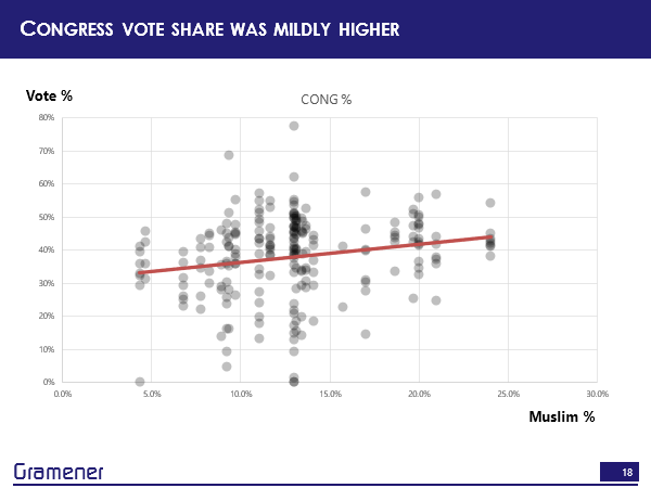
Congress, on the other hand, had a mildly higher vote share and where there was a significantly larger voter population.
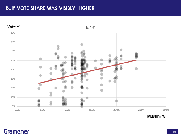
It turns out that BJP was the one that gained the most.
Now while I’m moderately okay, at Python, I’m terrible at electoral analysis. So I have no idea what this means. Okay, I’ll let you figure it out. The elections in Maharashtra and Haryana are also coming up and it turns out that Congress is aligned with AIMIM and, well, let’s just leave it at that.
So, what can we do with this? What kinds of datasets exist and what is the potential of being able to join data sets across two spaces? That’s something that I’m pretty keen on.
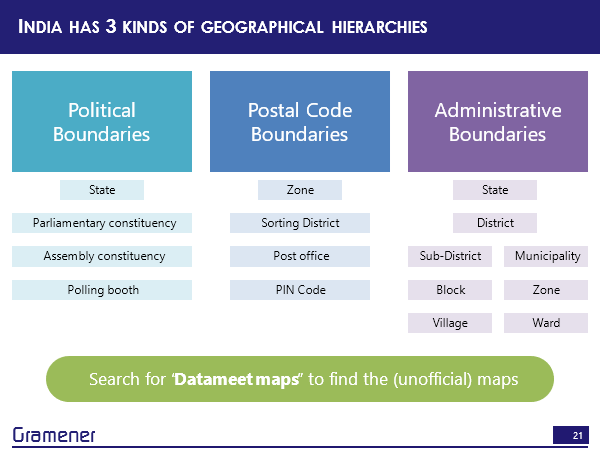
It turns out that in India, there are broadly three kinds of geographic hierarchies. There is a political boundary hierarchy, a postal boundary hierarchy and an administrative boundary hierarchy.
By political boundary, I mean, the state parliamentary constituency, assembly constituency, going all the way down to polling booth. This has all of the results of the elections and one of the important aspects of this is that policies get made to a good extent at this level because the MPs and the MLS are focused on their respective constituencies.
The second is a postal code boundary. There is a zone within which there is a sorting district within which there is a post office and there is a PIN code, there are about 110,000 of these in total.
The third is the administrative boundary hierarchy. So there is a state there is a district, there’s also something called a division, but we’ll leave that aside, then there could be a sub district block or village, if it’s a rural area, or it could be municipality zone and ward if it’s a township.
Now, this apart, there is one other way we can create our own hierarchies. But before that, in case you’re looking for shapefiles, for many of these, the easiest way to get the shapefile for India is to search for “Datameet maps”. Datameet is a group that it’s a discussion forum and there is a lot of active discussion on various kinds of maps, pretty much any kind of map, there’s a decent chance that you’ll find it on Datameet and if it’s not there on Datameet, ask the people, they might be able to post something, and if not, it probably just doesn’t exist.
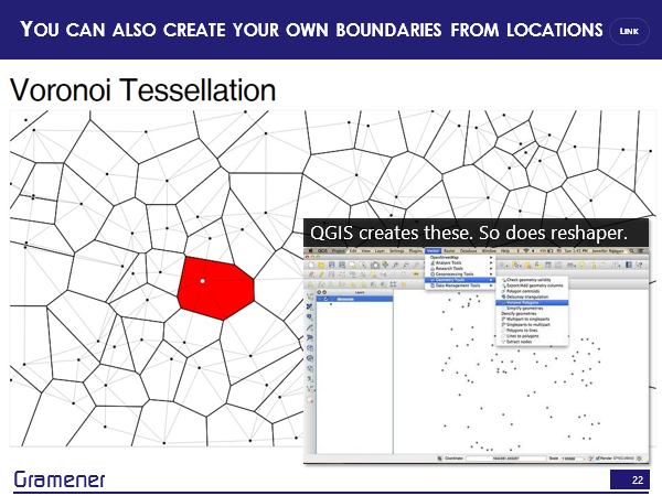
But you can also create your own boundaries. If you have a single location, you can look at the area that is closest to this particular location than any other location. So for example, if this were a network of, let’s say, schools, then what is that vision that is closest to a particular school than any other school.
So if I take this particular point as a school, then this red region represents all of those points which are closer to this school than any other school.
This particular process is called Voronoi tessellation and is something that comes out of box with QGIS, it’s something that you can create with the command line prompt again using the reshape or library, but what that means is that now you can take literally any point and convert that into a region and the potential for that is quite high.
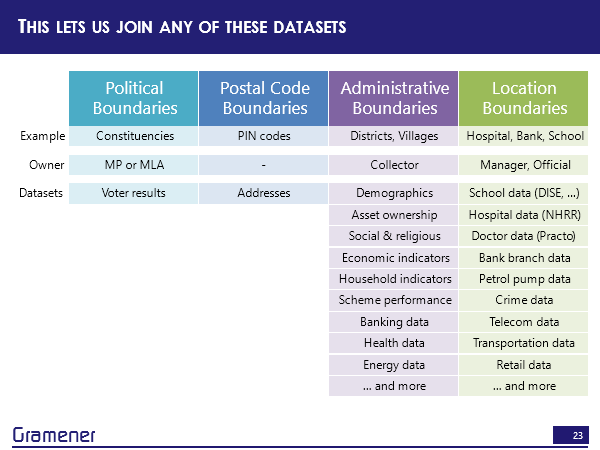
So if I look at the kinds of data sets that you can create with location boundaries, right, so there’s… take all the hospitals, take all the schools, take all the bank branches, take all the petrol pumps take all the locations where crimes have been reported, take any address or take all the telephone towers, take all the locations where there are stores of a particular brand.
All of these are datasets for which you can get an address and an address can be geocoded into a point. If it can be geocoded into a point, you can convert that into a region and for each of these, you naturally have some kind of data for schools, you know how many teachers or how many students that are for telecom towers, you know, which is the organization that runs that tower, potentially the telecom organization will know how many calls are flowing through it, if it’s healthcare data, you know, how many facilities that hospital has, how many patients, how many doctors, all of these are data sets that can be added to that particular cell in your respective region.
But what this means, therefore, is that if we take any of these data sets that which you can create from location boundaries, or that often already exist by administrative boundaries — and this is a pretty powerful set as well. Census gives us demographic data, asset ownership, who owns laptops, internet connections, TV, cars, fridges, social and religious data, economic indicators, well, income, household indicators, is the house made of a mud roof brick roof, do you have a toilet in the house not have a toilet in the house, practically every government scheme is tracked this way. So how many people have benefited from the National Rural Employment Guarantee act? Banking data is reported this way health data is reported this way.
So effectively, anything that the government runs is reported by administrative boundaries. Anything that the corporate sector runs, by and large, is reported by locations. So between these two, there is enormous potential. But there’s also the fact of how decision making happens. Ultimately, political boundaries are owned, in some sense by an MP or an MLA. And, of course, there is also the associated IAS equivalents, who usually run it by administrative boundaries. So if I wanted somebody on the political side to make decisions, then I could take any of this data and put it on to the constituency boundaries. If I wanted an administrative official to make a decision, then I could take any of this data and put it on to a district. If I wanted a manager or a principal of a school, or the CEO of a hospital to make a decision, I could take all of that data and put it onto their geographic boundary.
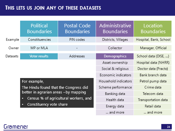
For example, one of the things that the Hindu again did was found that the Congress is doing much better in the agrarian areas and they did that by taking the census data, which had the percentage of farmers and mapping that on to the voter constituency regions.
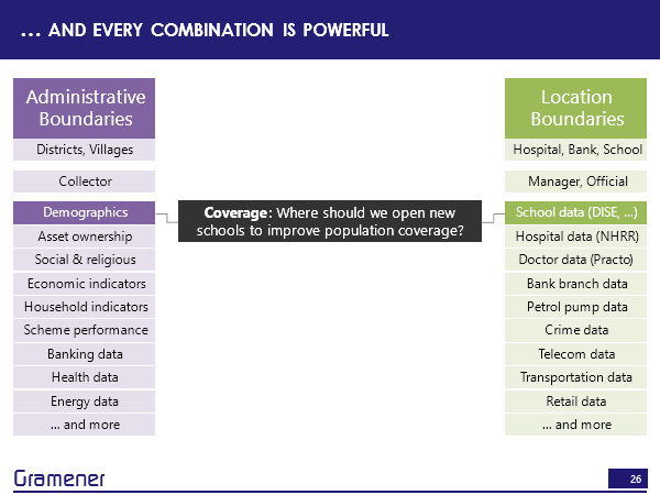
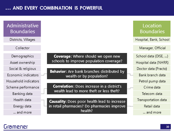
If we took, for example, census demographic data and school data, we can answer a question, where should we open new schools so that students don’t have to travel far or where there is a reasonably equal distribution of students across schools?
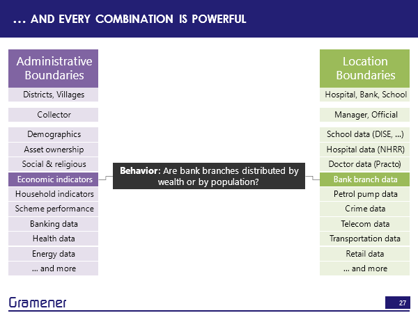
If we took economic indicators how well the country is growing versus bank branch data? Then we can answer questions like are the bank branches distributed? Based on population? That is, does every person roughly have equal access to the bank or based on wealth? Does every rupee have roughly equal access to the bank or if it’s in between? How close is it from one to the other?
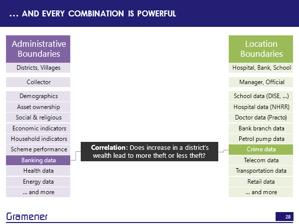
We could find out whether increasing the district’s wealth leads to more theft. So that means people get richer. So does that mean that it does that lead to increase in crime? Or does it lead to less theft? Because the people are richer, and they don’t need to steal therefore? And these are data sets that are available and can be joined.
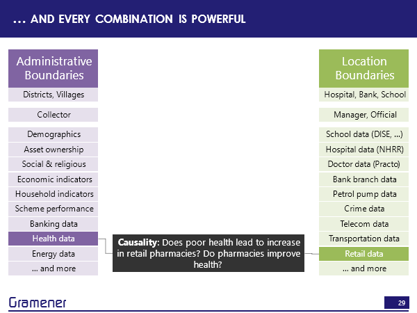
Similarly, with health data, does poor health lead to an increase in the number of pharmacies that are set up in that region because the pharmacies can sell more. Vice versa, if you actually set up more pharmacies? And does that have a positive impact on the people’s health in that particular region?
Now, the reason these questions are trivial to ask, but nearly impossible to solve today is because merging the data across different kinds of layers of maps is non-trivial. But both conceptually and technologically is quite an easy exercise.

What can we do to solve problems like this? Well, me personally, I’d love to see more of these hidden insights come out but there are a few things that you can do, literally right now.
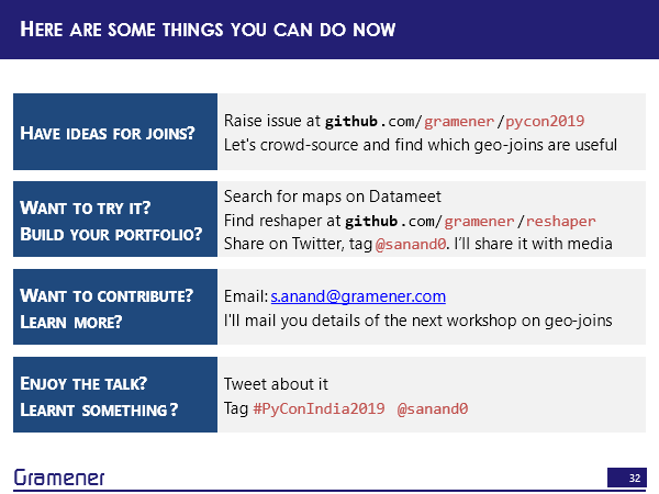
First, if you have an idea, take a look at these data sets, any of the data sets that you know and raise an issue on this particular repository and I’d invite all of you to share this with people. It’ll be great to see what kinds of ideas can be solved using these problems and I’d like to crowd source this to a number of people on the administrative side, on the NGO side, and on the corporate side, to create a repository that says here are things that we can do.
If you want to try solving one of these and discovering your own insight, to build your own portfolio to share some useful knowledge. Then start by finding a map. Like I said, Datameet is a good place where you can find them up. You can find the reshaper library on https://github.com/gramener/reshaper. The links are again, on https://github.com/gramener/pycon2019. This is the one link that you need to remember and if you find something, do share it on Twitter. Please tag me @sanand0, I’d love to share it at least with the media and get some people to understand the power of geospatial joins.
If you want to contribute to the library right now it’s in a terrible state. Or if you want to learn more, I’m planning to organize a series of workshops on geospatial joins, do drop me an email. My email ID is s.anand@gramener.com and I’ll mail you the workshops.
If nothing else, if you just enjoyed the talk and you’ve learned something about it, then tweet about it. The tags are #PyconIndia2019, my ID, @sanand0. More than anything else, I’d love to see some insights come out by joining data.
Happy mapping!
Question: So my question is, basically, I’m belonging to northeast part of India. So I’m from Assam. So what happened in terms of the documentation for this geographic data and so those are always kept in a sort of, you know, register. We call registers or something, so how we use that image processing and all like, to enable those things into a more of a like a public space?
Answer: Okay. There are broadly three ways in which you can get this kind of data out. The first is beg, borrow, steal. Somebody in the government may have this data. So for example, if you go to the Survey of India, they sell these shape files. Of course, I’ve been trying to buy one of these shape files for the last six years now and have failed and I’ve tried it through the Prime Minister’s office and I still failed. But it’s actually easier to just walk over to the Survey of India office and give them a USB stick, and they’ll give it. So, depending on how you approach it, it may prove relatively straightforward.
On the other hand, sometimes the maps don’t exist. So for example, most interesting anecdote was the former head of the postal College of Mysore was trying to create a postal map, the region of all of the PIN codes. It turns out that nobody knows what the region is that a PIN code covers. So he created that he uploaded that ISRO’s Bhuvan, and then after about a year and a half realize that people have permission to upload into ISRO but download from Bhuvan. So after one and a half years of putting all the data, the data is locked, it’s not even there. So today, what is the best source of getting PIN code data? It turns out that what people did was took various locations, geocoded them, they said, this location is at that this particular PIN code, this location is at that this particular PIN code, let’s draw a region around it using the concept of Voronoi polygons, and publish it. So the second possibility is to create such maps.
The third possibility that you talked about, which is can we use image processing to detect it? Some features can be detected that way. So, for example, if you want to detect urban regions are constructed regions, that’s possible using satellite photography, if you want to locate water bodies, and whether they are growing or shrinking, so for example, in Chennai, the Chembarambakkam lake actually drying up, that’s something that you can draw a boundary around using image processing and that’s a straightforward method. But the thing is, I don’t think a single method will work for a wide variety of data sets, which is why we have many of these.
But the biggest lesson that I’ve learned is that 90% of the things that we want, somebody else has usually wanted, and has managed to get their inputs. So, I find that the most efficient ways to ask and Datameet is a pretty good place to ask if somebody already has his data.
Question: Anand, thank you very much for your talk. I’ve got a question regarding shape files. I had the requirement of using the map of India a few times and I suddenly realized that our external boundaries in a lot of places are in dispute and the kind of shape files that we get are not matching with what politically we want our file boundaries to be. So is there any official place from where we can get these shape files because the only shape file which are available are those distorted shape files, and I finally had to change the shape files myself to use it. I couldn’t find any official place from where to get the shape file.
Answer: So, the official place is the Survey of India, which claims to sell these maps like I said, for the last five, six years now I’ve been trying to buy these maps it’s actually not possible. But there are people who have succeeded and stock is being recorded, right? Okay. Let’s just say that if you go to Datameet maps, you will get unofficial but correct maps.
Question: So, since you are in the field, shouldn’t we have a system of getting correct official maps? Isn’t there a process being put in place or something?
Answer: I tried talking to a couple of people at the Prime Minister’s office and suggested this. They put me on the phone with the Inspector General of Surveys or some such high ranking official who said yes, absolutely, connected me to some person, who connected me to some person, who connected me to some person, who is exactly the same person I talked to in the first place. So, I don’t know. I’m sure there is a process. I don’t know it well enough.