2026 3

Data Stories with AI Workshop

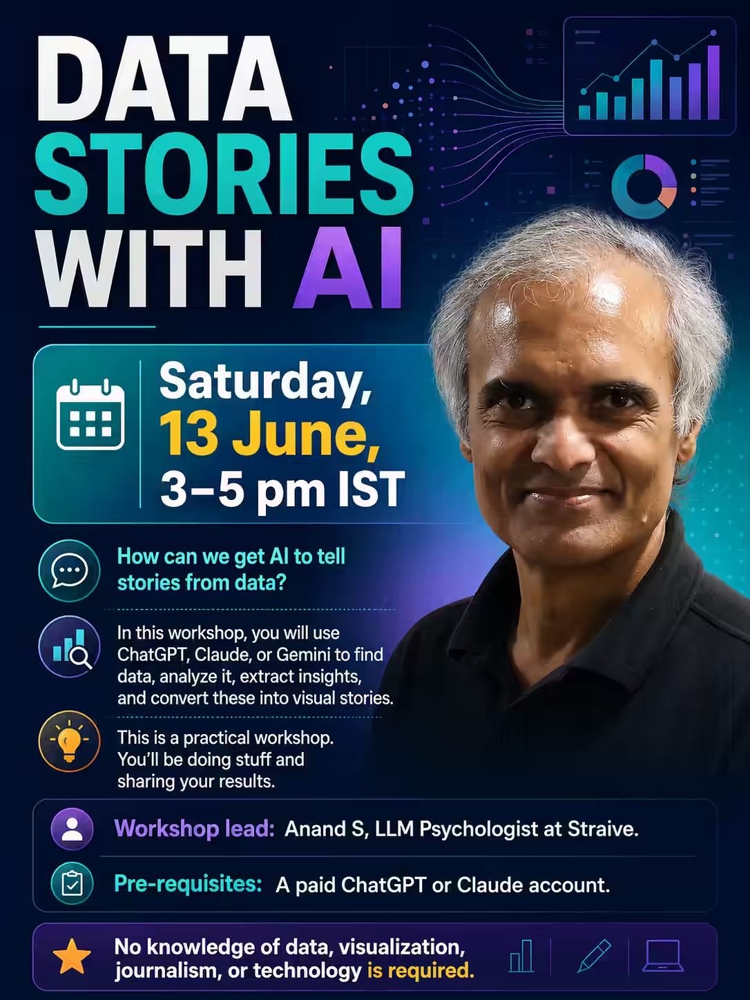
On Sat 13 Jun 2026 at 3 pm, I conducted an online workshop on Data Stories with AI. Registration link: https://forms.gle/dNkUxtJ2PVqNMNcE9 In this workshop, the audience used ChatGPT and Claude, mostly, to: Find data Analyze it Extract insights Visualize as stories It’s a data visualization using AI workshop for journalists - but you don’t need to know data, visualization, journalism, or even technology. But this is a practical workshop. You’ll be doing stuff and sharing your results. ...

Creating data stories in different styles

TL;DR: Don’t ask AI agents for one output. Ask for a dozen, each in the style of an expert. Share what works best. AI agents build apps, analyze data, and visualize it surprisingly well, these days. We used to tell LLMs exactly what to do. If you’re an expert, this is still useful. An expert analyst can do better analyses than an AI agent. An expert designer or data visualizer can tell an AI agent exactly how to design it. ...

The Jamnagar Chokepoint - Data Story

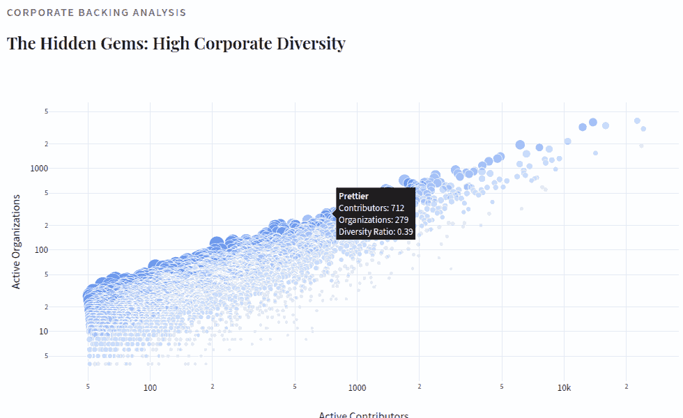
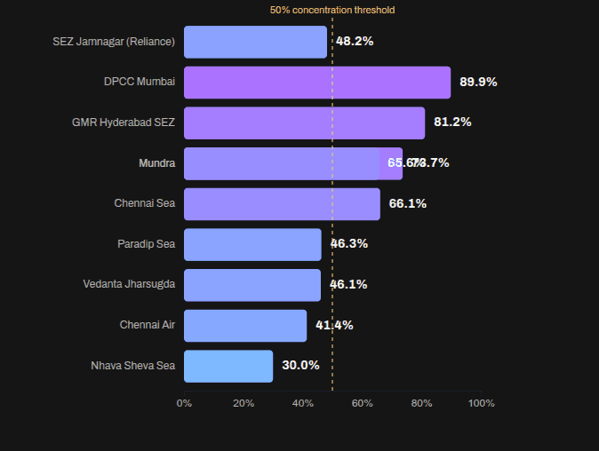
Vivek published an Indian commodity export/import dataset on 31 Dec 2025. Codex and Claude increased their rate limits for the holiday season, so I had: Codex analyze the data (OpenAI models are a bit more rigorous) and create an ANALYSIS.md file. Claude create a visual story based on the analysis. (Claude narrates and visualizes better). Here is the data story. Here are the prompts used. Analyze I downloaded export-import.parquet from https://github.com/Vonter/india-export-import which has data sourced from the Indian [Foreign Trade Data Dissemination Portal](https://ftddp.dgciskol.gov.in/dgcis/principalcommditysearch.html) Each row in the dataset represents a trade entry for a single commodity, country, port, year, month, and type (import or export). - `Commodity` string: Name of the commodity - `Country` string: Name of the foreign country - `Port` string: Name of the port in India - `Year` int32: Year for the import/export activity - `Month` int32: Month for the import/export activity - `Type` category: Type of trade (Import or Export) - `Quantity` int64: Quantity of the commodity - `Unit` string: Unit for the quantity - `INR Value` int64: Value of the commodity in INR - `USD Value` int64: Value of the commodity in USD Analyze data like an investigative journalist hunting for stories that make smart readers lean forward and say "wait, really?" - Understand the Data: Identify dimensions & measures, types, granularity, ranges, completeness, distribution, trends. Map extractable features, derived metrics, and what sophisticated analyses might serve the story (statistical, geospatial, network, NLP, time series, cohort analysis, etc.). - Define What Matters: List audiences and their key questions. What problems matter? What's actually actionable? What would contradict conventional wisdom or reveal hidden patterns? - Hunt for Signal: Analyze extreme/unexpected distributions, breaks in patterns, surprising correlations. Look for stories that either confirm something suspected but never proven, or overturn something everyone assumes is true. Connect dots that seem unrelated at first glance. - Segment & Discover: Cluster/classify/segment to find unusual, extreme, high-variance groups. Where are the hidden populations? What patterns emerge when you slice the data differently? - Find Leverage Points: Hypothesize small changes yielding big effects. Look for underutilization, phase transitions, tipping points. What actions would move the needle? - Verify & Stress-Test: - **Cross-check externally**: Find evidence from the outside world that supports, refines, or contradicts your findings - **Test robustness**: Alternative model specs, thresholds, sub-samples, placebo tests - **Check for errors/bias**: Examine provenance, definitions, methodology; control for confounders, base rates, uncertainty (The Data Detective lens) - **Check for fallacies**: Correlation vs. causation, selection/survivorship Bias (what is missing?), incentives & Goodhart’s Law (is the metric gamed?), Simpson's paradox (segmentation flips trend), Occam’s Razor (simpler is more likely), inversion (try to disprove) regression to mean (extreme values naturally revert), second-order effects (beyond immediate impact), ... - **Consider limitations**: Data coverage, biases, ambiguities, and what cannot be concluded - Prioritize & Package: Select insights that are: - **High-impact** (not incremental) - meaningful effect sizes vs. base rates - **Actionable** (not impractical) - specific, implementable - **Surprising** (not obvious) - challenges assumptions, reveals hidden patterns - **Defensible** (statistically sound) - robust under scrutiny Save your findings in ANALYSIS.md with supporting datasets and code. This will be taken up by another coding agent to create reports, data stories, visualizations, dashboards, presentations, articles, blog posts, etc. Ensure that ANALYSIS.md is documented well enough so that all assets are clear, the approach, intent and implications are understandable. Visualize I downloaded export-import.parquet from https://github.com/Vonter/india-export-import which has data sourced from the Indian [Foreign Trade Data Dissemination Portal](https://ftddp.dgciskol.gov.in/dgcis/principalcommditysearch.html) Each row in the dataset represents a trade entry for a single commodity, country, port, year, month, and type (import or export). - `Commodity` string: Name of the commodity - `Country` string: Name of the foreign country - `Port` string: Name of the port in India - `Year` int32: Year for the import/export activity - `Month` int32: Month for the import/export activity - `Type` category: Type of trade (Import or Export) - `Quantity` int64: Quantity of the commodity - `Unit` string: Unit for the quantity - `INR Value` int64: Value of the commodity in INR - `USD Value` int64: Value of the commodity in USD Then I had Codex analyze it. The analysis is in ANALYSIS.md. Find the most intesting insights from ANALYSIS.md and create a data story with supporting visualizations. Write as a **Narrative-driven Data Story**. Write like Malcolm Gladwell. Think like a detective who must defend findings under scrutiny. - **Compelling hook**: Start with a human angle, tension, or mystery that draws readers in - **Story arc**: Build the narrative through discovery, revealing insights progressively - **Integrated visualizations**: Beautiful, interactive charts/maps that are revelatory and advance the story (not decorative) - **Concrete examples**: Make abstract patterns tangible through specific cases - **Evidence woven in**: Data points, statistics, and supporting details flow naturally within the prose - **"Wait, really?" moments**: Position surprising findings for maximum impact - **So what?**: Clear implications and actions embedded in the narrative - **Honest caveats**: Acknowledge limitations without undermining the story Visualize like The New York Times Interactives. Ensure that all visualizations interactive and provide revelatory insights as well as some kind of delightful experience. Follow the typography, color & theme, backgrounds, interaction patterns, and animation principles of The Verge's frontends. Generate a single page index.html + script.js.

2025 6

Vibe-Coding for Interesting Data Stories

Last weekend, I fed Codex my browser history and said “explore.” It found a pattern I call rabbit holes – three ways we browse: Linear spiral - one page > next page > next. E.g. filing income tax, clicking “next” on the PyCon schedule. Hub & spoke - hub > open tabs > back to hub. E.g. exploring DHH’s Ubuntu setup, checking Firebase config. Wide survey - source > many, many pages. E.g. clearing inbox, scanning news. Then Claude Code built this lovely data story. ...

Tomorrow, we’ll be vibe-analyzing data at a Hasgeek Fifth Elephant workshop. It’s a follow-up to my DataHack Summit talk “RIP Data Scientists”. I showed how it’s possible to automate many data science tasks. In this workshop, the audience will be doing that. Slides: https://sanand0.github.io/talks/2025-09-16-vibe-analysis/ (minimal because… well, it’s “vibe analysis”. We’ll code as we go.) Here are datasets I’ll suggest to the audience: India Census 2011: https://www.kaggle.com/datasets/danofer/india-census MovieLens movies: https://grouplens.org/datasets/movielens/32m/ IMDb movies: https://datasets.imdbws.com/ Occupational Employment and Wage Statistics (OEWS): https://www.bls.gov/oes/tables.htm Global AI Job Market & Salary Trends 2025: https://www.kaggle.com/datasets/bismasajjad/global-ai-job-market-and-salary-trends-2025 Flight Delay Dataset: https://www.kaggle.com/datasets/shubhamsingh42/flight-delay-dataset-2018-2024 London House Price Data: https://www.kaggle.com/datasets/jakewright/house-price-data Exchange Rates to USD: https://www.kaggle.com/datasets/robikscube/exhange-rates-to-usd-from-imforg-updated-daily Thailand Road Accidents (2019-202): https://www.kaggle.com/datasets/thaweewatboy/thailand-road-accident-2019-2022 … but if you’d like stories from any interesting recent datasets (10K - 10M rows, easy-to-download), please suggest in the comments. 🙏 ...

Here’s a comic book analyzing my Google Search History. It’s a simpler version of my earlier post. I created it using PicBook, a tool I vibe-coded over ~5 hours. PicBook: https://tools.s-anand.net/picbook/ Code: https://github.com/sanand0/tools/tree/main/picbook Codex chat: https://chatgpt.com/s/cd_6886699abfb08191acf036f6185781be The code prompt begins with Implement a /picbook tool to create a sequence of visually consistent images from multiline captions using the gpt-image-𝟭 OpenAI model and continues for 6 chats totaling ~22 min. My review took 4.5 hours. Clearly I need to optimize reviews. ...

My VizChitra talk on Data Design by Dialog was on LLMs helping in every stage of data storytelling. Main takeaways: After open data, LLMs may the single biggest act of data democratization. https://youtu.be/hPH5_ulHtno?t=01m24s LLMs can help in every step of the (data) value chain. https://youtu.be/hPH5_ulHtno?t=00m47s LLMs are bad with numbers. Have them write code instead. https://youtu.be/hPH5_ulHtno?t=06m33s Don’t confuse it. Just ask it again. https://youtu.be/hPH5_ulHtno?t=05m30s If it doesn’t work, throw it away and redo it. https://youtu.be/hPH5_ulHtno?t=20m02s Keep an impossibility list. Revisit it whenever a new model drops. https://youtu.be/hPH5_ulHtno?t=20m02s Never ask for just one output from an LLM. Ask for a dozen. https://youtu.be/hPH5_ulHtno?t=22m20s Our imagination is the limit. https://youtu.be/hPH5_ulHtno?t=26m35s Two years ago, they were like grade 8 students. Today, a postgraduate. https://youtu.be/hPH5_ulHtno?t=00m47s Do as little as possible. Just wait. Models will catch up. https://youtu.be/hPH5_ulHtno?t=31m45s Funny bits: ...

It's not what you know. It's how you learn

Simon Willison’s blog post mentioned MDN’s browser compatibility tables that list the earliest release date for each browser feature. I figured: let’s see which browsers release features fastest. I calculated average delay for each browser’s feature release. For each browser, I looked at how many days after the first release it took to add a feature, averaged it, and published an interactive, scrolly-telling data story. ...

How to Fake Data That Tells a Story

Fake data is usually boring if you analyze it. It’s usually uniform, with no outliers or interesting patterns. If I ask ChatGPT: Generate realistic fake tourism data using these columns: - Age - Nationality - Gender - Income - Booking_Channel - Month - Occupancy_Rate - Travel_Frequency - Spending Run the code and let me download the output as a CSV file. … the output is remarkably boring. Men & women from all countries and ages in every month visit equally. Income and spending are uniformly distributed - and the same pattern holds for all countries and ages. ...

2022 1

I’m planning to publish a 3-hour self-paced #onlinecourse. But I don’t know which topic would be more useful. One topic is #datascience tools for non-programmers. Another is a step-by-step guide to #datastorytelling for analysts. What’s more useful for you? Could you share with people, so I work on the more useful course? (Thanks 🙏) LinkedIn

2021 5

I’m really looking forward to this Data Comicgen #event. Get the #data on 5 Aug Analyze it with #googlesheets Use Comicgen for #comics #storytelling Submit on 26 Aug It’s a great opportunity to find fellow data storytellers and comic enthusiasts – to see their work and share yours. And win awards. LinkedIn

We are looking for a Chief Sales Officer. (For Princeton, New Jersey.) Do you ensure clients get value from what you sell? Do you have the energy to go after partners and logos relentlessly? Do you feel the thrill of using data to tell stories? Are you game to take a $10m data company to $50m? We would like to talk to you. Please visit 👇 https://gramener.com/job/?id=90554 LinkedIn

Talks

Since 2011, I’ve been speaking about data & AI at events & organizations. My Talks YouTube playlist videos of public talks. My Talks slides page has recent talk content and transcripts. Events Some of the events I’ve spoken at are: TEDx: IIM Bangalore, NMIMS Bangalore, Whitefield, KG Institutions, … Strata: New York 2018, London 2015 PyCon: India, Indonesia, Iran, Kenya, … Bio for talks If you need a short bio to introduce me, you’re welcome to modify this. ...

Jolie No. 1

There are more Bollywood actors in Hollywood. Some are even turning down Hollywood roles. So we wondered: How easily can a Bollywood actor connect to a Hollywood actor? As part of the Oct 2019 Gramener data story hackathon, Anand, Kishore, and Niyas created a Jolie No 1 — a data video where [Govinda](https://en.wikipedia.org/wiki/Govinda_(actor) announces (in our imagination) that he will act with Angelina Jolie in Jolie No 1, but declines to comment on who introduced them. We picked a theme first The hackathon theme was “movies”. We explored 5 themes: ...

Always a pleasure when our work lands on Andy Kirk’s list 😊 – thanks for being a great motivator, Andy! LinkedIn

2020 1

My year in 2020

In 2020 I made 3 resolutions. Read 50 books. I almost made it. Here are my reviews. Walk 10,000 steps daily. I managed it, like the last two years. Lose 2 kgs. I failed – and instead, put on 6 kgs. On self-improvement, I completed a Landmark course and an Art of Living course. Both had a huge productivity impact. (Mail me for details.) On software, I starting playing Minecraft and moved from Gmail to Windows 10 Mail. More on this. ...

2019 1

Richie Lionell demonstrating how #augmentedreality weaves in with #comics and #datastorytelling at the Indian School of Business The anecdote I loved about this event was when an attendee from the nearby AI workshop got bored, wandered in here, and was hooked ☺ LinkedIn

2012 1

Storytelling: Part 1

In a number of sessions I’ve been to, people ask analysts to make their results more interesting – to tell stories with them. I’m co-teaching a course, part of which involves telling stories with data. So this got me thinking: what is a story? How does one teach storytelling to, let’s say, an alien? Consider this mini-paper. ABSTRACT: Meter readings exhibit spikes at slab boundaries. We also find significant evidence of improbably events at round numbers. Electricity shortage is a serious problem in most Indian states. Part of this problem is due to the inaccuracy of reporting procedures used in monitoring meter readings. Our focus here is not to document or experimentally determine the degree of inaccuracy. We have adopted a data driven approach to this problem and attempt to model the extent of inaccuracy using basic statistical analysis techniques such as histograms and the comparison of means. Our dataset comprises of the frequency analysis 12-month dataset containing monthly meter readings of 1.8 million customers in the State of Andhra Pradesh. We find that a histogram of these readings shows unexpectedly high values at the slab boundaries: 50 (+45.342%, t > 13.431), 100 (+55.134%, t > 16.384), 200 (+33.341%, t > 15.232), and 300 (+42.138%, t > 19.958). We also detected spikes at round numbers: 10 (+15.341%, t > 5.315), 20 (+18.576%, t > 6.152), 30 (+11.341%, t > 4.319). The statistical significance of every deviation listed above is over 99.9%. Further, every deviation has a positive mantissa. This leads us to confidently declare the existence of a systematic bias in the meter readings analysed. You’re probably thinking: “I know why he’s put this example here. It must be a bad one. So, what a rotten paper it must be!” ...