Vivek published an Indian commodity export/import dataset on 31 Dec 2025.
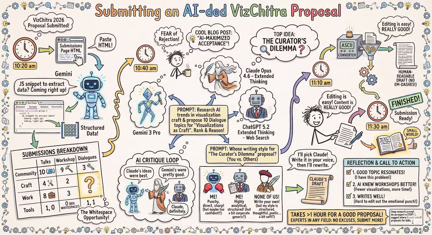
Codex and Claude increased their rate limits for the holiday season, so I had:
Codex analyze the data (OpenAI models are a bit more rigorous) and create an ANALYSIS.md file. Claude create a visual story based on the analysis. (Claude narrates and visualizes better). Here is the data story.
Here are the prompts used.
Analyze I downloaded export-import.parquet from https://github.com/Vonter/india-export-import which has data sourced from the Indian [Foreign Trade Data Dissemination Portal](https://ftddp.dgciskol.gov.in/dgcis/principalcommditysearch.html) Each row in the dataset represents a trade entry for a single commodity, country, port, year, month, and type (import or export). - `Commodity` string: Name of the commodity - `Country` string: Name of the foreign country - `Port` string: Name of the port in India - `Year` int32: Year for the import/export activity - `Month` int32: Month for the import/export activity - `Type` category: Type of trade (Import or Export) - `Quantity` int64: Quantity of the commodity - `Unit` string: Unit for the quantity - `INR Value` int64: Value of the commodity in INR - `USD Value` int64: Value of the commodity in USD Analyze data like an investigative journalist hunting for stories that make smart readers lean forward and say "wait, really?" - Understand the Data: Identify dimensions & measures, types, granularity, ranges, completeness, distribution, trends. Map extractable features, derived metrics, and what sophisticated analyses might serve the story (statistical, geospatial, network, NLP, time series, cohort analysis, etc.). - Define What Matters: List audiences and their key questions. What problems matter? What's actually actionable? What would contradict conventional wisdom or reveal hidden patterns? - Hunt for Signal: Analyze extreme/unexpected distributions, breaks in patterns, surprising correlations. Look for stories that either confirm something suspected but never proven, or overturn something everyone assumes is true. Connect dots that seem unrelated at first glance. - Segment & Discover: Cluster/classify/segment to find unusual, extreme, high-variance groups. Where are the hidden populations? What patterns emerge when you slice the data differently? - Find Leverage Points: Hypothesize small changes yielding big effects. Look for underutilization, phase transitions, tipping points. What actions would move the needle? - Verify & Stress-Test: - **Cross-check externally**: Find evidence from the outside world that supports, refines, or contradicts your findings - **Test robustness**: Alternative model specs, thresholds, sub-samples, placebo tests - **Check for errors/bias**: Examine provenance, definitions, methodology; control for confounders, base rates, uncertainty (The Data Detective lens) - **Check for fallacies**: Correlation vs. causation, selection/survivorship Bias (what is missing?), incentives & Goodhart’s Law (is the metric gamed?), Simpson's paradox (segmentation flips trend), Occam’s Razor (simpler is more likely), inversion (try to disprove) regression to mean (extreme values naturally revert), second-order effects (beyond immediate impact), ... - **Consider limitations**: Data coverage, biases, ambiguities, and what cannot be concluded - Prioritize & Package: Select insights that are: - **High-impact** (not incremental) - meaningful effect sizes vs. base rates - **Actionable** (not impractical) - specific, implementable - **Surprising** (not obvious) - challenges assumptions, reveals hidden patterns - **Defensible** (statistically sound) - robust under scrutiny Save your findings in ANALYSIS.md with supporting datasets and code. This will be taken up by another coding agent to create reports, data stories, visualizations, dashboards, presentations, articles, blog posts, etc. Ensure that ANALYSIS.md is documented well enough so that all assets are clear, the approach, intent and implications are understandable. Visualize I downloaded export-import.parquet from https://github.com/Vonter/india-export-import which has data sourced from the Indian [Foreign Trade Data Dissemination Portal](https://ftddp.dgciskol.gov.in/dgcis/principalcommditysearch.html) Each row in the dataset represents a trade entry for a single commodity, country, port, year, month, and type (import or export). - `Commodity` string: Name of the commodity - `Country` string: Name of the foreign country - `Port` string: Name of the port in India - `Year` int32: Year for the import/export activity - `Month` int32: Month for the import/export activity - `Type` category: Type of trade (Import or Export) - `Quantity` int64: Quantity of the commodity - `Unit` string: Unit for the quantity - `INR Value` int64: Value of the commodity in INR - `USD Value` int64: Value of the commodity in USD Then I had Codex analyze it. The analysis is in ANALYSIS.md. Find the most intesting insights from ANALYSIS.md and create a data story with supporting visualizations. Write as a **Narrative-driven Data Story**. Write like Malcolm Gladwell. Think like a detective who must defend findings under scrutiny. - **Compelling hook**: Start with a human angle, tension, or mystery that draws readers in - **Story arc**: Build the narrative through discovery, revealing insights progressively - **Integrated visualizations**: Beautiful, interactive charts/maps that are revelatory and advance the story (not decorative) - **Concrete examples**: Make abstract patterns tangible through specific cases - **Evidence woven in**: Data points, statistics, and supporting details flow naturally within the prose - **"Wait, really?" moments**: Position surprising findings for maximum impact - **So what?**: Clear implications and actions embedded in the narrative - **Honest caveats**: Acknowledge limitations without undermining the story Visualize like The New York Times Interactives. Ensure that all visualizations interactive and provide revelatory insights as well as some kind of delightful experience. Follow the typography, color & theme, backgrounds, interaction patterns, and animation principles of The Verge's frontends. Generate a single page index.html + script.js.