Visualisation

How isolated is Bollywood from world cinema?

These are the major group actors based on who they act with most.

Actors mostly act with other actors in the same…
  1. Language. Not country. For example, the Spanish / Mexican group is across countries. But Indian actors divide into North Indian and South Indian. It’s language, not country.
  2. Time period. Old American actors are a separate group from Hollywood. (Naturally. Brad Pitt was born after Humphrey Bogart died. They couldn’t have acted together.)
  3. Genre. Hollywood Porn actors don’t act with mainstream Hollywood. Same with Japanese Porn, Hollywood TV, and Hollywood Horror actors.

How are these groups themselves connected? Do Chinese actors act with Hollywood often? How isolated is Bollywood from world cinema?

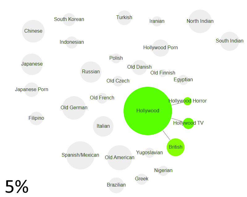
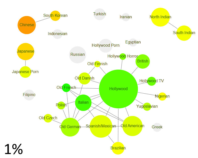
Hollywood is the core group

Take groups that act with other groups at least 5% of the time. Mainstream Hollywood acts with British and Hollywood TV/Horror actors. All other clusters are isolated.


Indian & Japanese clusters emerge

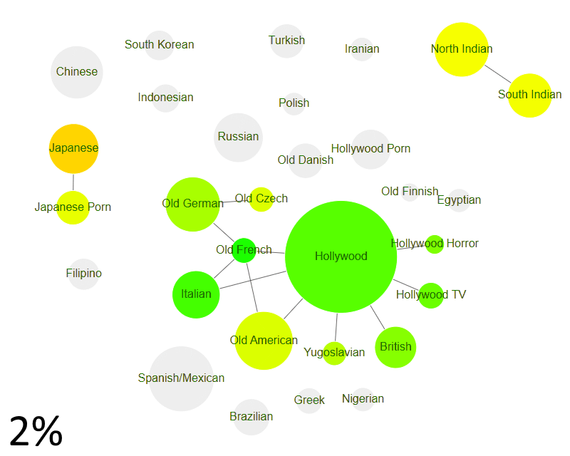
Let’s go more liberal. Take groups that act with other groups at least 2% of the time. Hollywood forms a big connected cluster. It includes most of Europe — British, German, French, Czech, Yugoslavian & Italian actors.

North & South Indian actors form the first non-Hollywood cross-language cluster.

The Japanese and Japanese porn actors form a cluster too. (Interestingly, it’s easy for a Japanese porn actor to act with mainstream Japanese actors. Hollywood porn actors find it far harder to act with Hollywood.)

Among groups that act with other groups at least 1% of the time, we have:

Chinese & Korean cluster emerges

Chinese & South Korean actors form the first cross-country cross-language cluster.

Hollywood expands to act with Scandinavian, Spanish, Polish, Brazilian & Nigerian films.

Other film industries (Russian, Greek, Egyptian — even Hollywood Porn — are still isolated.)


World Cinema vs the rest

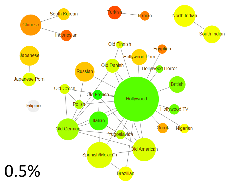
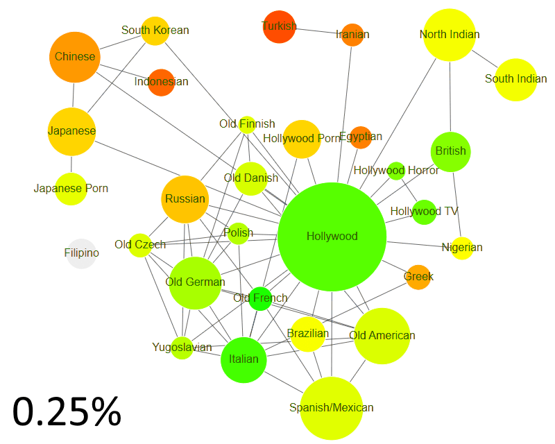
Among groups that act with other groups at least 0.5% of the time, we have:

  1. Turkish & Iranian groups coming together
  2. Indonesian actors acting with the Chinese
  3. Hollywood expanding to cover Russian, Greek, Egyptian, and finally, Hollywood Porn. (It’s easier for Brazilian / Nigerian to act with Hollywood than to be a Hollywood Porn actor.)

At this point, there are 6 actor groups that act with each other at least 1 out of 200 times (0.5%).

  1. World Cinema (Hollywood & friends)
  2. Japanese (mainstream & porn)
  3. Indian (North & South)
  4. Chinese, South Korean & Indonesian
  5. Turkish & Iranian
  6. Filipino

One world of cinema

If we look at groups that act with other groups at least 0.5% of the time, we have a far more unified picture. Almost every actor group acts with another group at least 1 out of 400 times.

But even here, there’s an exception. Filipino actors — the most insular major actor group in the world.


So, how isolated is Bollywood from World Cinema? For its size, it’s one of the most isolated actor groups. (But not as much as Iranian/Turkish or Filipino.)

Colour spaces

In reality, a colour is a combination of light waves with frequencies between 400-700THz, just like sound is a combination of sound waves with frequencies from 20-20000Hz. Just like mixing various pure notes produces a new sound, mixing various pure colours (like from a rainbow) produces new colours (like white, which isn’t on the rainbow.)

Our eyes aren’t like our ears, though. They have 3 sensors that are triggered differently by different frequencies. The sensors roughly peak around red, green and blue. Roughly.

It turns out that it’s possible to recreate most (not all) colours using a combination of just red, green and blue by mimicking these three sensors to the right level. That’s why TVs and monitors have red, blue and green cells, and we represent colours using hex triplets for RRGGBB – like #00ff00 (green).

There are a number of problems with this from a computational perspective. Conceptually, we think of (R, G, B) as a 3-dimensional cube. That’d mean that 100% red is about as bright as 100% green or blue. Unfortunately, green is a lot brighter than red, which is a lot brighter than blue. Our 3 sensors are not equally sensitive.

You’d also think that a colour that’s numerically mid-way between 2 colours should appear to be mid-way. Far from it.

This means that if you’re picking colours using the RGB model, you’re using something very far from the intuitive human way of perceiving colours.

Which is all very nice, but I’m usually in a rush. So what do I do?

  1. I go to the Microsoft Office colour themes and use a colour picker to pick one. (I extracted them to make life easier.) These are generally good on the eye.
  2. Failing that, I pick something from http://kuler.adobe.com/
  3. Or I go to http://colorbrewer2.org/ and pick a set of colours
  4. If I absolutely have to do things programmatically, I use the HCL  colour scheme. The good part is it’s perceptually uniform. The bad part is: not every interpolation is a valid colour.

Correlating subjects

A question from Dorai get me thinking: does being good at maths help in programming?

I don’t have a personal view. But since Reportbee has data on the Class 12 examination results for the last three years, we thought we could do a bit of analysis.

Here’s the correlation of the scores of various subjects with Computer Science.

Correlation Subject
0.79 CHEMISTRY
0.79 PHYSICS
0.75 ENGLISH
0.75 MATHEMATICS
0.72 LANGUAGE
0.67 BIOLOGY
0.66 ECONOMICS
0.66 COMMERCE
0.65 ACCOUNTANCY
0.56 HISTORY
0.52 GEOGRAPHY

It almost breaks neatly into four groups.

  1. Physics & Chemistry, both of which have a correlation of 0.79, and clearly are the most correlated with Computer Science
  2. Maths, English & Language, which have a correlation of 0.72 – 0.75
  3. Biology, Economics, Commerce and Accountancy, which hover at around 0.66
  4. History & Geography, which are 0.52 – 0.56

The results in 2010 are almost exactly the same.

Correlation Subject
0.78 PHYSICS
0.78 CHEMISTRY
0.75 ENGLISH
0.75 MATHEMATICS
0.73 LANGUAGE
0.67 ACCOUNTANCY
0.65 ECONOMICS
0.65 COMMERCE
0.64 BIOLOGY
0.60 GEOGRAPHY
0.55 HISTORY

I’m not sure what it is that leads to this kind of correlation. In fact, the full correlation between every pair of subjects (for 2011) is below:

subject-correlation

What inferences would you draw from this?

And what do you think is the reason for this?

India district map

I put together a district map of India in SVG this weekend.

So what?

You can now plot data available at a district level on a map, like the temperature in India over the last century (via IndiaWaterPortal). The rows are years (1901, 1911, … 2001) and the columns are months (Jan, Feb, … Dec). Red is hot, green is cold.

temperature

(Yeah, the west coast is a great place to live in, but I probably need to look into the rainfall.)

districts.svg has has 640 districts (I’ve no idea what the 641st looks like) and is tagged with the State and District names as titles:

<g title="Madhya Pradesh">
  <path title="Alirajpur" d="..." />
  <path title="Jhabua" d="..." />
  ...
</g>

How?

I made it from the 2011 census map (0.4MB PDF). I opened it in Inkscape, removed the labels, added a layer for the districts, and used the paint bucket to fill each district’s area. I then saved the districts layer, cleaning it up a big. Then I labelled each district with a title. (Seemed like the easiest way to get this done.)

Thanks to @planemad, @gkjohn, @arjunram for inputs. Play around. Feedback welcome.

Formatting tables

Formatting tables in Excel is a fairly common task, but there are a number of ways to improve on the way it’s done most of the time.

Here are a few tips. Fairly basic stuff, but hopefully useful.

Eating more for less

A couple of years ago, I managed to lose a fair bit of weight. At the start of 2010, I started putting it back on, and the trajectory continues. I’m at the stage where I seriously need to lose weight. I subscribe to The Hacker’s Diet principle – that you lose weight by eating less, not exercising.
An hour of jogging is worth about one Cheese Whopper. Now, are you going to really spend an hour on the road every day just to burn off that extra burger? You don't exercise to lose weight (although it certainly helps). You exercise because you'll live longer and you'll feel better.
I’m afraid I’ll live too long anyway, so I won't bother exercising just yet. It's down to eating less. Sadly, I like food. So to make my “diet” work, I need foods that add less calories per gram. Usually, when browsing stores, I check these manually. But being a geek, I figured there’s an easier way. Below is a graph of some foods (the kind I particularly need to avoid, but still end up eating). The ones on the top add a lot of calories (per 100g), and better to avoid. The ones at the right cost a lot more. Now, I’m no longer at the point where I need to worry about food expenses, but still, I can’t quite kick the habit, also you might want to check out this Rootine's comparison of B12 methylcobalamin and cyanocobalamin that will help you in your diet. Hover over the foods to see what they are, and click on them to visit the product. (If you’re using an RSS reader and this doesn’t work, read on my site.)
(The data was picked from Tesco.) It’s interesting that cereals are in the middle of the calorie range. I always thought they’d be low calories per gram. Turns out that if I want to to have such foods, I’m better off with desserts or ice creams (profiterole, lemon meringue or tiramisu). In fact, even jams have less calories than cereals. But there are some desserts to avoid. Nuts are a disaster. So are chocolates. Gums, dates and honey are in the middle – about as good as cereals. Salsa dip seems surprisingly low. Custards seem to hit the sweet spot – cheap, and very low in calories. Same for jellies. So: custards and jelly. My daughter’s going to be happy.

Visualising the IMDb

The IMDb Top 250, as a source of movies, dries out quickly. In my case, I’ve seen about 175/250. Not sure how much I want to see the rest.

When chatting with Col Needham (who’s working his way through every movie with over 40,000 votes), I came up with this as a useful way of finding what movies to watch next.

visualising-the-imdb-1

Each box is one or more movies. Darker boxes mean more movies. Those on the right have more votes.  Those on top have a better rating. The ones I’ve seen are green, the rest are red. (I’ve seen more movies than that – just haven’t marked them green yet 🙂

I think people like to watch the movies on the top right – that popularity compensates (at least partly) for rating, and the number of votes is an indication of popularity.

For example, my movie pattern tells me that I ought to see Cidade de Deus, Inglourious Basterds and Heat – which I knew from the IMDb Top 250, but also that I ought to cover Kick-Ass, The Hangover and Juno.

visualising-the-imdb-2

It’s easy to pick movies in a specific genre as well.

visualising-the-imdb-3

Clearly, there are many more Comedy movies in the list than any other type – though Romance and Action are doing fine too. And I seem the have a strong preference for the Fantasy genre, in stark contrast to Horror.

(Incidentally, I’ve given up trying to see The Shining after three attempts. Stephen King’s scary enough. The novel kept me awake checking under my bed for a week at night. Then there’s Stanley Kubrick’s style. A Clockwork Orange was disturbing enough, but Haley Joel Osment in the first part of A.I. was downright scary. Finally, there’s Jack Nicholson. Sorry, but I won’t risk that combination on a bright sunny day with the doors open.)

You can track your list at http://250.s-anand.net/visual.

For those who want to play with the code, it’s at http://code.google.com/p/two-fifty/source/browse/trunk/visual.html.

Moderating marks

Sometimes, school marks are moderated. That is, the actual marks are adjusted to better reflect students’ performances. For example, if an exam is very easy compared to another, you may want to scale down the marks on the easy exam to make it comparable.

I was testing out the impact of moderation. In this video, I’ll try and walk through the impact, visually, of using a simple scaling formula.

BTW, this set of videos is intended for a very specific audience. You are not expected to understand this.

Rough transcript

First, let me show you how to generate marks randomly. Let’s say we want marks with a mean of 50 and a standard deviation of 20. That means that two-thirds of the marks will be between 50 plus/minus 20. I use the NORMINV formula in Excel to generate the numbers. The formula =NORMINV(RAND(), Mean, SD) will generate a random mark that fits this distribution. Let’s say we create 225 students’ marks in this way.

Now, I’ll plot it as a scatterplot. We want the X-axis to range from 0 to 225. We want the Y-axis to range from 0 to 100. We can remove the title, axes and the gridlines. Now, we can shrink the graph and position it in a single column. It’s a good idea to change the marker style to something smaller as well. Now, that’s a quick visual representation of students’ marks in one exam.

Let’s say our exam has a mean of 70 and a standard deviation of 10. The students have done fairly well here. If I want to compare the scores in this exam with another exam with a mean of 50 and standard deviation of 20, it’s possible to scale that in a very simple way.

We reduce the mean from the marks. We divide by the standard deviation. Then multiply by the new standard deviation. And add back the new mean.

Let me plot this. I’ll copy the original plot, position it, and change the data.

Now, you can see that the mean has gone down a bit — it’s down from 70 to 50, and the spread has gone up as well — from 10 to 20.

Let’s try and understand what this means.

If the first column has the marks in a school internal exam, and the second in a public exam, we can scale the internal scores to be in line with the public exam scores for them to be comparable.

The internal exam has a higher average, which means that it was easier, and a lower spread, which means that most of the students answered similarly. When scaling it to the public exam, students who performed well in the interal exam would continue to perform well after scaling. But students with an average performance would have their scores pulled down.

This is because the internal exam is an easy one, and in order to make it comparable, we’re stretching their marks to the same range. As a result, the good performers would continue getting a top score. But poor performers who’ve gotten a better score than they would have in a public exam lose out.

Mapping PIN codes

I haven’t found an open or reliable database providing the geo-location of Indian PIN codes. That’s a bother if you’re creating geographic mash-ups. The closest were commercial sources:

  • a PIN code directory from the Postal Training Centre for Rs. 2,000, which probably just contains a list of PIN codes, and
  • a PIN code map from MapMyIndia for Rs. 1,00,000, whose quality I’m not sure of. (I spoke to one of their sales representatives who mentioned that the data was gathered via companies such as Coca Cola, using their local distribution knowledge, perhaps GPSs.)

Crowd-sourcing this might help. Here’s a site where you can map the location of any PIN code you know:

pincode.datameet.org

For example, if you knew the exact location of the PIN code 110083 (which happens to be Mongolpuri in New Delhi), just go to http://pincode.datameet.org/IN/110083 and move the marker to where it should be.

I’ve initially populated the data from GeoNames. Arun has offered OpenStreetMap data. If you know of any sources that we could use, please let me know. And if you want to use the data, feel free. It’s CC licensed. You can check out the source on github too.

Visualising student performance 2

This earlier visualisation was revised based feedback from teachers. It’s split into two parts: one focused on performance by subject, and another on performance of each student.

Students’ performance by subject

Visualisation by subject

This is fairly simple. Under each subject, we have a list of students, sorted by marks and grouped by grade. The primary use of this is to identify top performers and bottom performers at a glance. It also gives an indication of the grade distribution.

For example, here’s mathematics.

Student scores in a subject

Grades are colour-coded intuitively, like rainbow colours. Violet is high, Red is low.

Colour coding of grades 

The little graphs on the left show the performance in individual exams, and can be used to identify trends. For example, from the graph to the left of Karen’s score:

A single student's score

… you can see that she’d have been an A1 student (the first two bars are coloured A1) but for the dip in the last exam (which is coloured A2).

Finally, there’s a histogram showing the grades within the subject.

Histogram of grades

Incidentally, while the names are fictitious, the data is not. This graph shows a bimodal distribution and may indicate cheating.

Students’ performance

Visualisation by student 

This is useful when you want to take a closer look at a single student. On the left are the total scores across subjects.

Visualisation of total scores

Because of the colour coding, it’s easy to get a visual sense of a performance across subjects. For example, in the first row, Kristina is having some trouble with Mathematics. And on the last row, Elsie is doing quite well.

To give a better sense of the performance, the next visualisation plots the relative performance of each student.

Visualisation of relative performance

From this, it’s easy to see that Kristina is the the bottom quarter of the class in English and Science, and isn’t doing to well in Mathematics either. Gretchen and Elsie, on the other hand, are consistently doing well. Patrick may need some help with Mathematics as well. (Incidentally, the colours have no meaning. They just make it overlaps less confusing.)

Next to that is the break-up of each subject’s score.

Visualisation of score break-up

The first number in each subject is the total score. The colour indicates the grade. The graph next to it, as before, is the trend in marks across exams. The same scores are shown alongside as numbers inside circles. The colour of the circle is the grade for that exam.

In some ways, this visualisation is less information-dense than the earlier visualisation. But this is intentional. Redundancy can help with speed of interpretation, and a reduced information density is also less intimidating to first-time readers.