Restartable and Parallel

When processing data at a large scale, there are two characteristics that make a huge difference to my life. Restartability. When something goes wrong, being able to continue from where it stopped. In my opinion, this is more important than parallelism. There’s nothing as depressing as having to start from scratch every time. Think of it as the ability to save a game as opposed to starting from Level 1 in every life. ...

Storytelling: Part 1

In a number of sessions I’ve been to, people ask analysts to make their results more interesting – to tell stories with them. I’m co-teaching a course, part of which involves telling stories with data. So this got me thinking: what is a story? How does one teach storytelling to, let’s say, an alien? Consider this mini-paper. ABSTRACT: Meter readings exhibit spikes at slab boundaries. We also find significant evidence of improbably events at round numbers. Electricity shortage is a serious problem in most Indian states. Part of this problem is due to the inaccuracy of reporting procedures used in monitoring meter readings. Our focus here is not to document or experimentally determine the degree of inaccuracy. We have adopted a data driven approach to this problem and attempt to model the extent of inaccuracy using basic statistical analysis techniques such as histograms and the comparison of means. Our dataset comprises of the frequency analysis 12-month dataset containing monthly meter readings of 1.8 million customers in the State of Andhra Pradesh. We find that a histogram of these readings shows unexpectedly high values at the slab boundaries: 50 (+45.342%, t > 13.431), 100 (+55.134%, t > 16.384), 200 (+33.341%, t > 15.232), and 300 (+42.138%, t > 19.958). We also detected spikes at round numbers: 10 (+15.341%, t > 5.315), 20 (+18.576%, t > 6.152), 30 (+11.341%, t > 4.319). The statistical significance of every deviation listed above is over 99.9%. Further, every deviation has a positive mantissa. This leads us to confidently declare the existence of a systematic bias in the meter readings analysed. You’re probably thinking: “I know why he’s put this example here. It must be a bad one. So, what a rotten paper it must be!” ...
Colour spaces

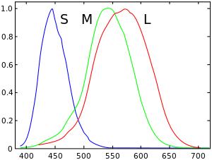
In reality, a colour is a combination of light waves with frequencies between 400-700THz, just like sound is a combination of sound waves with frequencies from 20-20000Hz. Just like mixing various pure notes produces a new sound, mixing various pure colours (like from a rainbow) produces new colours (like white, which isn’t on the rainbow.) Our eyes aren’t like our ears, though. They have 3 sensors that are triggered differently by different frequencies. The sensors roughly peak around red, green and blue. Roughly. ...

Style of blogging

Until 2007, my blog was mostly just linking to stuff I found interesting on the Web. Since 2007, I’ve tried to write longer articles, mostly based on my own experiences. At the moment, that’s unsustainable. Right now, being in a startup, I doing more stuff than I ever have in the past. (That does not mean working more hours, by the way.) My posts, going forward, are likely to be smaller, less original, but hopefully more frequent. ...

Is Protocol buffers worth it?

Google’s Protocol Buffers is a “language-neutral, platform-neutral, extensible mechanism for serializing structured data – think XML, but smaller, faster, and simpler” XML is slow and large. There’s no doubting that. JSON’s my default alternative, though it’s a bit large. CSV’s ideal for tabular data, but ragged hierarchies are a bit difficult. I was trying to see if Protocol Buffers would be smaller and faster, at least when using Python. I took JSON as the base, and checked the write speed, read speed and file sizes. Here’s the comparison: ...