O3/O4 Mini are starting to replace Excel (or Tableau/Power BI) for quick analysis and visualizations. At least for me.
I normally open Excel when I need a fast chart or pivot. For instance, we track outages of our semi‑internal server, LLM Foundry.
To grab the data I ran one line in the browser console:
$$(".lh-base").map(d => d.textContent.trim()).filter(d => d.includes("From"));
This produced lines like:
Apr 20, 2025 03:11:27 PM +08 to Apr 20, 2025 03:27:12 PM +08 (15 mins 45 secs)
Apr 19, 2025 10:03:15 PM +08 to Apr 19, 2025 10:05:45 PM +08 (2 mins 30 secs)
Apr 19, 2025 09:47:13 PM +08 to Apr 19, 2025 09:49:45 PM +08 (2 mins 32 secs)
Apr 19, 2025 08:49:00 PM +08 to Apr 19, 2025 08:51:51 PM +08 (2 mins 51 secs)
Apr 19, 2025 08:13:02 PM +08 to Apr 19, 2025 08:15:35 PM +08 (2 mins 33 secs)
...
Then I told O4-Mini-High:
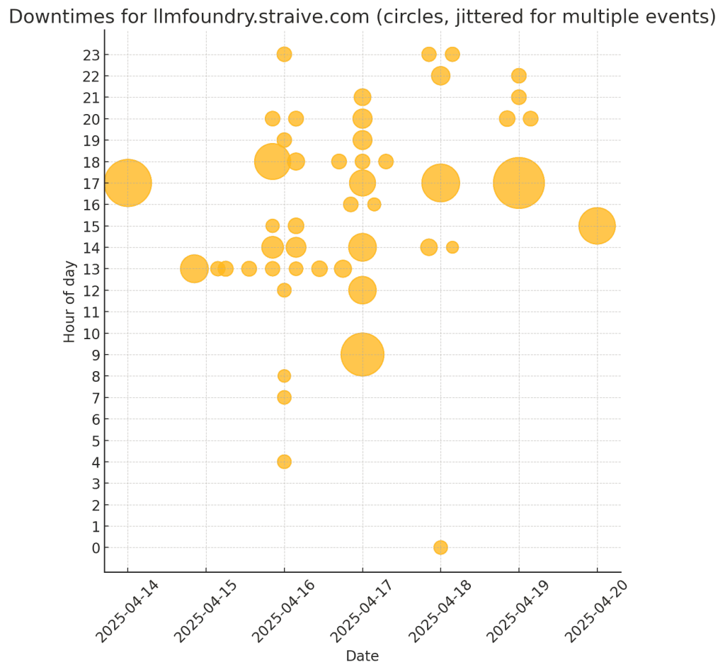
Here are downtimes for llmfoundry.straive.com. Convert this to CSV and allow me to download it. Also, draw the downtimes on a grid, rows=hour of day, columns=date, cell contains 1 circle per outage in that time period, size of each circle is based on the duration of the outage.
Apr 20, 2025 03:11:27 PM +08 to Apr 20, 2025 03:27:12 PM +08 (15 mins 45 secs) Apr 19, 2025 10:03:15 PM +08 to Apr 19, 2025 10:05:45 PM +08 (2 mins 30 secs) Apr 19, 2025 09:47:13 PM +08 to Apr 19, 2025 09:49:45 PM +08 (2 mins 32 secs) … (rest of the data - about 50 rows)
![]()
Here’s the power of what a model like O4 Mini High can do.
- It can reason. So, it planned an approach. (Convert to CSV, transform into date and hour. create a grid-based plot, use a pandas DataFrame, save it to a CSV, etc.)
- It can code. It is pretty good at coding, and this is not too hard a problem, so it got the code right in one shot.
- I can run code. This is a powerful step. It executed the code and produced the visualization above.
All of this took less than one minute.
I did not look at the code. I just focused on the picture and suggested changes.
This draws crosses, not circles, for each hour. Also, if there are multiple outages in an hour, I want multiple circles.
Here’s the output that took less than 10 seconds:
Next iteration:
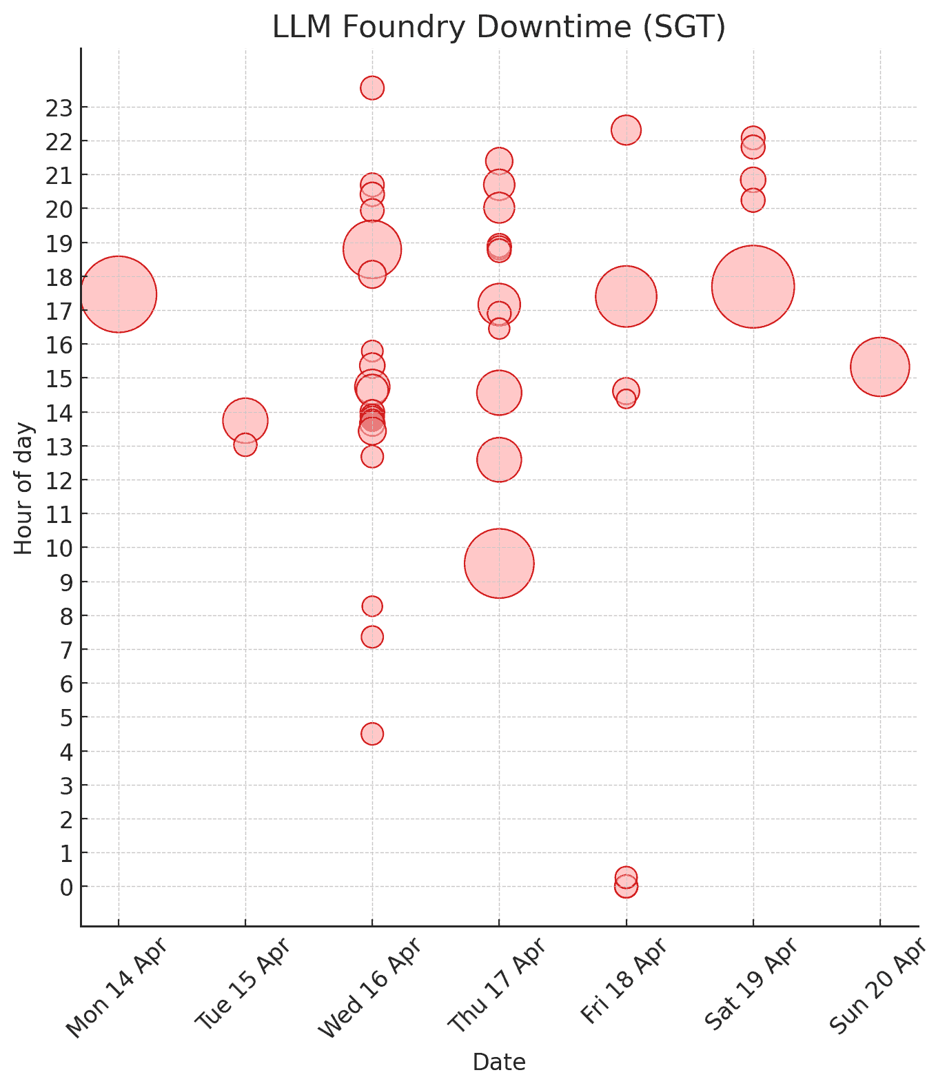
Make the circles red with the same level of transparency. Set the title to “LLM Foundry Downtime (SGT)”. Instead of jittering the circle, let the Y position be the middle of the outage time.
![]()
Next iteration:
Change the red to a milder shade. Set alpha to 0.5 but add a stroke with alpha 0.9. Format the dates like “Sun 20 Apr”, etc.
![]()
That’s it! I never even looked at the code. The whole loop took 3 minutes - far faster than I could manage, though I’m good at code and data visualization!
More importantly, the model frees me to focus on the real problem, which is why is the downtime high?