STEP 1: I asked Nano Banana 2 (via Gemini Pro) to:
Imagine and draw a photo that looks ultra realistic but on a closer look, is physically impossible, and can only exist because images are a 2D projection that we extrapolate into three dimensions.
Avoid known / popular illusions or images of this kind, like Escher’s work, and create something truly original. Think and draw CAREFULLY!
… six times, followed by “Suggest a name for this”.
STEP 2: I asked Claude to analyze these like an expert at paradoxical images.
Below is what Gemini generated, along with Claude’s rating and reviews.
Here’s how I feel.

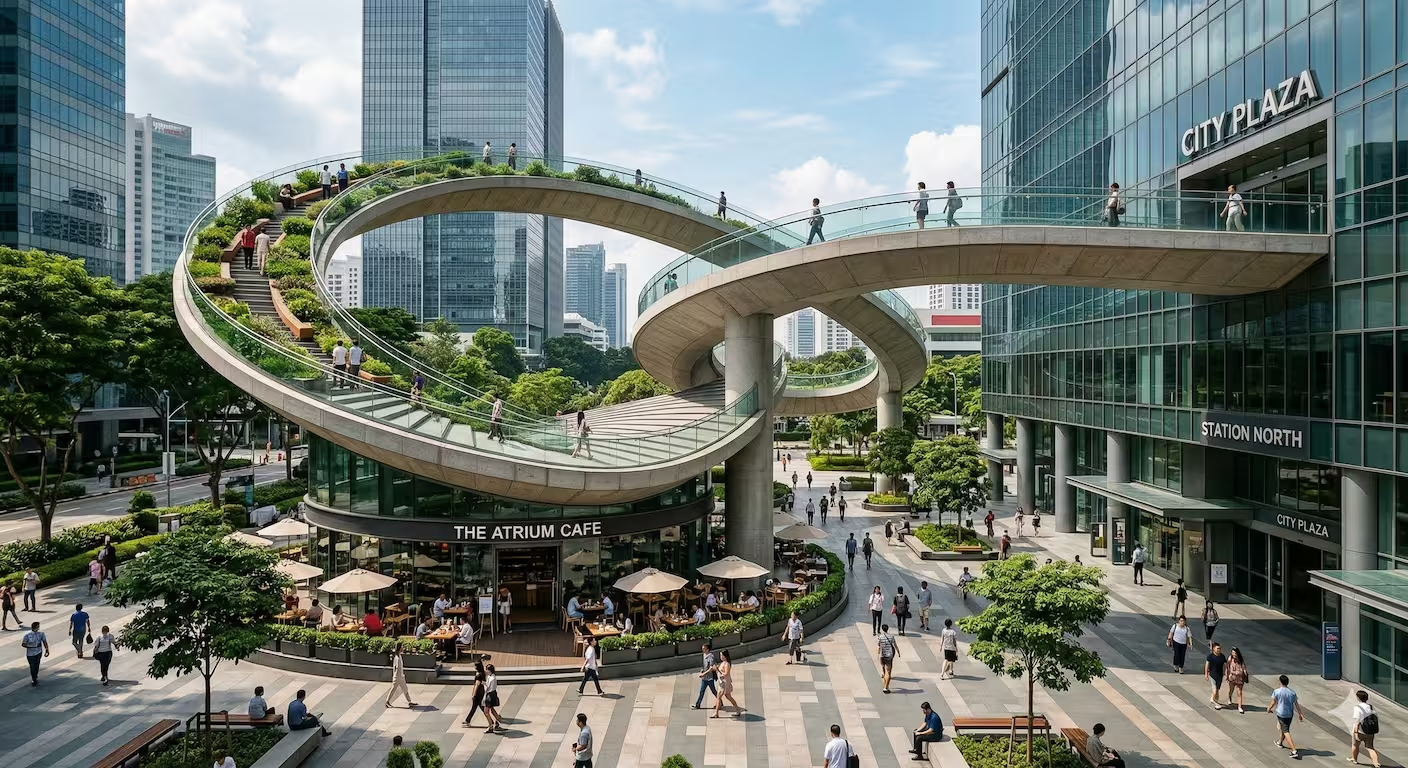
The Möbius Atrium ⭐⭐⭐½
Thinking
Defining the Core Concept
I’m focusing on crafting a misleadingly realistic image, a scene designed to draw the viewer in. The aim is for an initial perception of normalcy, immediately followed by the realization of its impossibility.
Constructing the Paradox
I’m now zeroing in on the impossible structure. The central hub is taking shape in my mind as the pivotal point where the walkway morphs into a roof, the “intersections”. The goal is to craft a scene where the ribbon’s path is initially believable, until the viewer traces the path and identifies a violation of physical laws. The architectural details are critical; the goal is to enhance the initial impression of normalcy.
Refining the Architectural Paradox
I’m now focusing on the paradoxical loop’s visual cohesion. The goal is to ensure the ribbon’s path appears plausible initially. I’m focusing on the “intersections” where the walkway morphs into the roof, and the roof becomes the garden floor. The background skyscraper’s role is critical. The aim is to create visual deception through a plausible layout, which is ultimately exposed as an architectural impossibility.
Visualizing the Impossibility
I’m working on the plaza details to ensure they enhance the initial impression of realism. The goal is to make the central loop believable at first glance, before revealing its paradoxical nature upon closer inspection. The continuous ribbon structure must seem both plausible and physically impossible.
I am focused on the scene’s realism and paradox. A bustling plaza setting is now my primary focus. A continuous ribbon walkway must start as an elevated pedestrian bridge, cross over a plaza, and connect to a hub column. From this hub, it rises to become a cafe’s roof. I am designing a visual that shows this ribbon structure curving down to become an elevated garden which loops, connecting back to the initial elevated walkway, which must somehow also be its own foundation, connecting seamlessly back into the column hub. Details such as people walking, sitting, and interacting with the environment are important to the illusion.
Visualizing the Impossibility
I’m now focusing on a continuous concrete and glass ribbon. It needs to look like a plausible walkway, overpass, and roof, all in one, while remaining physically impossible. This loop starts as an elevated pedestrian bridge coming from a building on the right. It curves over a plaza with people and greenery, then connects to a central hub column. From there, it rises to become a cafe’s roof. The same structure curves down as an elevated garden that loops around a skyscraper. This elevated garden must move downwards and merge back with the initial column, appearing to pass under the original walkway.
Defining the Urban Scene
I’m now establishing the scene, a bustling plaza environment to ground the impossible structure. I’m focusing on the details: the glass buildings, greenery, and the diverse array of people to enhance the initial impression of normalcy. The aim is a visually dense and plausible setting for the architectural paradox.
I am working on a visual scene of a bustling plaza to provide a stage for the impossible structure. The goal is to make the central loop believable at first glance, before revealing its paradoxical nature. I’m imagining a continuous concrete and glass ribbon that forms a loop as an overpass and cafe roof. I am picturing the continuous ribbon walkway from a right building with people walking. This loops into an elevated garden that connects back to the column hub. This hub column is central, and links all parts of the loop.
Defining the Illusory Plaza
I’m solidifying the urban setting. The goal is a densely populated plaza, filled with activity to create a believable environment. I’m focusing on the plaza details: glass skyscrapers, foliage, and diverse pedestrians. The scene must initially appear normal, so that the paradox is starker. The challenge lies in integrating the impossible structure into this environment seamlessly.
I’m now fully focused on creating a bustling plaza to provide a stage for the impossible structure. I am working on the scene’s composition so that the illusion is starker. I am imagining a continuous concrete and glass ribbon that forms a loop as an overpass and cafe roof. I am picturing the continuous ribbon walkway from a right building with people walking. This loops into an elevated garden that connects back to the column hub, which is the central, linking all parts of the loop.
Analyzing Urban Form
I am now focusing on the stylistic and physical attributes of this urban setting. The image is indeed realistic, however, it contains an impossible looping walkway. The structure intersects itself in a way that’s only possible in 2D projection, similar to a Möbius strip. The composition is well-balanced.
Verifying Realistic Elements
I’m checking the scene for stylistic accuracy, noting the realism. The image has a good composition. The impossible structure, while convincing, uses a looping walkway that only exists in 2D projection, similar to a Möbius strip. I want the user to be aware of this.
Since this image relies on the brain’s attempt to resolve a topological paradox within a mundane urban setting, the name should sound like a standard architectural landmark that hides a glitch in reality.
I suggest: The Möbius Atrium.
Why this works:
- The Möbius Strip: It references the mathematical property of a surface with only one side, mirroring how the walkway’s “top” becomes its “bottom” through the loop.
- Architectural Mundanity: Using the word “Atrium” or “Plaza” grounds the image in reality, making the physical impossibility feel like a casual bureaucratic oversight rather than a fantasy.
Other contenders:
- The Zenith Paradox: For the way the path ascends and descends simultaneously.
- The Junction at Station North: A local-sounding name that implies people use this impossible route every day to get to work.
- Euclid’s Oversight: A subtle nod to the breaking of classical geometric rules.
Claude’s Review
Mechanism: Topological impossibility
What to look for: This attempts something far more ambitious than depth-order tricks — a Möbius topology in architecture. The expert question is: can I trace a continuous path along the upper walkway surface and return to my starting point having traversed both the top and underside of the ribbon?
The structure appears to loop so that what begins as the walkway floor becomes the underside of the roof structure and then connects back — a one-sided surface. That’s a Möbius strip.
Why this is harder to read than the Anchored Arc: The Möbius mechanism is distributed — the impossibility is never localized to a single crossing point. You must complete the full loop to confirm it. In a 2D image, this requires active visual effort. Compare to the Anchored Arc, where one glance at the beam/arch crossing fires the paradox.
Trigger point quality: 5/10. The expert will sense something is wrong immediately but will struggle to locate the exact violation. The image produces unease, not “aha.” The view is too busy — people, greenery, signage, multiple levels — and the ribbon makes several crossings that could each be the site of impossibility.
Expert question a beginner wouldn’t ask: Is this a Möbius strip or just a figure-8 loop? A figure-8 flyover is perfectly buildable. The distinction matters: for true Möbius topology, the surface must invert orientation through the twist. That’s hard to show in a static image without marking the surface.
Anchor strategy: Excellent — Singapore/Hong Kong elevated walkways are familiar, so the brain wants to accept it. “The Atrium Cafe” and “Station North” labels are particularly clever — they mundanize the impossible.
Verdict: Conceptually the most ambitious image in the series. The topological mechanism is genuinely unusual. But the paradox doesn’t land cleanly — you sense rather than see it.
The Pastoral Threshold ⭐½
Thinking
Defining the Impossibility
I’m currently focused on defining the nature of the spatial paradox within a normal-seeming scene. The initial concept involves a cluttered room. I am now working on the specific elements and how they’ll interact to create the illusion of impossible geometry, visible only from a chosen vantage point.
Constructing the Paradox
I am now structuring the paradoxical element within the scene. I’ve settled on an artist’s studio as the location. My focus is on integrating an impossible staircase into the artwork displayed on an easel. The staircase will loop back on itself in the painting, creating the illusion of impossible geometry when viewed from a specific angle. The goal now is to render this painted scene in a way that blends into the overall environment, making the paradox more subtle.
Visualizing the Implausible
I’m now focusing on integrating the impossible staircase within the painted artwork. I’ve considered the spatial relationships in the scene, aiming for a natural look. The artist’s workspace details, like the brushes and the paint tubes, are finalized, giving context to the paradox on the easel. The painting title, artist signature and other details are being worked out. I am working on the exact path of the stairs to ensure it creates the necessary optical illusion. The plan is to ensure that the lighting adds depth and realism.
Refining the Paradox
I am now focusing on refining the studio environment. I’m finalizing details, such as the arrangement of paint tubes, brushes, and the artist’s personal items. The exact path of the impossible staircase within the painting is set, but its integration with the studio setting is still being refined to ensure the optical illusion is as convincing as possible. The scene will feature a naturalistic light and composition.
Constructing the Scene
I am now structuring the entire scene to incorporate all requested details. The artist’s studio now includes a wooden work table, brushes in a ceramic pot labeled “Winsor & Newton,” paint tubes, pencils, and a sketchpad with the name “EL IZA.” The worn paint palette nearby adds context. The easel holds the crucial painting, and its positioning within the studio is set to achieve the right perspective for the illusion. I’m finalizing lighting.
Assessing Creative Novelty
I’m now evaluating the originality. While the image presents a physically impossible scene—a staircase merging with a bookshelf—it leans heavily on existing stylistic themes. I’m focusing on whether the depiction deviates enough from known conventions to be considered truly novel.
Refining Spatial Distortion
I am now aiming for a truly novel spatial distortion. The prior attempt, while realistic, drew too directly from known illusions. My revised strategy centers the paradox on the window itself, not an element within the scene. I will replace the easel with a pastoral field and sheep, which serves as a realistic anchor. The crux now lies in re-engineering the window frame, with split-level sills to generate conflicting depth perspectives, which I think will avoid direct Escher allusions. The bottom-left pane now functions as a “depth trap.”
Analyzing Spatial Impossibility
I’m now assessing the generated visual paradox against the original specifications. It still leans too heavily on established illusion concepts, particularly those of Escher, and thus is not fully original. To remedy this, I will ground the impossible geometry in the window frame, not a painting within the scene. I am now replacing the easel with a pastoral landscape. I plan to re-engineer the window structure to generate conflicting depth perspectives, with split-level sills. The bottom-left window pane will contain an impossible view of both an interior cellar and a distant landscape.
Analyzing Spatial Anomalies
I’m focusing now on the spatial inconsistencies within the images. The goal is to make sure these elements are clearly non-standard and break physical logic within a realistic, high-fidelity scene, where details make the impossible elements more striking. I am concentrating on the subtle ways that things intersect or don’t.
Refining Photorealism and Illogic
I’m verifying that the image maintains photorealistic style while incorporating significant spatial anomalies. It is crucial the scene’s initial realism heightens the impact of the impossible elements. The cat tail/beam interaction and the stairwell’s unexpected placement achieve this subtle disruption of perceived reality. This builds on the foundation established previously, and I consider it a successful evolution.
Considering the subtle way the physical world and the painted world overlap in this image, here are a few name suggestions that play on that “impossible” intersection:
- The Pastoral Threshold: Suggests the canvas isn’t just a surface, but a literal doorway between the studio and the field.
- The Grazing Anchor: A nod to the sheep that is simultaneously “anchored” to the painted grass and the physical wooden easel.
- Canvas Spill: A literal description of the landscape leaking out of its bounds.
- The Painter’s Blind Spot: Playing on the idea that the artist is so focused on her work that she hasn’t noticed reality is merging with her art.
- Incongruent Horizons: Highlights the way the 2D plane of the painting has hijacked the 3D space of the room.
Personally, I’m partial to “The Pastoral Threshold”—it feels as quiet and unassuming as the image itself until you spot the glitch.
Claude’s Review
Attempted mechanism: Hybrid spatial planes
What to look for: The intended paradox is that the painting on the easel is not merely a painting — it bleeds into the 3D space of the studio. The canvas supposedly functions as both a bounded artwork and an actual window into a real space.
The critical expert diagnosis: the paradox did not materialize.
Look at the image carefully. What do you see? An artist in her studio. A painting of a pastoral scene on an easel. The painting is well-executed and hangs in correct perspective. Nothing in the image actually violates physical law.
The Gemini thinking described wanting “Canvas Spill” — sheep or grass extending beyond the canvas boundary into the physical room, or the painting’s light source contradicting the studio’s light source, or the canvas depth perspective conflicting with the room’s depth. None of these appear. The image is just a beautiful, photorealistic painting of an artist’s studio — with no impossibility embedded.
Beginner trap: The beginner accepts the image as a successful impossible image because the artist named it and described it as one. They’ll rationalize an impossibility that isn’t there. An expert insists on being able to point to the violation.
One possible weak paradox, if you squint: The painting on the easel appears very large relative to the room — possibly its implied distance (given the pastoral horizon) should make it feel more “through a window than on a canvas.” But that’s not a paradox, it’s just realism in the painting’s depth.
Why it failed: Hybrid spatial planes are the hardest mechanism to execute in photorealistic AI imagery. They require the model to place objects that are simultaneously 2D and 3D — which creates a contradiction the diffusion model doesn’t know how to commit to. The model rendered a plausible studio instead.
Verdict: A miss. This is the weakest image in the series.
The Anchored Arc ⭐⭐⭐⭐⭐
Thinking
Defining the Core Concept
I’m focused on developing a scene that’s inherently impossible, exploiting 2D perception. The initial setting is a realistic, everyday space – a rustic interior. I’m aiming for a sense of normalcy that gradually unravels into the impossible.
Constructing the Illusion
I’m now building the impossible element: a stone bridge inside the rustic interior. It connects two seemingly disparate elevations within the space. The visual trick will rely on a carefully crafted perspective to create a jarring disconnect from reality. The goal is to make the elevation change feel seamless and inexplicable.
Refining the Composition
I’m now zeroing in on the specifics of the stone bridge’s architecture within the rustic interior. I’m focusing on how the bridge interacts with the scene’s elements to enhance the illusion. The main focus is the elevation trick. I am thinking carefully about camera angles to maximize the distortion.
I am finalizing the placement of the bridge, working on the connection of disparate elevations to enhance the overall effect. The details of the table setting are taking shape, which aids the impossible perspective. I’m giving more focus to the interplay of shadows and the bridge, and how the shadows on the apples and linen reinforce the impossible depth.
Constructing the Impossible
I’m now zeroing in on the core illusion: the stone bridge connecting disparate elevations within the rustic interior. I’m focusing on the architectural design of the bridge itself, ensuring it seamlessly merges with the existing environment. I’m thinking about the viewing angle. The bridge must appear to defy physical space. The aim is to make the entire scene feel natural, but completely wrong. I am prioritizing a high level of detail for materials like aged wood and worn stone. The lighting should reinforce the illusion.
Constructing the Core Scene
I’m now establishing the scene’s groundwork. The setting will feature a rustic farmhouse interior, starting with mundane elements: a wooden table, apples in a bowl, and a linen cloth. I’m focusing on the interplay of lighting. My focus is the stone bridge that will defy normal perspective.
The scene’s architectural elements are coming together. I’m concentrating on the bridge’s design to highlight its paradoxical nature within the room. I’m meticulously detailing aged wood, stone textures, and lighting to enhance the illusion, specifically the viewpoint.
Visualizing the Implausible
I’m working on the core paradox: the physical impossibility presented by the stone bridge. I’m focusing on crafting an aged aesthetic with light and textures. I am analyzing the relationship between the bridge’s segments and the table, and how the bridge casts shadows on objects that should be spatially in front of it. The key is conveying the illusion’s impact. The bridge’s curvature is crucial for generating the 2D perception trick.
Analyzing the Impossible
I’m focusing on the requested impossible 3D projection, evaluating how effectively the image realizes this concept. I’m assessing the effectiveness of the central stone arch and how it achieves the physically impossible object through a 2D projection.
Refining the Illusion
I’m working to enhance the impossible projection. The initial visual was strong, conveying the impossible arch effectively. However, I identified distracting annotations. I’m regenerating the image to eliminate these labels, aiming to preserve the hyper-realistic textures and natural lighting.
Eliminating the Distractions
I’m now focused on removing the visual clutter that takes away from the illusion. While the scene effectively presents the impossible 3D projection, the “A” and “B” annotations are distracting. I’m regenerating the image to remove these labels, aiming to maintain the documentary style, preserving the textures of the stone, wood, and cloth, and the natural lighting to keep the illusion strong.
Analyzing Spatial Anomalies
I’m verifying that the image maintains the desired impossible geometry within the rustic room setting. The focus is on the stone arch and ensuring the 2D projection illusion is clearly represented. I am working to ensure no extraneous elements or unwanted annotations are present within the generated scene.
Confirming Visual Consistency
I’m now carefully examining the image to ascertain that the impossible geometry remains intact. The stone archway is key, acting as the primary visual indicator of the 2D projection illusion. My goal is to guarantee the absence of any extraneous visual information within the rendered environment. I will present this for assessment.
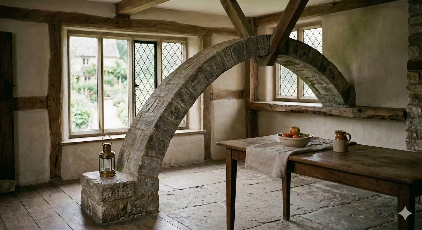
How about “The Anchored Arc”?
At first glance, it feels like a rustic, cozy interior, but the more you look, the more the spatial logic collapses. The stone arch starts firmly on the floor in the foreground, yet manages to “pass through” the wooden beam and anchor itself into a wall that—based on the window—should be several feet behind it.
A few other options depending on the “vibe” you want:
- The Carpenter’s Paradox: Because it looks like a builder followed the blueprints for a 2D sketch without checking 3D reality.
- Depth Graft: Highlighting how the arch is literally grafted from one depth plane to another.
- Aperture Error: Sounds like a technical glitch in how the scene was “captured.”
Claude’s Review
Mechanism: Depth-order cycle (Penrose-type)
What to look for: Trace the arch from its left foot forward, then overhead, then back to its right embedding point, and ask at each segment: what is in front of what?
Here’s what the expert traces:
- Left foot: planted on a stone block in the near foreground — clearly the closest object in the scene
- Arch apex: The stone arch passes behind the central wooden ceiling beam — the beam occludes the arch here
- Right foot: embedded into the far wall — definitively the deepest object
The contradiction: The left foot is in front of everything. The beam is in front of the arch. But the right foot, which is the same continuous object as the left foot, is behind the beam and behind the wall. A single continuous object cannot simultaneously be the nearest and the farthest thing in the room.
Trigger point quality: 9/10. An expert finds it in under 10 seconds. A beginner finds it in 20–40 seconds — that’s ideal pacing.
Anchor strategy: Flawless. The bowl of apples, the lantern, the linen cloth — all placed near the impossible junction as misdirection. The Cotswold farmhouse setting is visually familiar, which makes the brain want to accept it.
Shadow test: The light source is the left windows. There is no shadow cast by the arch onto the floor — a subtle slip, but forgivable since the arch’s self-contradiction is the main act. A purist would notice.
Verdict: The best image in the series. This is a well-constructed impossible image — the equivalent of a clean Penrose triangle transported into photorealistic space.
The Carpenter’s Paradox ⭐⭐⭐½
Thinking
Defining the Visual Concept
I’m now focusing on a complex visual concept. I’ve settled on the idea of a busy workshop or an outdoor scene. The goal is to obscure the impossible element within a chaotic composition. The scene must appear candid, as if snapped in daylight. This will help make the manipulation less obvious at first glance.
Refining the Impossible Structure
I’m now zeroing in on the impossible structure’s details. The woodworking setup will feature a multi-level architectural model on a workbench. It will use interlocking beams and ramps. The aim is to create an illusion of depth, so that the apparent physical impossibility is initially obscured. The visual trick will rely on a horizontal beam crossing over a vertical post at one point, and the vertical post crossing over the same horizontal beam at another point.
Constructing the Impossible Object
I am now focusing on the impossible structure on the workbench, seeking ways to make it subtly and fundamentally impossible. The artisan’s figure is now central, but not dominant. I plan for this woodworking structure to incorporate a visual trick that exploits occlusion and perspective. I am attempting to design an architectural model that, from a single viewpoint, presents a logical, continuous path that is, in reality, geometrically impossible.
Designing the Composition
I’m now integrating the impossible object into a realistic artisan studio. I’m focusing on the interplay of elements; the loft setting with natural light, the busy workbench, the artisan’s actions, and the impossible structure. I need to ensure a balance between the chaotic workshop and the precisely designed impossible object. The visual trick will rely heavily on occlusion and perspective to ensure a sense of continuity, but will be mathematically impossible in 3D space.
Defining the Artisan’s Action
I am now visualizing the artisan’s role in constructing the impossible object. She will be adjusting a clamp on the workbench, drawing the viewer’s eye to the area where the illusion occurs. I am focusing on her age, clothing, and physical state to ensure she appears focused on her task, and realistic. The composition balances the artisan’s activity with the impossible object, and the cluttered workbench.
Analyzing Spatial Paradox
I’m currently focused on evaluating the image’s adherence to spatial paradox principles. It’s supposed to create an impossible object, but the latest iteration uses repeated figures instead of a true optical illusion. My current goal is to ensure the image effectively conveys a coherent impossible geometry and doesn’t rely on repeating elements.
Refining Impossible Geometry
I’m now revising the design for the impossible object. The previous attempt, while realistic, lacked a true optical illusion; it leaned on duplicated figures. I’m aiming for a perspective-driven anomaly, a self-intersecting structure exploiting depth perception. The current plan is to modify the wood shop scene to include a complex, contradictory geometry. A key goal is to have a main pillar appear from behind a central beam, then cross over it higher up, defying logical construction and relying on the grain pattern for coherence.
Revising Illusory Structure
I’m now zeroing in on an image that centers on geometric impossibility. The current image lacks the necessary coherence; it depends on duplicated elements. I’m aiming for a perspective-driven anomaly within a wood shop scene. My main focus is a structure that looks self-intersecting, challenging depth perception. I’m working to make a main pillar look as if it emerges from behind, yet later appears over the top of a beam, using grain patterns for visual cohesion.
Refining Spatial Illusions
I have checked the updated image and confirmed the duplicate character has been removed, and the earlier hallucinated text is gone. The setting now accurately portrays the workshop. I’m focusing on refining the impossible geometry. I’m redesigning the scene around a Penrose-style object and removing the woman to make it the central focus. I will generate a new image to push for a more impossible geometry.
Generating Impossible Geometry
I have verified the new image incorporates the desired impossible geometry; the Penrose lattice is now at the scene’s focal point. I have successfully removed the woman and her tools, and I’m currently refining the lighting to produce physically impossible shadows. I’ve also incorporated foreground wood pieces to frame the shot. I will carefully adjust the camera angle to enhance the illusion.
Analyzing Compositional Deficiencies
I’m currently focused on the spatial arrangement within the generated image and whether it successfully presents an impossible object. I’ve noted that while the image exhibits some visual strengths, it hasn’t achieved the intended impossible geometry. The composition has some improvements, but the core objective remains unfulfilled.
Refining Geometrical Impossibility
I’m now focused on generating a geometrically impossible structure. My aim is to replace the previous design with a Penrose-style lattice, ensuring consistent wood grain and non-Euclidean intersections to create a continuous loop. I’m also planning to adjust the lighting from the windows to conflict and enhance the surrealism. Removing the figure and the tools is also part of my plan, to clear any potential visual contradictions.
Revising Impossible Geometry
I’ve checked the image and while visually strong, the structure is still physically possible and not impossible. I removed the person and tools, and I will attempt to make the wood beams form a Penrose lattice that connects in loops. I’ll make the light from the windows conflict. Clutter will be cleared from the base. The camera angle is now lower and centered.
Analyzing Spatial Logic
I’ve confirmed the alterations regarding the removal of the woman and hands, leading to an improved composition. The foreground elements were addressed effectively. I will next focus on the central wooden object, examining it for physical plausibility.
Refining Impossible Geometry
I’m now implementing alterations to the scene to generate a Penrose-style impossible shape for the central wooden structure. I’ve cleaned the intersecting beams at the top and base of the main vertical post, working on the vertical post itself. The goal is to make the top appear most distant, while the base appears closest, exploiting depth perception to create a spatial contradiction.
Implementing Spatial Illusion
I’m now working to generate an impossible shape using depth perception. I’ve cleaned up the central wooden structure by removing intersecting beams at the top and base. The vertical post’s top is the most distant part, while its base is the nearest. Horizontal and diagonal beams will create a Penrose-style shape. I’m keeping natural light, a shallow depth of field, and wood textures consistent.
Assessing Structural Integrity
I’m now focused on the spatial anomalies and geometric impossibilities within the structure. The workshop environment’s details and the central object’s texture are under scrutiny. The focus is now solely on the structure itself.
Analyzing Geometric Anomalies
I’m verifying that the physically impossible nature of the structure is evident. Specific attention is on the self-intersections to confirm they defy 3D logic. The image successfully executes the removal of superfluous elements and highlights the structure with an emphasis on its unique joinery.
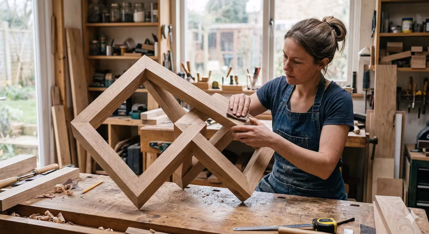
This image plays with the concept of isometric ambiguity, where the wood grains and joinery appear perfectly tactile and real, yet the structural logic collapses upon closer inspection.
I suggest naming it: The Carpenter’s Paradox
Why this name works:
- The Irony: A workshop is a place of absolute precision and physical laws. To see a masterfully crafted “joint” that defies Euclidean geometry in such a grounded setting creates a sharp intellectual contrast.
- The Medium: It highlights that while the material (oak) looks authentic, the structure is an architectural impossibility that can only exist as a 2D projection.
- The Narrative: it suggests a craftsman who became so obsessed with joinery that they managed to “solve” a shape that shouldn’t exist.
Alternative Ideas:
- The Grain of Contradiction
- Orthogonal Defiance
- The Non-Euclidean Joiner
Claude’s Review
Mechanism: Depth-order cycle (Penrose-type)
What to look for: This is a 3D Penrose impossible object rendered in oak. Follow the beams and ask at each intersection: which beam is in front?
The structure consists of rectangular frames intersecting at angles. At the central crossing region, trace any beam: it appears in front of the next, which appears in front of the next, which appears in front of the first — a cyclic occlusion chain.
Expert technique: the grain continuity test. In a truly impossible object, the wood grain should appear continuous across joins that physically couldn’t be continuous — two separate pieces meeting but their grain flowing as if from a single piece. This image partially achieves that, which is a nice detail.
Trigger point quality: 6/10. The structure has too many intersections. The paradox is real but distributed across many beams, and the complexity makes it hard to lock onto a single clean contradiction. Compare to a Penrose triangle: three vertices, three contradictions, perfectly readable. This object has 6+ intersections and you’re not sure which one to commit to.
Expert question: Is this object actually impossible, or just visually complex? A careful 3D modeler might find an escape hatch — a valid 3D geometry that produces this exact 2D projection. The more intersections, the more likely an escape exists.
Anchor strategy: Very good — the workshop setting with visible tools, workbench, and window is mundane and high-quality. The object being a finished sculpture rather than a work-in-progress is smart: it implies skilled craftsmanship, which makes the brain want to accept its physical reality.
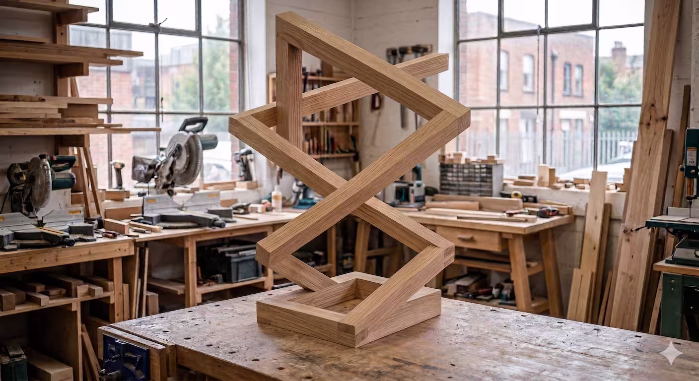
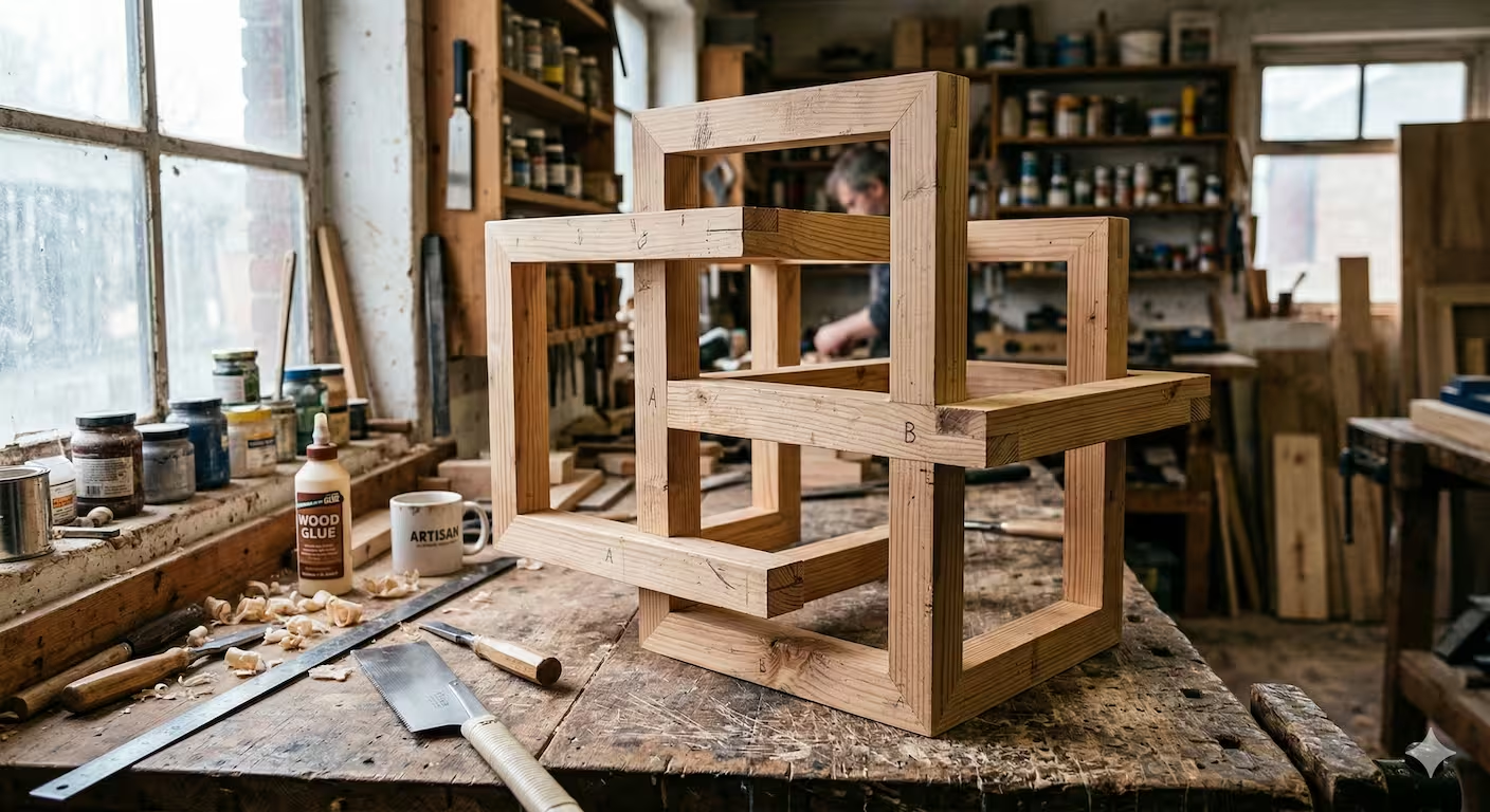
The Fold of Oak ⭐⭐⭐
Thinking
Defining the Impossible
I’m working on an ultra-realistic impossible structure. I’m focusing on a detailed natural environment with complex lighting to start. The aim is a real-looking photo with 2D tricks that produce 3D contradictions.
Refining the Setting
I’m now prioritizing the environment. A well-lit artist’s studio seems ideal. It will have wooden shelves filled with art supplies, tools, raw materials and a rustic wooden work table. In the background, brick walls and large windows should provide natural light. The plan involves a blurred background of the studio and its contents, to enhance realism. I’m focusing on crafting a twisted lattice sculpture out of wood as the impossible object.
Constructing the Illusion
I’m now zeroing in on the impossible object. The wooden sculpture is evolving. I’m focusing on the structural impossibility: beams that twist and connect in ways that defy 3D geometry. The goal is a seamless blend of realism and optical illusion. I’m prioritizing the visual impact of the contradictions.
Visualizing the Implausible
I’m now focusing on composing the scene. The artist, a woman, is positioned to the left, intently working on the impossible sculpture which is the central focus. I’m prioritizing the interplay of light and shadow on the wood. The blurred background should support the realism of the studio with the artist’s work.
Defining the Contradiction
I’m now zeroing in on the core of the illusion, the geometric flaw itself. The impossible object must look like it could exist, so it must be made from wood, looking like a real wooden object that is being worked on in a workshop by the artist. I’m focusing on the interplay of visual cues and geometric impossibility. The goal is to make the paradox of the structure immediately apparent upon close inspection. I’m planning the intersection point of the impossible connections.
Finalizing the Scene
I’m now zeroing in on the final image. The artist’s pose and studio details are set. The focus is sharp on the impossible object’s critical connection. I’ve designed the beams to loop in a way that creates a single, continuous, impossible object. I’m focusing on the light and shadow to expose the structural contradiction.
Analyzing Impossible Geometry
I’m focusing on the generated visual’s adherence to the impossible geometry concept. My priority is confirming that the depicted structure, a workshop, is indeed physically unbuildable while maintaining an ultra-realistic photographic style. I’m assessing the textures, lighting, and geometric accuracy to ensure the core concept is faithfully rendered.
Confirming Geometrical Paradox
I’m now zeroing in on the geometrical paradox itself. The goal is to verify that the generated workshop is undeniably unbuildable in 3D while still adhering to the photographic realism. I’m prioritizing the original paradox aspect and verifying the absence of any direct Escher influence. I’m also confirming that the alignment creates the visual deception, leading to an impossible but visually coherent structure.
This woodworking scene appears ultra-realistic at first glance, but close inspection of the central wooden structure reveals a physical impossibility. The beams on the left pass both over and under each other in a paradox that can only exist through the specific viewpoint provided by a 2D projection.
That image definitely captures that “wait, what?” feeling. Since it blends the tactile, grounded reality of a woodshop with a geometric glitch in the matrix, here are a few name suggestions:
- The Carpenter’s Knot: A play on “The Gordian Knot,” suggesting a problem that can’t be solved by untying it, only by changing how you look at it.
- The Fold of Oak: Sounds like a standard craft piece until you realize the wood is “folding” through itself in 3D space.
- Perspective’s Limit: A more literal take on how the image relies on a single, fixed point of view to maintain the illusion.
- The Joiner’s Paradox: “Joining” usually implies two pieces meeting; here, they seem to exist in the same space simultaneously.
- Flatland Craft: A nod to the book Flatland, implying this object was built by someone who understands dimensions we can’t see.
Personally, I’m partial to The Joiner’s Paradox—it feels like something a frustrated apprentice would accidentally build in a dream.
Claude’s Review
Mechanism: Depth-order cycle (identical to Carpenter’s Paradox)
Expert observation: This is the same mechanism as Carpenter’s Paradox, executed in the same setting (woodworking workshop), with the same material (oak frames), differing mainly in that the object is rotated 45° and a human figure is present.
What the figure adds: The carpenter’s hands interacting with the object anchor it more firmly in physical reality, which should heighten the paradox. But it also creates a risk — her hands occlude portions of the impossible junctions, offering the brain a potential escape hatch. If you can’t see the critical crossing, you can’t confirm it’s impossible. Here the woman’s hands are near but not fully blocking the key intersections, so the paradox survives.
Object vs Carpenter’s Paradox: This object is simpler and slightly more legible — fewer beams, cleaner diamond composition. Paradox slightly easier to read.
The core problem: This is the second wood-workshop impossible-frame image. Within a six-image series, repeating the same mechanism, material, setting, and compositional format constitutes a significant creative limitation.
The Planar Glitch ⭐⭐
Thinking
Defining the Environment
I’m currently focused on defining the environment for this impossible scene. A photorealistic workshop or architectural setting seems most promising. I am leaning toward a brightly lit and busy atmosphere. I am actively considering how to integrate the impossible geometry seamlessly into this environment.
Constructing the Core Object
I am now focusing on the central impossible object and its composition. My intention is to create a structure of intersecting wooden blocks. It should present as a solid volume, but be impossible in three dimensions. I am aiming for a complex, handcrafted wooden sculpture on a workbench, constructed from interlocking square pine beams. The beams are to form an impossible cuboid framework.
Refining the Composition
I am now focusing on refining the scene’s visual composition to emphasize projective impossibility. I am exploring how to arrange the workbench, tools, and background elements to create the desired focal point on the impossible wooden structure. I am actively working on the lighting to enhance the illusion. I am prioritizing a slightly elevated, front-on camera angle to maximize the effect of the intersecting wooden frames.
Developing the Construction
I am now delving into the precise mechanics of the impossible structure. The key is in the intersection of three beams, a vertical and two horizontals, which visually overlap perfectly. The image needs to clearly show this intersection, emphasizing the illusion of solid objects occupying the same space.
Analyzing the Junction
I am now closely analyzing the critical intersection of the wooden beams. My latest thought is that the visual trickery lies in the apparent seamlessness of the intersection. The image must show how the grain of the vertical beam seems to pass through the horizontal beam without a break, simultaneously occupying the same space. I’m focusing on the interplay of light and shadow.
Developing the Setup
I am now structuring the scene with a focus on realism to amplify the impossible nature of the central object. I’ve settled on a busy, brightly lit artist’s studio. I’m prioritizing the inclusion of a worn workbench and scattered tools to provide context. The impossible wooden structure will be the focal point on the central bench, with a cluttered background to enhance the illusion. The lighting is being adjusted to cast sharp shadows and highlight the critical intersection.
Analyzing Visual Paradoxes
I’m assessing the latest rendering; the forced perspective creates an impossible workshop structure. The focus is on the overlapping planes at the ‘B’ intersection, creating a visual paradox, and I’m comparing it to earlier concepts. The photorealism is present, and I’m examining how effectively the illusion holds.
Examining Novel Illusions
I’m now determining how effectively the generated “woodworking piece” achieves its paradoxical nature. The goal is to avoid simple clones of existing concepts, so the originality of the implementation is under evaluation. I’m focusing on how well the forced perspective creates an effective illusion within this specific context.
How about The Carpenter’s Paradox?
It plays on the contrast between the gritty, tactile realism of the workshop—the wood shavings, the glue, the weathered workbench—and the structural impossibility of the object itself.
If you want something a bit more technical or “dry” (fitting for a blog post or a data-viz discussion), here are a few other options:
- The Planar Glitch: Highlights that the object only “works” because of the 2D projection.
- Miter’s Knot: Sounds like a traditional woodworking joint, but implies a knot that can’t be untied by physics.
- The Orthogonal Lie: A nod to the right angles that shouldn’t be able to connect the way they do.
- Draftsman’s Delusion: Suggests a prototype that followed a flawed blueprint to a literal, impossible end.
Claude’s Review
Mechanism: Depth-order cycle (same as above)
Immediate expert red flag: There are handwritten “A” and “B” labels visible on the beams. These break immersion completely and signal this is a diagram, not a photograph. The Gemini thinking explicitly tried to remove them and failed. This is a production error that should disqualify the image from serious consideration.
Beyond the labels: This is the third wood-workshop impossible-frame image in six. By this point the repetition is undeniable. A series with 50% identical setting-plus-mechanism is not exploring the space of impossible images; it is defaulting to a comfort zone.
Verdict: The weakest execution of the three woodshop images, and ranked last in the series overall.
Claude’s Synthesis
What the model does well
Nano Banana 2’s strongest suit is photorealism as a weapon. The material quality — mortar between stones, timber grain, leaded glass, studio clutter — is genuinely high. This matters because impossible images depend entirely on the viewer’s willingness to accept the scene before discovering the contradiction. The model can produce that initial acceptance convincingly.
The Anchored Arc is the standout work of the series: a textbook impossible image. The mechanism is clean (depth-order cycle), the trigger point is locatable and well-timed, the setting is perfectly chosen, and the mundane props (apples, lantern) function as skilled misdirection. If this image were the only one submitted, the review would be strong.
The Möbius Atrium shows conceptual ambition. Topological impossibility is rarely attempted in photorealistic paradox imagery — it’s much harder to execute than Penrose-type depth cycles. The image succeeds in conveying unease even if it doesn’t land a precise trigger point.
The dominant weakness: template collapse
An expert reviewer’s sharpest criticism is this: three of six images are the same image. Carpenter’s Paradox, Fold of Oak, and Planar Glitch all use:
- A woodworking workshop
- An impossible interlocking wooden frame object in oak
- Depth-order cycle via Penrose-type impossible solid
- A craftsperson or workshop context as anchor
This isn’t creative variation — it’s repetition. The model found a template that works and defaulted to it. This is the AI equivalent of a student who writes three essay answers using the same paragraph structure: technically passable, but it signals limited range.
The prompt asked for images that “can only exist because images are a 2D projection” — a rich design space that includes shadow contradictions, impossible horizons, scale impossibilities, hybrid window/painting planes, impossible architectural interiors, impossible figures (two legs become three), etc. The model barely touched this space.
The Pastoral Threshold failure is diagnostic
The failed Pastoral Threshold image tells us something important: the model struggles with hybrid spatial planes — the mechanism where 2D and 3D spaces interpenetrate. This is arguably the richest and most original mechanism available to AI image generators, since they have unique capabilities in blending image spaces. That the model couldn’t execute it suggests the prompt engineering didn’t push hard enough on that frontier.
Comparison to the genre
| Comparator | What they master | Banana’s position |
|---|---|---|
| Escher | Internally consistent impossible architectures traceable by finger | Anchored Arc approaches this; others don’t |
| Reutersvärd / Penrose | Clean 3-junction impossible solids | The woodshop series is essentially photographic Reutersvärd |
| Patrick Hughes (Reverspective) | Physical objects that deny their own physicality when viewed flat | The Atrium approaches this inverse but doesn’t commit |
| Sandro Del-Prete | Frame/painting/window bleeds | Pastoral Threshold attempted this and failed |
| Rob Gonsalves | Magic realism where two physically valid scenes share pixels | This is the direction Nano Banana 2 should explore |
The model operates comfortably in the Reutersvärd zone — impossible objects with photorealistic texture. It fails in the Del-Prete zone (frame-bleeding) and hasn’t yet attempted the Gonsalves zone (scene interpenetration). The topological Atrium is an admirable outlier.
Recommendations for the next series
- Abandon the woodshop — it’s become a crutch. One impossible-object image per series is enough.
- Push shadow contradictions — an outdoor scene where a person casts shadows in two incompatible directions from a single sun is simple, clean, and devastating.
- Pursue the canvas-reality bleed — try harder on the Pastoral Threshold concept with more explicit framing: sheep’s shadow falling outside the canvas onto the floor, one sheep’s back legs on wood floor.
- Try impossible scale — a scene where a distant mountain is smaller than a nearby thumbnail-sized stone, and both scales are “correct.”
- For topological work: commit harder — mark the surface with an arrow or color gradient so the viewer can trace the Möbius inversion.
Final assessment: A series of genuine technical quality with one masterwork, one ambitious experiment, one failed attempt, and three variations on the same theme. Nano Banana 2 demonstrates strong craft and real conceptual ambition — but the series reveals a model that hasn’t yet fully explored the design space it was given.
To be perfectly frank, it took me 5 minutes to carefully read what Claude liked so much about The Anchored Arc - and where the paradox was. I finally did figure it out (I think) and it does feel impressive.
But from now on, I should probably leave art to the machines and go play outside.
