Wage Rates of Nations and LLMs
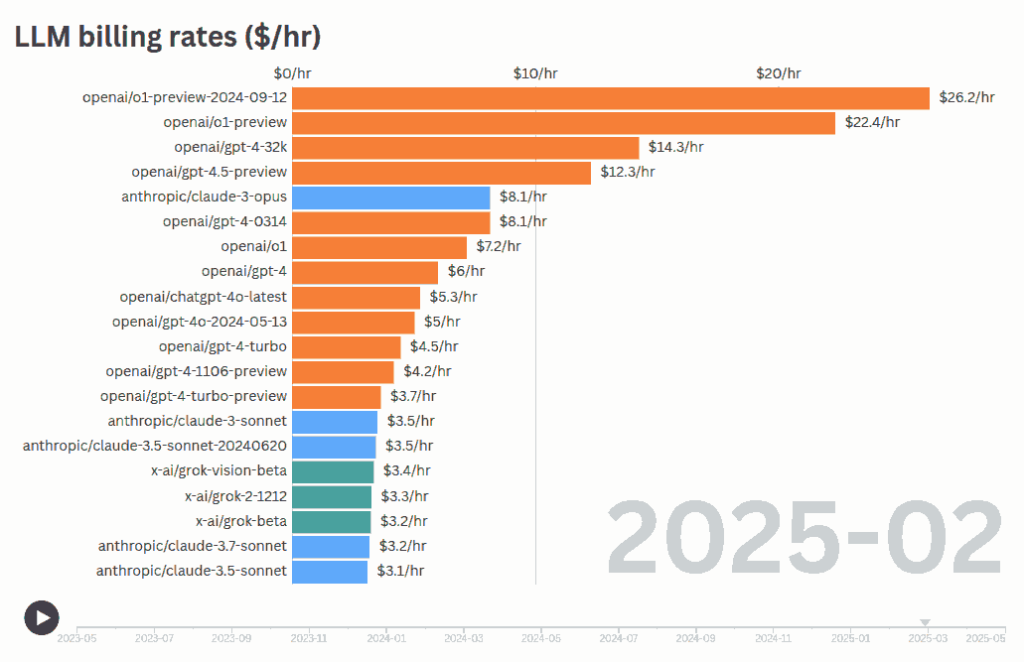
How much does an LLM charge per hour for its services?
If we multiple the Cost Per Output Token with Tokens Per Second, we can get the cost for what an LLM produces in Dollars Per Hour. (We’re ignoring the input cost, but it’s not the main driver of time.)
Over time, different models have been released at different billing rates. Most new powerful models like O3 or Gemini 2.5 Pro cost ~$7 – $11 per hr.
To get a sense of this, let’s look at wage rates across countries and industries:
| Rate ($/hr) | Countries (avg hourly wage) | Models |
|---|---|---|
| 0–2 | Bangladesh ($1.42/hr), Pakistan ($1.65/hr), Vietnam ($0.94/hr) | devstral-small ($0.01/hr), gemini-2.5-flash-preview ($1.50/hr) |
| 2–5 | Brazil ($3.09/hr), Mexico manufacturing ($4.90/hr) | claude-sonnet-4 ($2.23/hr), codex-mini ($2.54/hr) |
| 5–10 | India ($5.03/hr), South Africa avg ($9.38/hr), Poland min wage ($7.35/hr) | o3 ($7.16/hr), claude-opus-4 ($8.67/hr) |
| 10–15 | Germany ($12.93/hr), France ($12.41/hr), UK ($14.43/hr) | gemini-2.5-pro-preview ($11.89/hr), gpt-4.5-preview ($13.10/hr) |
| 15–20 | Spain ($15.87/hr), Italy ($16.80/hr), Japan ($17.98/hr) | No recent models in this range |
Workers in Europe and Japan are already more expensive than the more expensive models, at $12+ per hour. India, Brazil, Mexico etc. are more expensive than most of the average models.
Once a language model’s run-time cost drops below the local minimum wage, the “offshoring” advantage disappears. AI becomes the cheapest employee in every country at once. Countries whose economies depend on being the “cheaper alternative” for labor-intensive work face potential economic disruption.
Paradoxically, workers in countries with strong labor protections, unions, and higher wages (like Germany and France) may paradoxically be safer from AI displacement.
Source code: sanand0/llmpricing
Analysis: ChatGPT
Wage Rates of Nations and LLMs Read More »


