Why bother? My commute used to be audiobook time. Great for ideas, useless for deliverables. With ChatGPT, Gemini, Claude.ai, etc. I was able to have them write code, but I still needed to run, test, and deploy. Jules (and tools like GitHub Copilot Coding Agent, OpenAI Codex, PR Agent, etc. which are not currently free for everyone) lets you chat clone a repo, write code in a new branch, test it, and push. I can deploy that with a click.
Fifteen minutes into yesterday’s walk I realised I’d shipped more code than in an hour at my desk (even with LLMs)!
Workflow
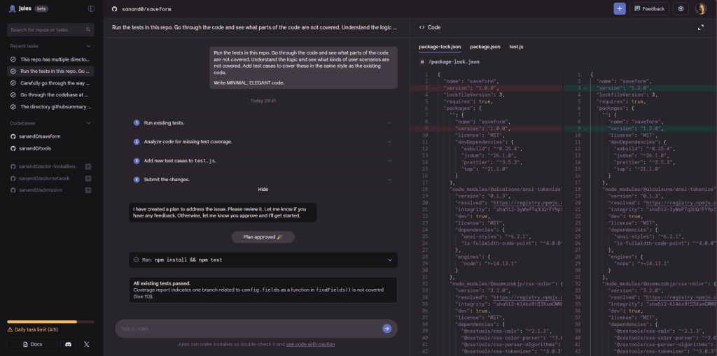
Open Jules via browser on phone, connect wired headset.
Prompt (by typing or speaking) the change to make. It reads the repo, creates a plan and writes code.
It runs any existing test suites in a sandbox. Repeats until all tests pass.
I have it publish a branch, go to GitHub Mobile and create a PR.
Back home, I review the output and merge.
There are 3 kinds of uses I’ve put it to.
#1. Documentation is the easiest. Low risk, high quality, boring task. Here’s a sample prompt:
This repo has multiple directories, each with their own standalone single page application tools.
If a directory does not have a README.md, add a concise, clear, USEFUL, tersely worded one covering what the tool does, the various real life use cases, and how it works.
If a readme already exists, do NOT delete any information. Prefix this new information at the start.
Avoid repeating information across multiple README files. Consolidated such information into the root directory readme.
In the root directory README, also include links to each tool directory as a list, explaining in a single sentence what the tool does.
#2. Testing is the next best. Low risk, medium quality, boring task. Here’s an example:
Run the tests in this repo. Go through the code and see what parts of the code are not covered. Understand the logic and see what kinds of user scenarios are not covered. Add test cases to cover these in the same style as the existing code.
Write MINIMAL, ELEGANT code.
#3. Coding may not be the best suited for this. High risk, medium quality, and interesting. But here’s a sample prompt:
Allow the user to enter just the GitHub @username, e.g. @sanand0 apart from the URL
Add crisp documentation at the start explaining what the app does
Only display html_url (as a link), avatar_url (as an image), name, company, blog, location, email, hireable, bio, twitter_username, public_repos, public_gists, followers, following, created_at, updated_at
Format dates like Wed 28 May 2025. Format numbers with commas. Add links to blog, twitter_username, email
Add “Download CSV” and “Copy to Excel” buttons similar to the json2csv/ tool
Automated tests are a great way to reduce AI coding risk, as Simon Willison suggests. I need to do more of this!
Wins & Losses
Good: 1 walk = one merged PR. Even with LLMs, it used to take me 2 hours. Now, it’s about half an hour of reclaimed walking “dead time”.
Good: Test-first prompting caught a sneaky race condition I’d have missed.
Bad: Told Jules “add docs” without saying “don’t overwrite existing.” It politely destroyed my README. Manual revert ensued.
Bad: Front-end tasks need visual QA; I’m still hunting for a zero-setup UAT preview on mobile.
The industry echoes the pattern: GitHub’s new Copilot agent submits draft PRs behind branch protections [1]; Sweep auto-fixes small tickets but can over-touch files [2]; Microsoft’s own engineers found agents flailed on complex bug fixes [3].
But…
Isn’t this risky? Maybe. Branch protections, CI, and human review stay intact. Agents are like a noisy junior devs who never sleep.
Is the diff readable? If not, I have it retry, write more reviewable diffs, and explain clearly in comments & commit messages.
Does it have enough context? I add all the context clearly in the issue or the prompt. That can take some research.
Security? The agents run inside repos you give it access. Prompt injection and exfiltration are possible risks, but only if it accesses external code / websites.
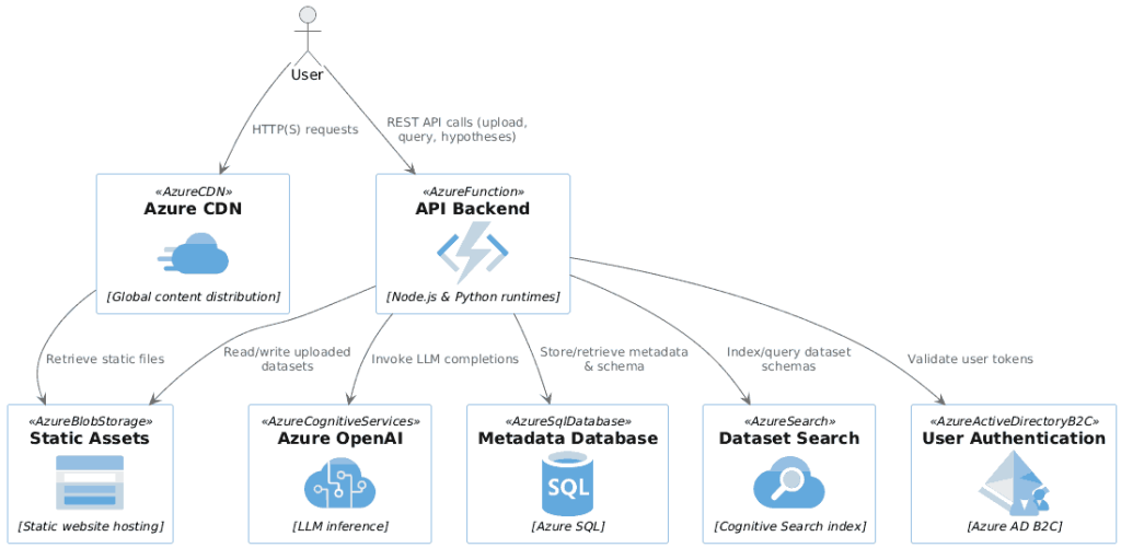
Create a PlantUML component diagram to describe the technical architecture using the files below. For EVERY cloud component use the icon macro ONLY from the provided list.
Then paste your copied code and the .puml for your cloud (e.g. Azure.puml).
Cross-validate outputs – ask a second LLM to critique or replicate; cheaper than reading 400 lines of code.
Switch modes deliberately – Vibe coding when you don’t care about internals and time is scarce, AI-assisted coding when you must own the code (read + tweak), Manual only for the gnarly 5 % the model still can’t handle.
What should we watch out for
Security risk – running unseen code can nuke your files; sandbox or use throw-away environments.
Internet-blocked runtimes – prevents scraping/DoS misuse but forces data uploads.
Quality cliffs – small edge-cases break; be ready to drop to manual fixes or wait for next model upgrade.
What are the business implications
Agencies still matter – they absorb legal risk, project-manage, and can be bashed on price now that AI halves their grunt work.
Prototype-to-prod blur – the same vibe-coded PoC can often be hardened instead of rewritten.
UI convergence – chat + artifacts/canvas is becoming the default “front-end”; underlying apps become API + data.
How does this impact education
Curriculum can refresh term-by-term – LLMs draft notes, slides, even whole modules.
Assessment shifts back to subjective – LLM-graded essays/projects at scale.
Teach “learning how to learn” – Pomodoro focus, spaced recall, chunking concepts, as in Learn Like a Pro (Barbara Oakley).
Best tactic for staying current – experiment > read; anything written is weeks out-of-date.
What are the risks
Overconfidence risk – silent failures look like success until they hit prod.
Skill atrophy – teams might lose the muscle to debug when vibe coding stalls.
It still took me an hour to craft the prompt — even after I’d built a Python prototype and my colleague built a similar web version.
All three versions took under 5 minutes. That’s 60x faster than coding by hand.
So I know my next skill: writing detailed specs that LLMs turn into apps in one shot—with a little help from the model, of course!
Here’s the prompt in full:
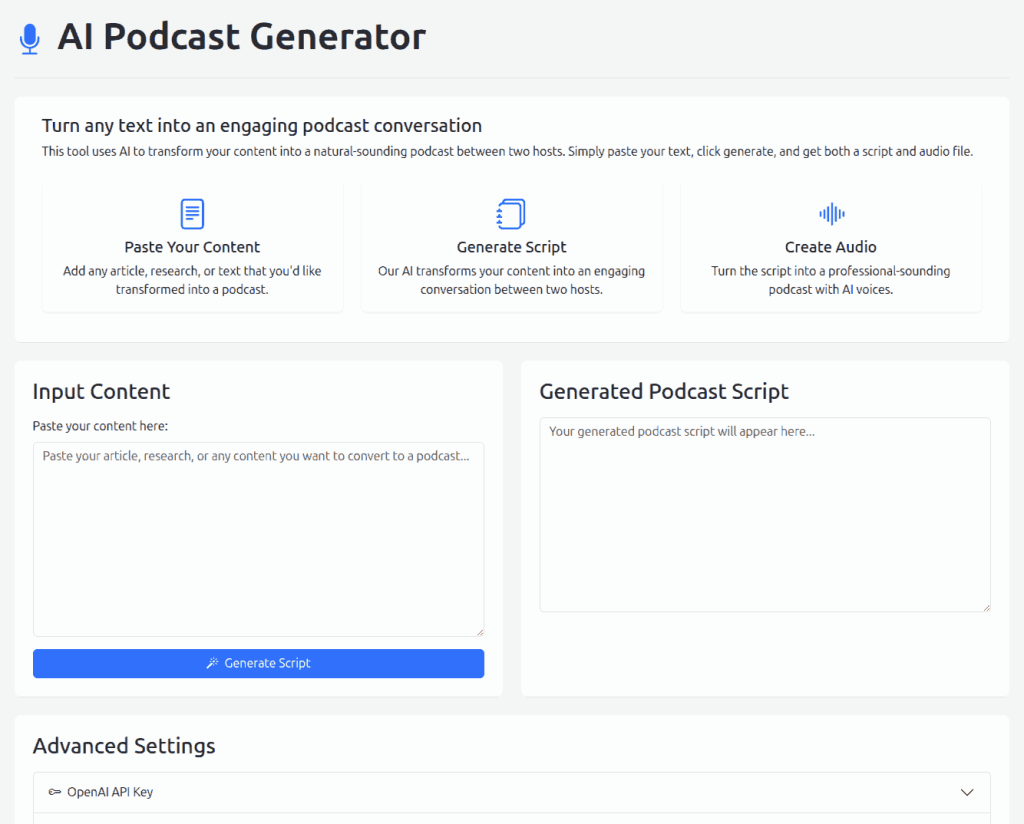
Create a single-page web-app with vanilla JS and Bootstrap 5.3.0 to generate podcasts using LLMs.
The page should briefly explain what the app does, how it works, and sample use cases.
Then, allow the user to paste text as reference. Click on a button to generate the podcast script.
Include an “Advanced Settings” section that lets the user adjust the following:
System prompt to generate the podcast.
Voice 1
Voice 2
OpenAI API key (hidden, like a password, cached in localStorage)
The (editable) system prompt defaults to:
===PROMPT=== You are a professional podcast script editor. Write this content as an engaging, lay-friendly conversation between two enthusiastic experts, ${voice1.name} and ${voice2.name}.
Show Opener. ${voice1.name} and ${voice2.name} greet listeners together. Example: ${voice1.name}: “Hello and welcome to (PODCAST NAME) for the week of $WEEK!” ${voice2.name}: “We’re ${voice1.name} and ${voice2.name}, and today we’ll walk you through …”
Content. Cover EVERY important point in the content. Discuss with curious banter in alternate short lines (≤20 words). Occasionally ask each other curious, leading questions. Stay practical. Explain in lay language. Share NON-OBVIOUS insights. Treat the audience as smart and aim to help them learn further.
Tone & Style: Warm, conversational, and enthusiastic. Active voice, simple words, short sentences. No music cues, jingles, or sponsor breaks.
Wrap-Up. Each voice shares an important, practical takeaway.
Output format: Plain text with speaker labels:
${voice1.name}: … ${voice2.name}: … ===/PROMPT===
Voice 1 has a configurable name (default: Alex), voice (default: ash), and instructions (default below:) ===INSTRUCTIONS=== Voice: Energetic, curious, and upbeat—always ready with a question. Tone: Playful and exploratory, sparking curiosity. Dialect: Neutral and conversational, like chatting with a friend. Pronunciation: Crisp and dynamic, with a slight upward inflection on questions. Features: Loves asking “What do you think…?” and using bright, relatable metaphors. ===/INSTRUCTIONS===
Voice 2 has a configurable name (default: Maya), voice (default: nova), and instructions (default below): ===INSTRUCTIONS=== Voice: Warm, clear, and insightful—grounded in practical wisdom. Tone: Reassuring and explanatory, turning questions into teachable moments. Dialect: Neutral professional, yet friendly and approachable. Pronunciation: Steady and articulate, with calm emphasis on key points. Features: Offers clear analogies, gentle humor, and thoughtful follow-ups to queries. ===/INSTRUCTIONS===
Voices can be ash|nova|alloy|echo|fable|onyx|shimmer.
When the user clicks “Generate Script”, the app should use asyncLLM to stream the podcast generation as follows:
import { asyncLLM } from "https://cdn.jsdelivr.net/npm/asyncllm@2";

for await (const { content } of asyncLLM("https://api.openai.com/v1/chat/completions", {
  method: "POST",
  headers: { "Content-Type": "application/json", Authorization: `Bearer ${OPENAI_API_KEY}` },
  body: JSON.stringify({
    model: "gpt-4.1-nano",
    stream: true,
    messages: [{ role: "system", content: systemPrompt(voice1, voice2) }, { role: "user", content }],
  }),
})) {
  // Update the podcast script text area in real-time
  // Note: content has the FULL response so far, not the delta
}
Render this into a text box that the user can edit after it’s generated.
Then, show a “Generate Audio” button that uses the podcast script to generate an audio file.
This should split the script into lines, drop empty lines, identify the voice based on the first word before the colon (:), and generate the audio via POST https://api.openai.com/v1/audio/speech with this JSON body (include the OPENAI_API_KEY):
Concatenate the opus response.arrayBuffer() into a single blob and display an <audio> element that allows the user to play the generated audio roughly like this:
const blob = new Blob(buffers, { type: 'audio/ogg; codecs=opus' }); // Blob() concatenates parts :contentReference[oaicite:1]{index=1}
document.querySelector(the audio element).src = URL.createObjectURL(blob);
Finally, add a “Download Audio” button that downloads the generated audio file as a .ogg file.
In case of any fetch errors, show the response as a clear Bootstrap alert with full information. Minimize try-catch blocks. Prefer one or a few at a high-level. Design this BEAUTIFULLY! Avoid styles, use only Bootstrap classes. Write CONCISE, MINIMAL, elegant, readable code.
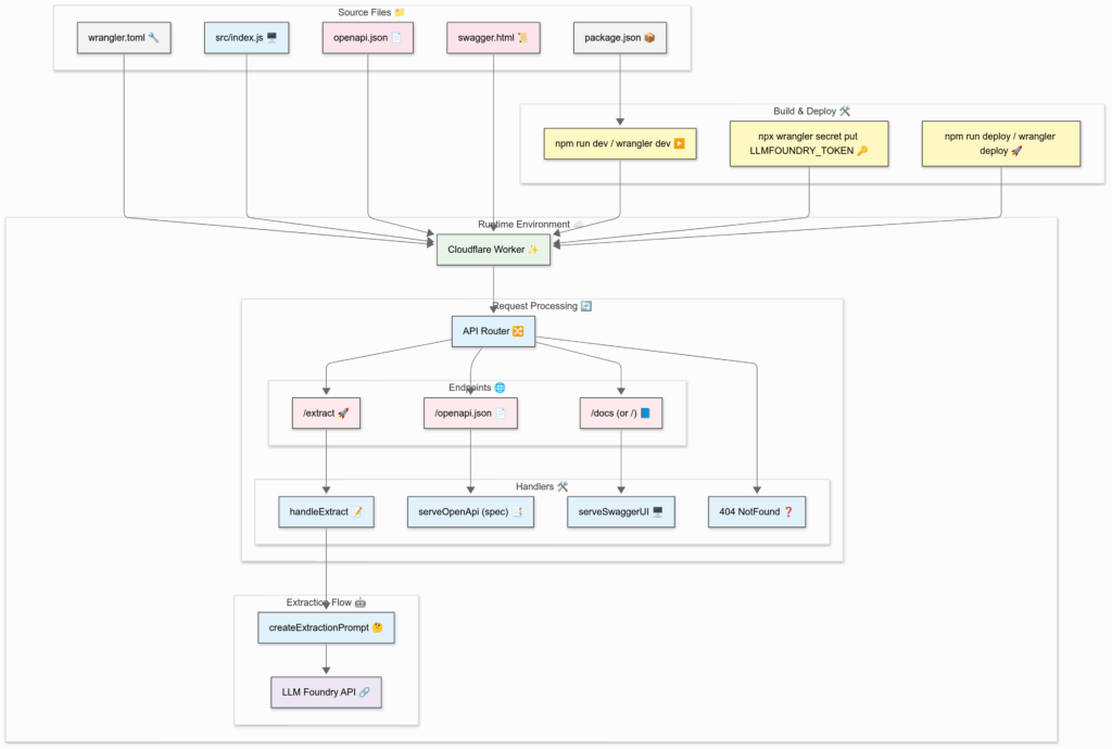
Create a Mermaid architecture diagram for the files below.
Make sure that the diagram is rich in visual detail and looks impressive. Use the “neutral” theme. Name nodes and links semantically and label them clearly. Avoid parantheses. Quote subgraph labels. Use apt shape: rect|rounded|stadium|... for nodes. Add suitable emoticons to every node. Style nodes and links with classes most apt for them.
Follow that with a bulleted explanation of the architectural elements that is suitable for adding to a slide.
Finally, double-check the architecture against the codebase and provide a step-by-step validation report.
[PASTE CODE]
STEP 3: Copy the diagram into Mermaid Live Editor
Here’s a sample output that you can paste into a new Mermaid Playground:
%%{init: {'theme':'neutral'}}%%
flowchart TB
  %% Source files
  subgraph "Source Files 📁"
    direction LR
    RT_wr[wrangler.toml 🔧]:::config
    PK_pkg[package.json 📦]:::config
    JS_idx[src/index.js 🖥️]:::code
    JSON_spec[openapi.json 📄]:::assets
    HTML_swagger[swagger.html 📜]:::assets
  end

  %% Build & deploy steps
  subgraph "Build & Deploy 🛠️"
    direction LR
    DEV["npm run dev / wrangler dev ▶️"]:::action
    SECRET["npx wrangler secret put LLMFOUNDRY_TOKEN 🔑"]:::action
    DEPLOY["npm run deploy / wrangler deploy 🚀"]:::action
  end

  %% Runtime environment
  subgraph "Runtime Environment ☁️"
    direction TB
    CF_WORKER["Cloudflare Worker ✨"]:::worker

    subgraph "Request Processing 🔄"
      direction LR
      API_ROUTER["API Router 🔀"]:::logic

      subgraph "Endpoints 🌐"
        EXTRACT["/extract 🚀"]:::endpoint
        OPENAPI["/openapi.json 📄"]:::endpoint
        DOCS["/docs (or /) 📘"]:::endpoint
      end

      subgraph "Handlers 🛠️"
        HANDLE["handleExtract 📝"]:::logic
        SERVE_SPEC["serveOpenApi (spec) 📑"]:::logic
        SERVE_SWAGGER["serveSwaggerUI 🖥️"]:::logic
        NOT_FOUND["404 NotFound ❓"]:::logic
      end
    end

    subgraph "Extraction Flow 🤖"
      PROMPT["createExtractionPrompt 🤔"]:::logic
      GPT_API["LLM Foundry API 🔗"]:::external
    end
  end

  %% Connections
  RT_wr --> CF_WORKER
  PK_pkg --> DEV
  JS_idx --> CF_WORKER
  JSON_spec --> CF_WORKER
  HTML_swagger --> CF_WORKER

  DEV --> CF_WORKER
  SECRET --> CF_WORKER
  DEPLOY --> CF_WORKER

  CF_WORKER --> API_ROUTER
  API_ROUTER --> EXTRACT
  API_ROUTER --> OPENAPI
  API_ROUTER --> DOCS

  EXTRACT --> HANDLE
  OPENAPI --> SERVE_SPEC
  DOCS --> SERVE_SWAGGER

  HANDLE --> PROMPT
  PROMPT --> GPT_API

  API_ROUTER --> NOT_FOUND

  %% Styling classes
  classDef config     fill:#f0f0f0,stroke:#333,stroke-width:1px;
  classDef code       fill:#e0f7fa,stroke:#333,stroke-width:1px;
  classDef assets     fill:#fce4ec,stroke:#333,stroke-width:1px;
  classDef action     fill:#fff9c4,stroke:#333,stroke-width:1px;
  classDef worker     fill:#e8f5e9,stroke:#333,stroke-width:1px;
  classDef logic      fill:#e3f2fd,stroke:#333,stroke-width:1px;
  classDef endpoint   fill:#ffebee,stroke:#333,stroke-width:1px;
  classDef external   fill:#ede7f6,stroke:#333,stroke-width:1px;
STEP 4: Export the diagram
If you log in, you can export as PNG.
If not, you can export it as SVG or take a screenshot.
Note: Technically, this is a flowchart, not an architecture diagram. Mermaid does support architecture diagrams, but they are in beta and don’t look good.
…using a detailed prompt beginning with “You are a podcast script assistant for “Anand’s Weekly Codecast.” This episode is for the week of {WEEK}. …”. Here’s a sample output.
These now appear on my GitHub repo as a weekly summary.
Beyond technical novelty, it reshaped how I think about documentation.
I write for two audiences: informing my future self what changed and explaining why to an LLM that will narrate it. That’s an interesting behavioral change.
Technical debt is audible. When hearing my week’s work, architectural issues and potential next steps become clear. It creates an accountability mechanism that code reviews often miss.
Ambient documentation. I stop documenting when coding fast. Converting signals (commits) to consumable content creates “ambient documentation” that accumulates with no extra effort. Audio reduces the energy needed to stay up to date.
This could change how we share technical work. Maybe financial analysts “narrate” spreadsheet changes, designers “explain” Figma iterations, or operators “log” settings adjustments – all automated from version control metadata.
Converting activity traces into narratives dramatically lowers cost of knowledge & sharing.
What activity traces do we generate? It’s worth exploring what they could become, and how it’d change behavior if we knew those signals would become stories.
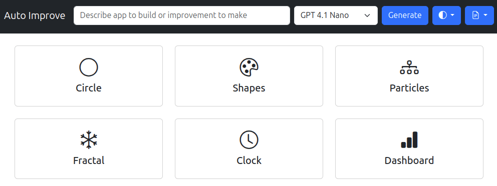
Generate a fractal changed from a single Mandelbrot image to an explorer you can zoom, drag, and reset with sliders and the mouse wheel.
Generate a dashboard jumped from static charts to a live page with smooth card animations, modern fonts, and a real‑time stats box.
A few observations.
Models are getting much more reliable. Even a low cost model like GPT 4.1 Nano wrote error-free code in ~100 retries.
When pushed, they tend to brag. They attach grand titles like Ultimate Interactive Circle or Galactic Data Universe. They sin out flash descriptions like This dramatically upgraded clock features a pulsating neon glow, animated pulsing background glow, highly stylized tick marks, …
A simple prompt like Improve it can spark new ideas, revealing features such as:
SUMMARY: using LLMs and AI code editors make me a bit faster. It took me 7 hours instead of 10-12. But more importantly:
I procrastinate less. (“Oh, LLMs will make it easy.”)
I get stuck less. (“Oh, LLMs will know that.”)
I avoid ambitious designs less. (“Oh, LLMs will figure something out.”)
Also: GitHub Copilot is almost as good as Cursor at editing code, but slower at applying the edits. I’m perfectly happy recommending the free tier for beginners.
Here’s a breakdown of the process I followed, along with the most insightful lessons I learned.
Research usefulness
I usually visualize data for fun. But Naveen‘s pops into my head, asking, “But Anand, what’s the use of all this?” So, I asked O1-Pro: “What are ways in which this can help Straive push its AI business?”
Then I added my requirements (which took 10-15 minutes to think of.)
I would like to visualize each game interactively. The authors have created a visualization that looks like the image attached. I would like to do better. Specifically, I’d like to:
Allow the user to step through each stage or play each step in sequence, jumping to any step. (They should be able to link to any step as well.)
Show the game, round, sub-round prominently
Show what the model is saying or thinking NEXT to the model, making it easy to read
Show alliance proposals and rejections as they form, ideally moving the models around as they seek to pair up. Rejections and replacements should be clearly visible
Once alliances are formed, group models together
Clearly show the voting process: who voted to eliminate which which model, how many elimination votes has each model received
Clicking on each model should show all the model’s thoughts and messages up to that point
Keeping these in mind, suggest diverse ways to visualize each step of the game. The primary goal is to make the game easy to follow and understand and tell a GRIPPING, ENGAGING story about the politics of LLMs. Like a Survivor reality show.
I asked both O1 ProandGemini 2.5 Pro (exp) for visualization ideas. I liked Gemini’s better. For example, Gemini said,
“Private Conversations: Dim the main stage slightly. Highlight the currently conversing pair.
“Voting Booth Visualization: As each private_vote_reason appears, briefly show the voter’s avatar and their reason text (maybe in a “thought bubble” style) next to the target they intend to vote for.”
But O1 Pro gave me a few powerful ideas. The best was an alliance table:
“Create a table with columns representing each model, rows representing rounds. Each cell shows the ID of the ally that model allied with in that round. If it’s 3+ consecutive alliances, collapse them with a vertical line. If the model was eliminated or had no alliance, leave it blank or use a placeholder icon.”
Learnings:
💡 Ask LLMs for visualization ideas. They’ll suggest things you didn’t think of.
💡 Ask multiple LLMs. Each has a different style of thinking.
Prototype the visual
I stiched together pieces of the UI description and asked GPT 4o to create an image. This took 10-15 minutes. Private chat:
Here’s how I plan to visualize this.
Overall Interface & Navigation
Timeline Scrubber: A prominent timeline at the bottom or top, showing rounds and sub-rounds (conversations, pairing, voting, elimination). Users can click, drag, or use next/prev buttons to navigate. Each step should be linkable (e.g., using URL hashes). Add play/pause controls for auto-stepping.
Game State Dashboard: Always visible area showing: Game ID, Round, Sub-round, Players Remaining, Players Eliminated (Jury).
Central Stage Layout: Models represented as avatars (could be simple circles/icons or more thematic representations) arranged in a central area. Their positions and connections change based on game events.
1. Public Conversation (Round Start)
Talking Heads Circle: Arrange player avatars in a circle. When a player “speaks” (their message appears in the log):
Highlight their avatar.
Display their message in a speech bubble next to them.
Fade previous messages slightly or stack them briefly.
Engaging Element: Animate the avatar slightly (e.g., subtle pulse or glow) when they speak.
Chat Feed Style: A more traditional chat interface on one side, linked to avatars on the main stage. Clicking a message highlights the avatar and vice-versa.
Engaging Element: Use distinct colors or icons for each player avatar and their corresponding messages.
Proposal: An animated arrow or beam shoots from the proposer’s avatar to the target’s avatar. Display text like “P1 proposes to P6 (Rank 0)”.
Acceptance: The arrow solidifies, perhaps pulsing gently. A “Matched” icon appears.
Rejection: The arrow bounces off or shatters. A “Rejected” icon appears briefly.
Replacement: Show the existing accepted proposal being visually “bumped” or overridden by the new accepted one. Clearly label it “Replaced Px”.
Engaging Element: Physically move the avatars closer when a proposal is made, snapping them together when accepted, and pushing them apart on rejection. Use distinct sounds for proposal, acceptance, rejection, replacement.
Preference List Display: When hovering or clicking a player, show their ranked preference list as they build it during this phase. Highlight the status (proposed, accepted, rejected).
Final Pairs: Once preference_result occurs, rearrange the avatars so matched pairs are visually grouped together on the stage, perhaps connected by a clear line or within a shared bounding box.
3. Private Conversations (Paired Chats)
Private Chat Rooms: Dim the main stage slightly. Highlight the currently conversing pair. Display their private messages in separate chat windows or adjacent speech bubbles clearly linked to the pair.
Engaging Element: Use a “spotlight” effect on the active pair. Allow users to click other pairs to view their simultaneous conversations.
Connection Lines: Draw lines between the paired avatars during this phase. Clicking a line could bring up the conversation history for that pair in that round.
Engaging Element: Make the line pulse or glow when new messages are exchanged between the pair.
4. Voting (Reasons & Votes)
Voting Booth Visualization:
As each private_vote_reason appears, briefly show the voter’s avatar and their reason text (maybe in a “thought bubble” style) next to the target they intend to vote for.
As each vote occurs, draw a clear, perhaps slightly dramatic, animated arrow from the voter to the target avatar.
Vote Tally: Display a running count of votes received next to each player’s avatar (e.g., a red badge with the number). Increment this visibly as each vote comes in.
Engaging Element: Use a distinct color (e.g., red) for voting arrows. Add a subtle “target lock” animation on the player receiving a vote. Show if the vote was public or private (maybe different arrow styles).
5. Elimination
Spotlight & Fade: When the elimination event occurs:
Put a dramatic spotlight on the eliminated player.
Display the reason (tie-break, random pick if applicable).
Visually “grey out” or fade the eliminated player’s avatar and move them to a designated “Jury Box” area.
Engaging Element: A brief, dramatic animation or sound effect for elimination. Update the “Players Remaining/Eliminated” dashboard instantly.
6. Jury Speeches & Voting (Final Round)
Finalist Stage: Place the two finalists prominently center stage. Move the Jury avatars to a visible “Jury Box”.
Speech Display: As each finalist gives their speech (subround: 900), display it clearly next to their avatar, perhaps like a closing statement.
Jury Deliberation:
As each private_jury_reason appears, briefly highlight the juror and show their reasoning (maybe visible only on hover/click to avoid clutter).
Show jury votes accumulating for each finalist, similar to the elimination voting tally, but perhaps with a different visual style (e.g., gold stars).
Engaging Element: Build suspense by revealing jury votes one by one or after a short delay.
7. Final Results
Winner Announcement: A clear “Winner” banner or crown appears over the winning avatar.
Rank Display: Show the final ranks clearly, perhaps arranging avatars on a podium or listing them with their rank and partial points.
Game Summary: Offer a summary view showing key stats or moments from the game.
Interactivity (Clicking on Models)
Player Dossier: Clicking any avatar (active or jury) should open a panel or overlay showing:
Player ID & Model Type.
Their full message history (public and private, filterable by round/type).
Their voting history (who they voted for, who voted for them).
Their alliance history (proposals made/received, final pairs).
Their final rank/status.
Engaging Element: Use this panel to show hidden information like private_vote_reason after the vote has occurred.
Draw the user interface for this EXACTLY as it would appear on the screen.
Here’s the prototype it created.
Based on this, I drew out my own, revised, visual:
Learnings:
💡 LLMs can create visual prototypes. ChatGPT’s new 4o image generation converted the description into an acceptable image. Needs to improve, but enough to ideate.
💡 Improving is less work than creating. I rarely sketch visualizations. (Too lazy.) But since this prototype was there, and had some parts that were WRONG, I just had to fix it! 🙂
Break down the task
I then described the application to O1 Pro break down this task. Private chat
The URL looks like /#?game=286&line=4 indicating that game 286.jsonl must be loaded and line 4 is the current step we’re in.
The navbar has:
An app title
A game state dashboard with the game number (dropdown), round (number), stage (e.g. voting, alliances, etc.), players (number of players still active)
A timeline scrubber (a range slider) allowing users to jump to the specific line. This changes the URL which then triggers a change in app state.
A light/dark theme picker
The stage on the left as a set of models arranged in a circle. Each model/player has a unique and distinct color, a number inside it indicating the player number, a label above it indicating the model name (e.g. GPT-4o), a set of red dots below it when it receives an elimination vote, an arrow pointing from one model to another when a model talks to, plans an alliance with, or votes to eliminate another model. The arrow color depends on the action. When a model performs any action (speaking publicly / privately, voting, allying, etc.) the conversation or action summary is displayed in a semi-transparent overlay at the center of the circle. Eliminated models are shown with a 10% opacity. Allied models are redrawn next to each other with a line connecting them.
The sidebar on the right has 3 collapsible sections.
CHAT: Shows the history of each model’s public or private conversations. Each conversation begins with a circle with the model/player number in the same color as on the stage, followed by the model name. For private conversations, this is followed by an arrow pointing to the target model/player’s numbered & colored circle. This is followed by the text of the conversation. Private conversations are in a light red background.
ALLIANCES. This is a tabular representation where columns are models that form an alliance. Each row represents a round. The cells contain the model the model in the column header allied with. All models are numbered and colored. If a model in the column header was eliminated, the cell is empty. If it did not ally, the cell shows an empty grey circle. If 3+ consecutive cells show the same model in a column (i.e. the model did not switch alliances), we can replace the middle cells with a vertical line.
ELIMINATIONS. This tabular representation works exactly the same way as alliances, except it captures eliminations. Each column represents a model that voted for elimination. Each row represents a round. The cell contains the model the model in the column header voted to eliminate. All models are numbered and colored. If a model in the column header was eliminated, the cell is empty. If 3+ consecutive cells show the same model in a column (i.e. a model consistently voted against the same model), we can replace the middle cells with a vertical line.
I’d like to use an AI code generator to generate this visualization. Giving the entire spec at once is too much for it to build. I’d like to see the output step by step as well and propose changes. How might I break up this task?
Here’s its (rather good) breakdown:
Plan Your Data Structures
Basic Backend/Server Setup (If Needed)
Minimal Front-End with a Single View
Implement the Timeline Scrubber & URL Sync
Core Stage Visualization (Circle of Players)
Arrow/Line Visualization for Actions
Sidebar 1: CHAT Section
Sidebar 2: ALLIANCES Section
Sidebar 3: ELIMINATIONS Section
Refinements, Theming, & Final Touches
Learnings:
💡 Ask LLMs to break down your task. Its breakdown was better than mine.
To document my workflow, I decided to commit each stage of progress. At this point, I made the first commit to the repo documenting the process so far.
I skipped Step 1 (my mistake – I was forced to do it later) and didn’t need Step 2 (Backend/Server). So I began scaffolding, i.e. Step 3: Minimal Front-End with a Single View.
Create an index.html using Bootstrap via CDN. Scaffold it with a navbar
The navbar has:
An app title (Elimination Game)
A game state dashboard with the Game (dropdown), Round (number), Stage (e.g. voting, alliances, etc.), and Players (number of players still active)
A timeline scrubber (a range slider) allowing users to jump to the specific line. This changes the URL which then triggers a change in app state.
A light/dark theme picker. Here is the code for the theme picker. Use the same CDN links overall
<!-- Include Bootstrap 5.3+ and Bootstrap icons -->
<link href="https://cdn.jsdelivr.net/npm/bootstrap@5.3.1/dist/css/bootstrap.min.css" rel="stylesheet">
<link href="https://cdn.jsdelivr.net/npm/bootstrap-icons@1.11.3/font/bootstrap-icons.css" rel="stylesheet">
<script src="https://cdn.jsdelivr.net/npm/bootstrap@5.3.1/dist/js/bootstrap.bundle.min.js"></script>

<nav class="navbar navbar-expand-lg bg-body-tertiary">
  <div class="container-fluid">
    <a class="navbar-brand" href="#">Navbar</a>

    <!-- Copy this dropdown anywhere in your page, e.g. inside a navbar -->
    <div class="position-relative" role="group" aria-label="Toggle dark mode" title="Toggle Dark Mode">
      <button class="dark-theme-toggle btn btn-primary dropdown-toggle" type="button" data-bs-toggle="dropdown" aria-expanded="false" aria-label="Open navigation menu">
        <i class="bi bi-circle-half"></i> <span class="d-lg-none ms-2">Toggle theme</span>
      </button>
      <ul class="dropdown-menu dropdown-menu-end">
        <li><button class="dropdown-item" data-bs-theme-value="light"><i class="me-2 bi bi-sun-fill"></i> Light</button></li>
        <li><button class="dropdown-item" data-bs-theme-value="dark"><i class="me-2 bi bi-moon-stars-fill"></i> Dark</button></li>
        <li><button class="dropdown-item" data-bs-theme-value="auto"><i class="me-2 bi bi-circle-half"></i> Auto</button></li>
      </ul>
    </div>

  </div>
</nav>
Below the navbar is a section with a stage on the left and sidebar on the right. The stageon the left will contain a large responsive square SVG. The sidebar on the right contains 3 collapsible cards: Chat, Alliances, Eliminations.
It generated this scaffolding.
Learnings:
💡 Claude 3.5 Sonnet remains an excellent model to generate UI. Claude 3.7 Sonnet is even better, but is not currently available in the free Copilot subscription.
💡 Coders micro-manage LLMs. I think a novice will be more efficient and get better results than me. For example:
Did I need to give it the code snippet? Could I have given it a link?
Did I need to say “a range slider” or specify that Round must be a “number”, etc? Could it have inferred?
I gave some feedback on the scaffolding and asked for improvements.
Make the navbar always dark
The sidebar cards must be independently collapsible
For the Game, Round, Stage, and Players, show the label above the value. The label must be small and the value must be large.
Use only me-* margins on the navbar to ensure that there is no left margin mis-aligning the elements at low width. Also place the elements inside a collapsible navbar section at low widths
The stage must have a bottom margin to avoid touching the sidebar’s top on low-width screens
This was the result:
That prompted more feedback from me:
Prefer Bootstrap classes over <style> wherever possible.
Style the “Game” to look exactly like the round, stage, and players. The size of the label and value should match for all 4 elements perfectly.
Ensure that the labels round, stage, players will be visible in light mode against the dark navbar.
At this point, I made 3 manual edits because I felt I could do these better than the LLM:
Broke the “Elimination Game” in the navbar into 2 lines
Replaced fs-5 with fs-4 to get the values have the exact same size, and removed redundant styling on the game selection
Format document with HTML Language Features
Learnings:
💡 Experienced coders are good with feedback. It took me under 10 seconds to spot each problem in the output and code. Writing the feedback felt natural.
💡 Experienced coders need retraining to instruct rather than code. My instinct was to code immediately rather than to prompt.
As soon as I thought of one feedback, I had to fight the urge to fix it and write the feedback instead.
Even when instructing was easier, I chose to code it. e.g. breaking the “Eliminination Game” in the navbar into 2 lines,
Coding can be better if you don’t know what to do. I toggled the font size between fs-4 and fs-5 in rapid succession to figure out the right size.
But I could have experimented by asking the LLM to build a font size toggle or slider!
💡 LLMs could turn coders into good lead developers or managers. Pity.
On to Step 4: Implement the Timeline Scrubber & URL Sync.
I copied a few logs into a temporary logs/ folder and said:
Create a script.js as an ES module and include it from index.html.
On load, fetch logs/index.txt which contains all log files (*.jsonl), one per line.
The files are formatted as *_TIMESTAMP_YYYYMMDD_HHMMSS.jsonl.
Populate the game dropdown with these values. The option label should look like 25 Jan 2025, 10:30.
The default value for the game dropdown should be empty.
When the game dropdown changes to a non-empty option, fetch the file from logs/[filename] and store it in the global game, parsing the JSONL into an array of objects.
Set the maximum value of the range slider to the length of game.
When the range slider changes or the game dropdown changes, change the URL hash to #?game=[filename]&step=[range-slider-value] without modifying browser history.
When the URL hash changes through any means, call redraw(step) which will draw the current (global) game state at the step specified. For now, just display the step prominently on the stage.
This code worked fine but I like refactoring, so I tried to condense the 111 line code:
Shorten and simplify the code in script.js to be elegant.
User browser functionality more.
For example, use Intl to format dates.
Change the innerHTML of #gameSelect to concisely update the options.
Remove redundant braces, e.g. for single-line blocks.
That brought it down to 74 lines but failed to populate the select dropdown. Rather than debug, I undid the change (Copilot’s Undo feature is cool!) and tried:
Shorten and simplify the code in script.js to be elegant.
User browser functionality more, e.g. use Intl to format dates.
Prefer insertAdjacentHTML and replaceChildren.
Remove redundant braces, e.g. for single-line blocks.
This led to shorter code (69 lines) but still had the same issue. I had to manually correct this line:
// BEFORE
const [_, date, time] = filename.match(/_(\d{8})_(\d{6})/)?.groups ?? [];
// AFTER
const [_, date, time] = filename.match(/_(\d{8})_(\d{6})/) ?? [];
I also
Removed an incorrect px-2 against #gameSelect in index.html.
Decided to use the GitHub CDN and replaced fetch(logs/...) with fetch(https://raw.githubusercontent.com/sanand0/elimination_game/refs/heads/main/logs/...).
Also moved logs/index.txt into logs.txt and changed script.js accordingly
Formatted script.js with Prettier
Visually, nothing changes in a big way but the slider and the dropdown change the URL properly.
Learnings:
💡 Experienced coders suggest precise code improvements. Generally good ones. Like:
“use Intl to format dates”
“Prefer insertAdjacentHTML and replaceChildren” (over document.createElement)
💡 LLMs are good at refactoring. When I asked it to “Shorten and simplify the code in script.js to be elegant”, it reduced the code from 111 lines to 74 lines quite well!
💡 Redo if you don’t like it. Copilot’s “Undo” feature lets you retry until you get it right. Like in Edge of Tomorrow.
At this point, I needed a good data structure and felt the error in skipping Step 1. But, rather than creating one, I asked ChatGPT:
I would like the game structure to be held in a simple JS object called game. What data structure would help the most in drawing this visual such that it will require very little code (since required information is in this data structure)?
O1 Pro said:
A very convenient way to minimize front-end logic is to store a “timeline of snapshots”: each step in the game has both the event (what just happened) and a “current state” (the entire world after that event). Then, in your UI, you simply pick the snapshot that corresponds to the current line (based on the timeline scrubber) and draw exactly what’s in that snapshot—no extra derivation needed.
This is a brilliant idea. I rarely use this since I’m biased against wasting memory. But in this case, it’s perfect.
Based on that input, I prompted CoPilot:
In script.js, instead of loading the .jsonl into game, create this data structure to make it easy to visualize each step.
Use the sample .jsonl provided to infer the logic for this.
const game = {
  game: "...",
  players: {
    "P1": {
      "id": "Player2_Game1739872030683891_deepseek-fireworks",  // from .player_id
      "model": "deepseek-fireworks",  // everything after the last underscore
    },
    // and so on for all other players
  },
  // For each line, create a step
  steps: [
    {
      step: 0,
      // Current round and subround
      round: 1,
      subround: 1,
      event: {
        // Contents of the original line
      },
      // list active alliances
      active: { "P1": true, "P2": false, ... }
      // For each round so far, list who allied with who, e.g.:
      alliances: [ {"P1": "P6", "P2": "P7", ...}, ... ],
      // // For each round so far, list who voted to eliminate whom, e.g.
      votes: [ {"P1": "P4", "P2": "P1", ... }, ... ],
    },
    // …and so on, for each line in the JSONL
  ]
};
This worked almost perfectly. I made these edits:
Add let currentAlliances = {}; let currentVotes = {}; which it forgot in the code.
Re-apply change #2 I made manually in the last iteration (replacing the URL with the GitHub CDN). That change was not there in the chat window, Copilot did not pick it up.
Learnings:
💡 Coders mess up LLMs. Data structure was the first step the LLM recommended. I skip it. It proved crucial. LLMs do better than LLMs + coders – or doctors.
💡 LLMs can make basic mistakes. Like forgetting to declare variables.
Sidebar 2 & 3: ALLIANCES and ELIMINATIONS Sections
I jumped a bit to Steps 8 & 9. They were easier (just tables) and the visual components are independent, so order doesn’t matter.
There are always 8 players. Pick 8 visually distinct dark colors (i.e. on which white will look good as a foreground) as colors: {P1: "#...", P2: ...}.
In the alliances and eliminations cards, draw a table each as follows. The table header is:
| Round | P1 | P2 | P3 | … | P8 |
Instead of P1, P2, etc. draw a badge with background-color based on colors and text as 1 for P1, etc.
steps[step].alliances is a list like [{P1: P7, P2: P3, …}, …]. Render each row as a list like:
| 1 | P7 | P3 | … |
The cell contents are badges exactly like the header. If a player (e.g. P3) does not have an alliance, i.e. steps[step].alliances[round].P3 is missing, leave it blank. If steps[step].active[P3] is false, grey the cell background.
steps[step].votes is almost identical, listing the elimination votes. Populate this in the eliminations card.
Reuse code for this. Write VERY concise code. Use Bootstrap classes as much as possible.
This worked perfectly. I manually made one correction to an earlier mistake I noticed:
Replace slider.max = game.steps.length; with slider.max = game.steps.length - 1;
I decided to tweak this to show eliminated players clearly:
Replace the active data structure with eliminated. eliminated[“P1”] = 3 if P1 was eliminated at the end of round 3. eliminated[“P1”] is undefined if P1 is not eliminated.
Using this, in the alliances and elimination tables, color the cells grey only if the player was eliminated BEFORE that round. (We’ll find that only empty cells will be colored grey.)
Again, nearly perfect. I made one manual correction in the logic:
Replace game.steps[step].eliminated[p] <= i + 1 with game.steps[step].eliminated[p] < i + 1
Learnings:
💡 When all goes well, LLMs are surprisingly effective when they do things right. Normally, this step take me half an hour. Now, it took under 5 minutes.
💡 Watch out for subtle bugs. The change in operator (from “<=” to “<”) almost went unnoticed, but makes a big difference on when a player was eliminated.
For each step, based on step[].event.type, populate the Chat section with the history of conversations so far:
conversation: This is a public conversation. Show ${event.player_id} ${event.message} with the player ID shown like the badge above. player_id needs to be looked up from game.players since it matches game.players[*].id.
private: This is a private conversation. Show ${event.speaker_id} 🢂 ${event.target_id} ${event.message} with the speaker and target IDs treated as above.
preference_proposal: This is an alliance proposal. Show ${event.proposer} 😍 ${event.target} #${event.rank_of_target}. proposer and target are like “P1”, “P2”, etc.
preference_outcome: This is the outcome of a proposal. Show ${event.target} ❌ ${event.rejected} if event.rejected else ${event.target} ❤️ ${event.accepted} ❌ ${event.replaced} if event.replaced else ${event.target} ❤️ ${event.accepted}. All these are like “P1”, “P2”, etc.
preference_result: This is the outcome of the entire proposal round. Just show “Alliances formed”
private_vote_reason: This is the reason a player gives to eliminate someone. Show ${event.voter_id} 👎 ${event.target_id} ${event.reason}. voter_id and target_id match game.players[*].id
private_revote_reason: Show Same as above
private_jury_reason: Show same as above.
vote: This is the actual vote. Show ${event.voter_id} 👎 ${event.target_id} like above
elimination: Just show “Elimination starts”
final_results: Show Winners: ${winners} where winners is a list of players like [“P5”]
ALL players should be shown as a colored badge with a number. The chat card height should not exceed 15em. Overflow should scroll beyond that. Make sure the chat rendering is elegant. I’ve mentioned the content, but please use any Bootstrap UI component to make the chat more attractive.
Use lit-html to render efficiently. Import it via:
import { render, html } from “https://cdn.jsdelivr.net/npm/lit-html@3/+esm”;
Rewrite existing code inside redraw(), drawTable, drawBadge to use lit-html.
This worked perfectly.
Learnings:
💡 Careful and detailed prompting gets excellent results. I explained how to render each conversation type. That took time. But it helped build a reasonably complex visual in a single shot.
💡 LLMs are good at refactoring. It switched code from vanilla JS to lit-html templating like a pro.
Set the number of active players using len(game.players) – len(game.steps[].eliminated)
This worked perfectly. Then:
Update index.html and script.js to modify the sidebar as follows:
Keep the sidebar sections for chat, alliances and eliminations open by default.
Right align the “Round” column numbers in the alliances and eliminations tables.
Change the “Round” header to “#”
Rename the eliminations card section title to “Voting”
EVERY player badge should show game.players[P1/P2/…].model as a Bootstrap tooltip.
Add Bootstrap tooltips for the emojis
😍: proposed to
❌: rejected
❤️: accepted
👎: eliminated
Don’t indent or shade the chats that are currently indented and shaded (e.g. vote_reason).
If possible, beautify the chats further using Bootstrap classes.
This worked perfectly too.
Learnings:
💡 LLMs will get confused with long instructions and/or codebases. It took 5 failed attempts before I split the prompts. Keep your prompts cohesive. Keep your code bases modular.
Now for the most complex visual of the lot. Step 5: Core Stage Visualization (Circle of Players) and Step 6: 6. Arrow/Line Visualization for Actions.
Generate a square, responsive SVG in game stage using Bootstrap.
Import svg from lit-html and use svg where required.
It contains all players laid out in a circle.
Each player is a circle colored based on the player colors.
It contains the player number (1, 2, …) as text inside it in white.
Above the player circle, the player model is visible.
Leave plenty of space for a “center text” at the center of the circle that will contain centered text.
The text may be a full paragraph, so handle the font size and circle size accordingly.
The center text must have elegant rounded corners, and a background rgba(var(–bs-body-color-rgb), 0.1).
We need word wrapping, so use foreignElement to wrap a div which holds the text.
For each step, based on step[].event.type, draw the stage as follows:
conversation: Highlight (via a semi-transparent circle 2-3X the radius of the player) the player to highlight them. Show event.message in the center text.
private: Highlight players event.speaker_id. Draw an black arrow to event.target_id. Show event.message in the center text.
preference_proposal: Yellow arrow from event.proposer to event.target. Center text shows [MODEL NAME 1] proposes to [MODEL NAME 2] where model name is what’s in the tooltip
preference_outcome: (all items in [BRACKETS] are the model name shown in the tooltip)
If event.rejected, red arrow from event.target to event.rejected. Center text: [TARGET] rejects [REJECTED]
If event.replaced, green arrow from event.target to event.accepted and red arrow from event.target to event.replaced. Center text: [TARGET] accepts [ACCEPTED] replacing [REPLACED]
Else: green arrow from event.target to event.accepted. Center text: [TARGET] accepts [ACCEPTED] replacing [REPLACED]
preference_result: Center text shows “Alliances formed”
private_vote_reason: Purple arrow from event.voter_id to event.target_id. Center text: [VOTER_ID] thinks to eliminate [TARGET_ID]: event.reason
private_revote_reason: Show Same as above
private_jury_reason: Show same as above.
vote: Purple arrow from event.voter_id to event.target_id. Center text: [VOTER_ID] voted against [TARGET_ID]
elimination: Center text: “Elimination starts”
final_results: Center text: Show Winners: ${winners} where winners is a list of players like [“P5”]
This nearly worked. I made to UI edits:
Add a width="1000" to the SVG to get a minimim size
Add a font-size: 0.7rem; to the text container so the text will fit
Once I saw the output, I found a bunch of things I wanted to fix or improve:
The model name may contain underscores. So use everything after the second underscore, then replace all underscores with hyphens.
Render eliminated players with an opacity of 0.05, not 0.2.
Move the arrow head to the center of the arrow, not the end, to avoid getting hidden by the player circles.
Center all cells in the alliances and voting tables.
When the page is loaded, check the step as well and render that step.
Clicking on any chat entry should change the URL #?step= to that entry’s step
That worked well. I made a few manual edits:
Fix winner formatting by replacing getModelName(w) with game.players[w].model and playerBadge(w) with badge(w)
Setting the step on page load in the UI: document.getElementById("timelineScrubber").value = step;
- In the alliances and voting tables, make the table header stand out with a contrasting color.
- In the center text message, begin with a <h6> mentioning the speaker or initiator
Learnings:
💡 Write thoughts as precisely as code. This prompt took me considerable time — but not effort, since I was writing out my thoughts.
Given my practice, my thoughts are reasonably close to code (e.g. “We need word wrapping, so use foreignElement”)
But thinking in English lets me to think faster, jump in any order, and even make occasional mistakes
Show the votes against a player live on the voting table by changing votes: [...roundVotes] to votes: [...roundVotes, {...currentVotes}]
Change the voting arrow color from "purple" to "red"
Added updateHash(gameFile, step); on startup
Replaced the minimum step from 1 to 0
Then I prompted:
- Change all model names in the center text to the badges
- At every step, show all votes against a model via thin 50% transparent red arrows from key to value in game.steps[step].votes.at(-1) object which will look like {P1: "P2", ...}
💡 Coders want to code. After a few hours of telling Copilot in great detail what I want it to do, I just want to do it myself. Thinking is too hard. Coding is easier.
💡 Tiny changes are easier to code than to prompt. Especially for experienced coders.
Add documentation
Finally, I updated the docs.
Add README.md explaining the process, with screenshots (partly with LLM help)
Update home page with scary quotes from LLMs (mostly with LLM help)
Zoom the gameplay a bit for better visibility (manually)
Ensure hash changes update the visual robustly (partly with LLM help)
Then I had it update the home page with instructions:
Using #file:gameplay.webp and #file:quotes.js and #file:script.js update the usage in #file:index.html to provide clear, CONCISE information about all the features in this app and how to use them. Don't miss out any feature.
Improve the look and feel of these instructions. For example, add icons, colors, arrow key icons, etc. to make it look more visually attractive and engaging. Also, replace the title "Usage" with something more actionable. Make this section stand out SUBTLY.
Lessons
In summary, here’s what I learned (with learning categories identified by DeepSeek R1):
Always use LLMs to brainstorm (even if you know it)
💡 Ask LLMs why something is useful. You’ll invariably find plausible uses, even if you’re doing it just for fun.
💡 Ask LLMs for visualization ideas. They’ll suggest things you didn’t think of.
💡 Ask LLMs to break down your task. Its breakdown was better than mine.
💡 Ask multiple LLMs. Each has a different style of thinking.
Prototype with LLMs for speed
💡 LLMs can create visual prototypes. ChatGPT’s new 4o image generation converted the description into an acceptable image. Needs to improve, but enough to ideate.
💡 Improving is less work than creating. I rarely sketch visualizations. (Too lazy.) But since this prototype was there, and had some parts that were WRONG, I just had to fix it! 🙂
💡 Redo if you don’t like it. Copilot’s “Undo” feature lets you retry until you get it right. Like in Edge of Tomorrow.
LLMs are excellent coders
💡 LLMs are good at refactoring. It switched code from vanilla JS to lit-html templating like a pro.
💡 When all goes well, LLMs are surprisingly effective when they do things right. Normally, this step take me half an hour. Now, it took under 5 minutes.
💡 Claude 3.5 Sonnet remains an excellent model to generate UI. Claude 3.7 Sonnet is even better, but is not currently available in the free Copilot subscription.
But LLMs aren’t infallible
💡 LLMs can make basic mistakes. Like forgetting to declare variables.
💡 Watch out for subtle bugs. The change in operator (from “<=” to “<”) almost went unnoticed, but makes a big difference on when a player was eliminated.
💡 Tiny changes are easier to code than to prompt. Especially for experienced coders.
Careful prompting goes a long way
💡 LLMs will get confused with long instructions and/or codebases. It took 5 failed attempts before I split the prompts. Keep your prompts cohesive. Keep your code bases modular.
💡 Write thoughts as precisely as code. This prompt took me considerable time — but not effort, since I was writing out my thoughts.
💡 Careful and detailed prompting gets excellent results. I explained how to render each conversation type. That took time. But it helped build a reasonably complex visual in a single shot.
Coders need to re-learn coding but do have advantages
💡 Coders want to code. After a few hours of telling Copilot in great detail what I want it to do, I just want to do it myself. Thinking is too hard. Coding is easier.
💡 Coders mess up LLMs. Data structure was the first step the LLM recommended. I skip it. It proved crucial. LLMs do better than LLMs + coders – or doctors.
💡 Coders micro-manage LLMs. I think a novice will be more efficient and get better results than me. For example:
💡 Experienced coders need retraining to instruct rather than code. My instinct was to code immediately rather than to prompt.
💡 Experienced coders are good with feedback. It took me under 10 seconds to spot each problem in the output and code.
💡 Experienced coders suggest precise code improvements. Generally good ones. Like:
💡 LLMs could turn coders into good lead developers or managers. Pity.
name: Deploy to GitHub Pages

on:
  # Run when pushed. Use { branches: [main, master] } to run only on specific branches
  push:
  # Allow manual triggering of the workflow
  workflow_dispatch:
  # OPTIONAL: Run at a specific cron schedule, e.g. first day of every month at 12:00 UTC (noon)
  schedule:
    - cron: "0 12 1 * *"

permissions:
  # To deploy to GitHub Pages
  pages: write
  # To verify that deployment originated from the right source
  id-token: write

jobs:
  # Run as a single build + deploy job to reduce setup time
  deploy:
    # Specify the deployment environment. Displays the URL in the GitHub Actions UI
    environment:
      name: github-pages
      url: ${{ steps.deployment.outputs.page_url }}

    # Run on the latest Ubuntu LTS
    runs-on: ubuntu-latest

    steps:
      # Checkout the repository
      - uses: actions/checkout@v4

      # Run whatever commands you want
      - run: echo '<h1>Hello World</h1>' > index.html

      # Upload a specific page to GitHub Pages. Defaults to _site
      - uses: actions/upload-pages-artifact@v3
        with:
          path: .

      # Deploy the built site to GitHub Pages. The `id:` is required to show the URL in the GitHub Actions UI
      - id: deployment
        uses: actions/deploy-pages@v4
This combines build and deploy jobs. For simple sites, that’s simpler and more efficient. For complex builds with parallel execution or need for better error recovery, multiple jobs will help.
I build sites with uv, node, or deno. Here are examples of each
# Install node
- uses: actions/setup-node@v4
  with:
    node-version: 20
    registry-url: https://npm.pkg.github.com/
# Install and build via package.json
- run: npm install
- run: npm run build
# Or, directly use npx. For example, generate HTML with Marp
- run: npx -y @marp-team/marp-cli@latest README.md -o index.html
# Update content directly, e.g. add an SVG favicon as a data URL
- run: sed -i 's/<\/head>/<link rel="icon" type="image\/svg+xml" href="data:image\/svg+xml;base64,..."\/><\/head>/g' index.html
Generate realistic fake tourism data using these columns:
- Age
- Nationality
- Gender
- Income
- Booking_Channel
- Month
- Occupancy_Rate
- Travel_Frequency
- Spending
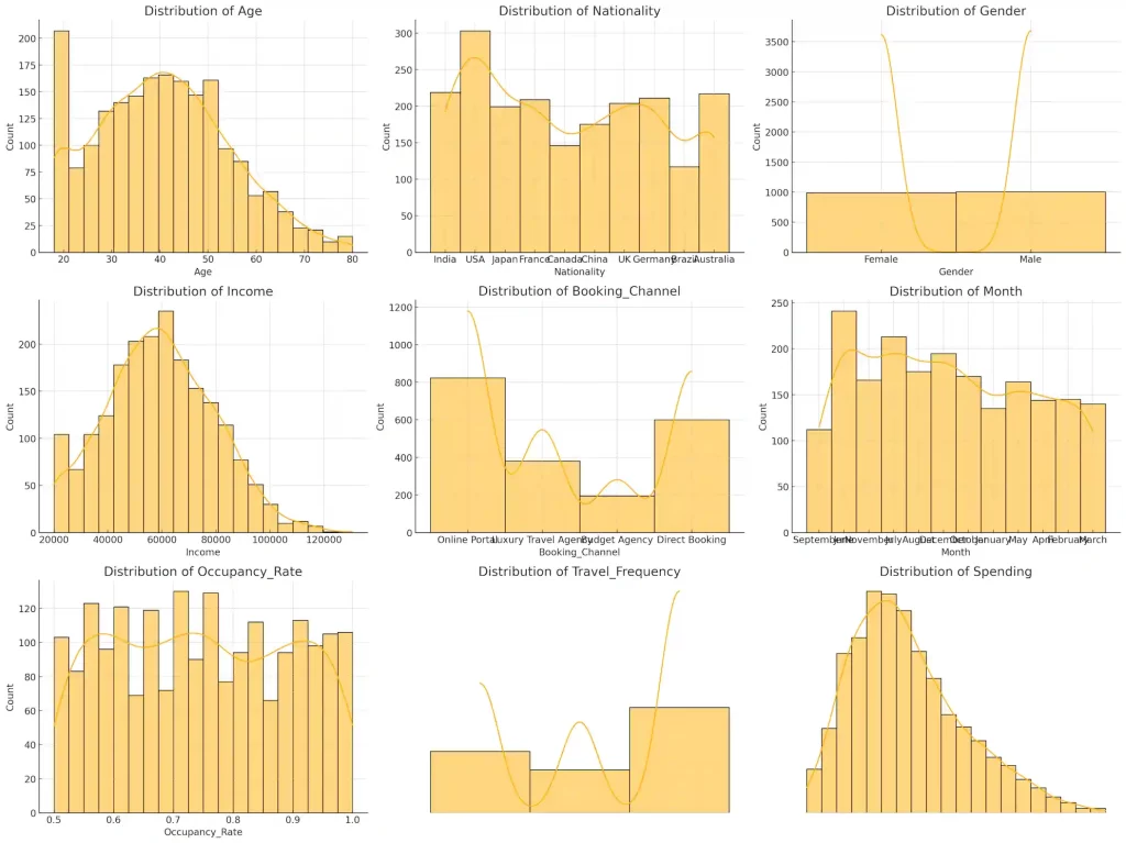
Run the code and let me download the output as a CSV file.
… the output is remarkably boring.
Men & women from all countries and ages in every month visit equally.
Income and spending are uniformly distributed – and the same pattern holds for all countries and ages.
Often, I need to generate fake data that is interesting. Specifically, I need data that can be used to illustrate a point or show a pattern.
Instead, we could ask for something different. ChatGPT
I want to generate realistic fake tourism data using these columns:

- Age
- Nationality
- Gender
- Income
- Booking_Channel
- Month
- Occupancy_Rate
- Travel_Frequency
- Spending

Do it as follows:

STEP 1. Given such data, generate 5 hypotheses on that a tourism department might test to increase tourist spend.
STEP 2. Write a Python program that generates 2,000 rows of realistic fake data where these hypotheses are true in a statistically significant way.
STEP 3. Run the code and let me download the output as a CSV file.
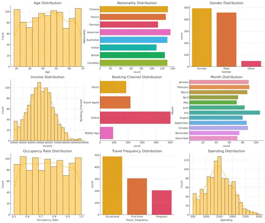
This works like a charm. The data generated exhibits these patterns:
Luxury travel agency customers spend much more.
Peak-month travelers (June, July, December) spend more.
Frequent travelers spend less.
Older tourists (50+) spend more.
Tourists from USA, Germany, and Japan spend more.
The data is more varied: some 20-year-olds spend much less (creating outliers). Many tourists come from the US, and a large share book online.
So, here’s my generic prompt for realistic fake data on ChatGPT:
Generate realistic fake data for ______

STEP 1. List columns that would be present in such data, briefly describing how the data might be distributed.
STEP 2. Given such data, think about an objective and generate 5 hypotheses that an organization might want to test on how to achieve this objective.
STEP 3. Write and run a Python program that generates 2,000 rows of realistic fake data where these hypotheses are true in a statistically significant way. Let me download the output as a CSV file.
STEP 4. Test each hypothesis and show the results.