I created an embedding map of my blog posts.
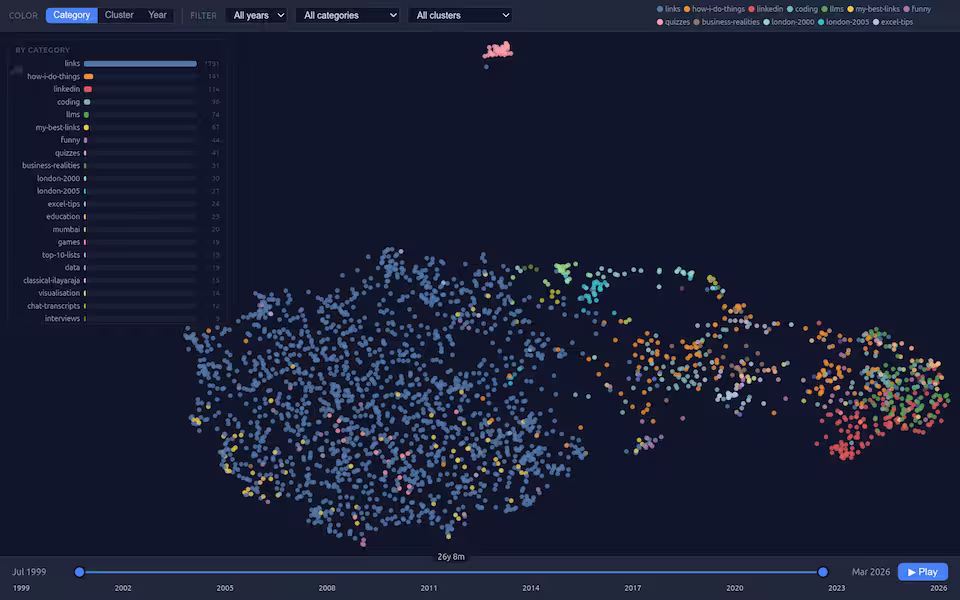
Each point is a blog post. Similar posts are closer to each other. They’re colored by category.
I’ve been blogging since 1999 and over time, my posts have evolved.
- 1999-2005: mostly links. I started by link-blogging
- 2005-2007: mostly quizzes, how I do things, Excel tips, etc.
- 2008-2014: mostly coding, how I do things and business realities
- 2015-2019: mostly nothing
- 2019-2023: mostly LinkedIn with some data and how I do things
- 2024-2026: mostly LLMs
… and this transition is entirely visible in the embedding space.
I used Codex and GitHub Copilot + Claude Sonnet 4.6 to create this visualization. It was vibe coded in the background while I was vibe-coding my PyConf Hyderabad talk. The rough process was:
- Extract the blog posts and pages (stripping out comments, adding titles).
- Use Gemini Embedding 2 Preview to generate 768-dimentional embeddings for un-embedded content.
- Create a UMAP visualization of these embeddings, colored by category, and make it interactive with filters and popups.