Creating motion charts in Excel is a simple four-step process.
- Get the data in a tabular format with the columns [date, item, x, y, size]
- Make a “today” cell, and create a lookup table for “today”
- Make a bubble chart with that lookup table
- Add a scroll bar and a play button linked to the “today” cell
For the impatient, here’s a motion chart spreadsheet that you can tailor to your needs.
For the patient and the puzzled, here’s a quick introduction to bubble and motion charts.
What is a bubble chart?
A bubble chart is a way of capturing 3 dimensions. For example, the chart below could be the birth, literacy rate and population of countries (X-axis, Y-axis and size). Or the growth, margin and market cap of companies.
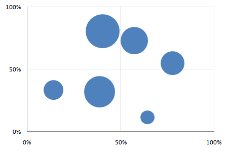
It lets you compare three dimensions at a glance. The size dimension is a different from the X and Y axes, though. It’s not easy to compare differences in size. And the eye tends to focus on the big objects. So usually, size is used highlight important things, and the X and Y axes used to measure the performance of these things.
If I were to summarise bubble charts in a sentence, it would be: bubble charts show the performance of important things (in two dimensions). (In contrast, Variwide charts show the same on one dimension.)
Say you’re a services firm. You want to track the productivity of your most expensive groups (“the important things”). Productivity is measured by 2 parameters: utilisation and margin. The bubble chart would then have the expense of each group as the size, and its utilisation and contribution as the X and Y axes.
What is a motion chart?
Motion charts are animated bubble charts. They track the performance of important things over time (in two dimensions). This is chart with 4 dimensions. But not all data with 4 dimensions can be plotted as a motion chart. One dimension has to be time, and another has to be linked to the importance of the item.
Motion charts were pioneered by Hans Rosling and his TED Talk shows you the true power of motion charts.
How do I create these charts?
Use the Motion Chart Gadget to display any of your data on a web page. Or use Google Spreadsheets if you need to see the chart on a spreadsheet: motion charts are built in.
If you or your viewer don’t have access to these, and you want to use Excel, here’s how.
1. Get the data in a tabular format
Get the data in the format below. You need the X, Y and size for each thing, for each date.
| Date | Thing | X | Y | Size |
| 08/02/2009 | A | 64% | 11% | 1 |
| 08/02/2009 | B | 14% | 33% | 2 |
| 08/02/2009 | C | 78% | 55% | 3 |
| 08/02/2009 | D | 57% | 73% | 4 |
| 08/02/2009 | E | 39% | 32% | 5 |
| 08/02/2009 | F | 40% | 81% | 6 |
| 09/02/2009 | A | 64% | 12% | 1 |
| 09/02/2009 | B | 14% | 33% | 2 |
| 09/02/2009 | C | 78% | 56% | 3 |
| 09/02/2009 | D | 57% | 73% | 4 |
| 09/02/2009 | E | 39% | 32% | 5 |
| 09/02/2009 | F | 40% | 81% | 6 |
| … | … | … | … | .. |
To make life (and lookups) easier, add a column called “Key” which concatenates the date and the things. Typing “=A2&B2” will concatenate cells A2 and B2. (Red cells use formulas.)
| Date | Thing | Key | X | Y | Size |
| 08/02/2009 | A | 39852A | 64% | 11% | 1 |
| 08/02/2009 | B | 39852B | 14% | 33% | 2 |
| 08/02/2009 | C | 39852C | 78% | 55% | 3 |
| 08/02/2009 | D | 39852D | 57% | 73% | 4 |
| … | … | … | … | … | … |
2. Make a “today” cell, and create a lookup table for “today”
Create a cell called “Offset” and type in 0 as its value. Add another cell called Today whose value is the start date (08/02/2009 in this case) plus the offset (0 in this case)
| Offset | 0 | (Just type 0) |
| Today | 08/02/2009 | Use a formula: =STARTDATE + OFFSET |
Now, if you change the offset from 0 to 1, “Today” changes to 09/02/2009. By changing just this one cell, we can create a table that holds the bubble chart details for that day, like below.
| Thing | X | Y | Size | Formula |
| A | 44% | 19% | 1 | X =VLOOKUP(TODAY & THING, DATA, 2, 0) Y =VLOOKUP(TODAY & THING, DATA, 3, 0) Size =VLOOKUP(TODAY & THING, DATA, 4, 0) |
| B | 6% | 13% | 2 | |
| C | 90% | 71% | 3 | |
| D | 41% | 61% | 4 | |
| E | 59% | 40% | 5 | |
| F | 16% | 77% | 6 |
Check out my motion chart spreadsheet to see how these are constructed.
3. Make a bubble chart with that lookup table
This is a simple Insert – Chart. Go through the chart types and select bubble. Play around with the data selection until you get the X, Y and Size columns right.
4. Add a scroll bar and a play button linked to the “today” cell
Now for the magic. Add a scroll bar below the chart.
Excel 2007 users: Go to Developer – Insert and add a scroll bar.
Excel 2003 users: Go to View - Toolbars - Control Toolbox and add a scroll bar
Right click on the scroll bar, go to Format Control… and link the scroll bar to the “Offset” cell. Now, as you move the scroll bar, the value in the offset cell will change to reflect it. So the “today” cell will change too. So will the lookup table. And so will the chart.
Next, create a button called “Play” and edit its code.
Excel 2007 users: Right click the button, go to Developer – View Code.
Excel 2003 users: Right click the button and select View Code.
Type in the following code for the button’s click event:
```vb Declare Sub Sleep Lib "kernel32" (ByVal dwMilliseconds As Long)Sub Button1_Click() Dim i As Integer For i = 0 To 40: ’ Replace 40 with your range Range(“J1”).Value = i ’ Replace J1 with your offset cell Application.Calculate Sleep (100) Next End Sub
<p>Now clicking on the Play button will give you this glorious motion chart in Excel:</p>
<p></p><object classid="clsid:D27CDB6E-AE6D-11cf-96B8-444553540000" codebase="http://download.macromedia.com/pub/shockwave/cabs/flash/swflash.cab#version=6,0,0,0" width="451" height="334" id="motion-chart.swf">
<param name="movie" value="/a/motion-chart.swf">
<param name="quality" value="high">
<param name="bgcolor" value="#ffffff">
<embed src="/a/motion-chart.swf" quality="high" bgcolor="#ffffff" width="451" height="334" name="motion-chart.swf" type="application/x-shockwave-flash" pluginspage="http://www.macromedia.com/go/getflashplayer"></embed>
</object>

---

## Comments

<!-- wp-comments-start -->
- **[Vinoth](http://vinovator.blogspot.com)** _13 Mar 2009 9:27 am_:
  Hi Anand.Very useful article.
  I can use similar motion chart to showcase how each of my team member's cumulative performance is contributing at the overall level.
- **Zoheb** _21 Mar 2009 12:02 am_:
  also could you rewrite the whole code,on how to slow it down.. i tried inserting it.but i don't think i put it in the right place.
- **David** _18 Mar 2009 2:16 pm_:
  Thanks! That did the trick! Great Blog!
- **David** _17 Mar 2009 7:56 pm_:
  Is there a way to slow it down?
- **[S Anand](http://www.s-anand.net/)** _17 Mar 2009 8:44 pm_:
  Sure. Use the sleep function. Add this to the module:
 \
Declare Sub Sleep Lib “kernel32” (ByVal dwMilliseconds As Long)
\
Then add a Sleep function after `Application.Calculate`
\
Sleep 200
- **Nach** _17 Mar 2009 8:50 am_:
Thank you...this is something that I have been trying to do for a long time now...but didnt know how to write the looped macro in Excel.
- **Zoheb** _20 Mar 2009 9:52 pm_:
Hi I had a question, if I wanted the counter by 3, how would i do that?
Thanks
-Zoheb
- **[S Anand](http://www.s-anand.net/)** _23 Mar 2009 7:39 am_:
I've changed the code and also revised it in the Excel file. Take a look.
To increment the counter by 3, change the properties of the scroll bar to make the increment 3 instead of 1. (Right click on the scroll bar and select "Properties")
- **[Al-Hamour](http://www.alhamour.com)** _23 Mar 2009 1:50 am_:
Great post! Thanks for sharing. Time delay code is very useful if you can upload it.. right now it goes too fast to see.
Also, is there a way to make the graph trace each of the moving circles?
- **Venkat** _1 Apr 2009 3:12 pm_:
Thanks Anand. Very useful to represent often boring data like time series analysis.
- **Firman** _17 Apr 2009 3:53 am_:
Thank you so much... i hope in the near future you can give us tutorial / article about how to make it more interactive... say... after we click the bubble we can divide it into smaller / more detailed parts.
Thank you
- **Reginald Vaz** _17 Apr 2009 7:08 pm_:
Extremely useful...thanks a lot for sharing
- **Pradeep Jindal** _2 May 2009 6:57 pm_:
Fabulous! I just starting to do it and find this article...
everything redy and beautiful...
can we add drill down to it
Thank you Anand :)
- **Mike** _12 May 2009 3:43 pm_:
Great Tool. I am also looking for a way to pause the animation. Any ideas?
- **Pete** _4 Jun 2009 1:30 am_:
Is there a way to embed the animation in excel?
- **[S Anand](http://www.s-anand.net/)** _14 Jul 2009 5:25 pm_:
Don't think we can export these motion charts into Powerpoint, I'm afraid.
- **[Sunny](http://www.iimb.ernet.in)** _13 Jul 2009 9:38 pm_:
Is there any way I can export these motion charts into microsoft powerpoint?
- **beth** _15 Jul 2009 1:50 am_:
do you know how you can embed this into a powerpoint? when i try to embed, you can't do the motion.
- **Sabnish** _11 Jul 2009 11:26 am_:
Hi...great help...thanks a lot....but for my presentation i will need to see the evolution by years...in this example it is the date which gets incremented...how to increase the year instead...thanks...hope you can help me....
- **Michael Brault** _8 Dec 2009 3:11 pm_:
I have the motion chart embed into a Dashboard with other charts and tables. The macro increments all tables. Any ida on how to limit the macro to a single table of data?
- **Alex** _22 Jan 2010 10:57 pm_:
Having problems creating it in Excel for mac. Any ideas?
- **[derek](http://i-ocean.blogspot.com/)** _14 May 2010 7:17 pm_:
Another kind of motion chart can be a line or bar chart showing the evolution of multiple line shapes or histograms with time.
You can also add a time display to show when the events are occurring. Rosling's application cleverly displays the year as a giant watermark behind the bubbles, so the eye doesn't have to stray to a corner to see the time. I've often thought a clock face symbol might be a neat alternative to a simple text display.
- **[Jeff Koenig](http://connellcommodities.com)** _5 Feb 2010 7:33 pm_:
Great bubble chart solution. I've been looking for a 3D bubble chart so I can move bubbles in 3D space, allowing me to track an additional dimension. Any ideas?
- **Dirk Cornette** _13 Apr 2010 10:23 pm_:
Great solution Anand.
I am trying to customize it, showing 1 customer per buble, size = revenue, Y-axes = number of our staff working for that customer, X axes showing margin %.
Solving two issues would make it more gapminder-like.
1. How to add a data label to the buble, showing the customer name ?
2. How to show the year ?
Any ideas ?
- **[Mahdi Meskin](http://www.meskin.ir)** _4 Jun 2010 6:24 am_:
Great post!
thanks.
- **[Drew](http://www.totallyawesomemapping.com)** _11 May 2010 4:10 pm_:
Just found your post, and I can't wait to try it out. Thanks for the tips!
- **NIall Tallon** _18 Aug 2010 12:08 pm_:
HI Anand,
This is great - a while since I updated and wrote macros - I am running a 64bit version of windows 7 and excel 2010 - and the macro won't run there - any ideas?
Thanks,
Niall
- **Niall Tallon** _18 Aug 2010 12:19 pm_:
HI Again,
Actually just have to add "PTRsafe" in the macro near the declare statement.
Pretty easy.......Email me if you want a copy with the changed macro.
Best regfards and with thanks,
NT
- **Kamesh.M** _15 Sep 2010 10:00 am_:
Great Post!
This can be done without Macros also.....
http://www.webanalyticsindia.com/2009-11-20/motion-chart-in-excel/
Best Regards
Kamesh
- **Pvl** _27 Jun 2012 8:41 am_:
Hi, Anand,
Thanks for good tutorial. But I'm very interested in creating such motion chart in Flash, like You posted as an example. Any suggestions how to do that?
- **Scott** _20 Dec 2010 4:31 pm_:
Hi,
Is it possible to make this so the individual bubbles have different colors or at least unique labels? I can only seem to have all the bubbles be one color and one label 'Thing'....
Thanks,
Scott
- **James Arnott** _8 Sep 2011 2:56 pm_:
Hi - I've come late to this but am finding it very useful. Thanks for sharing your work with us as it would have taken me ages to work it out myself.
- **Anna** _2 Nov 2011 3:52 pm_:
Does anyone know if it is possible to include this chart in a Share Point site? I know you can upload dashboards with the REST API but I don't know if it is possible to add motion charts. Can you shed some light on this topic. Thanks!
- **Atisha Banjare** _11 Nov 2011 11:06 am_:
Hi!! Great stuff and really useful. Thanks
- **kalaisam** _23 Jan 2012 11:37 am_:
Hai,
I read Excel file from my Google account using Zend. I call Motion chart using Publish gadget script. It automatically assign the default X-axis and Y-axis .I wish to assign the X- axis and Y-axis . I choose Advanced settings option to change the Axis and then call that script string in Php code. But Default axis only displayed ! How can i fix that ?
- **Bill** _16 Apr 2012 5:41 pm_:
Is it possible to have bubble diameters also show thier diameter change over time? Various smoothing algorithms could be offered to choose from.
- **Nal** _23 Mar 2012 6:48 am_:
hi, this is fantastic! Is it possible to put this into my powerpoint presentation?
thanks!
- **Sreekar** _3 Sep 2011 9:19 pm_:
Hi Anand - I tried using your macro and it gives a compilation error "Sub or Function not defined"; would you know how I could fix it? I am using 2010 Excel
- **Alan** _15 Sep 2011 1:01 am_:
Can you please post me the updated version for Excel 2010.
I dont know how to update the declare statement to include "PTR Safe"
Thank you
Alan
- **Chris** _28 Mar 2012 11:08 pm_:
Wonderful! Thanks for all this work. I use Excel 2010 and it shouldn't be too hard to adapt it (I won't bother you about it).
It's too bad it can't be embedded in PPT. Microsoft definitely needs to add this kind of thing to PowerPoint.
- **Kirk** _23 Jun 2012 4:57 pm_:
I tried this macro but got an error saying the macros in this project are disabled. Anyone have an idea on what I am doing wrong?
Sub Button20\_Click()
Declare Sub Sleep Lib "kernel32" (ByVal dwMilliseconds As Long)
Sub Button1\_Click()
Dim i As Integer
For i = 0 To 40:
Range("J1").Value = i
Application.Calculate
Sleep (100)
Next
End Sub
- **CK** _6 May 2012 10:18 am_:
Thank you for this useful tutorial.
How did you embed the motion chart moving on your web page please?
- **Gary** _16 Jul 2012 2:37 am_:
Oh, sorry to mention that it stops at the Sleep (100). I even tried to add the Declare but for some odd reason it keep advancing above where I type it. I appreciate any help.
Thank you
- **Gary** _16 Jul 2012 2:34 am_:
First let me say thank you. The code you posted did not work for me. I am using MS Excel 2010 and I keep getting the same error.
Microsoft Visual Basic for Applications
Compile error:
Sub or Function not defined.
Can you help me fix this error. This is what I have typed.
Sub Button1\_Click()
Dim i As Integer
For i = 1 to 39:
Range ("C1").Value = 1
Application.Calculate
Sleep (100)
Next
End Sub
- **Seymon** _15 Jul 2012 2:17 am_:
it is awesome, thanks
- **Merry Turnip** _9 Oct 2012 12:21 pm_:
THANK YOU SO MUCH, FOR YOUR TUTORIAL, I HAVE TRIED IT AND IT WORKS.
THANK YOU SO MUCH.
By the way, when I change Years to months, however, it doesn't work. Could you please teach me how to change year to months?
THANK AGAIN
REGARDS
- **Mukesh** _5 Sep 2012 11:24 pm_:
Hi Anand,
I need to show the data for only 4 years.
Could you please tell me how to slow down the motion further ?
I tried increasing the value of the number in Sleep (), but its not making a difference
- **maanu** _19 Nov 2012 10:34 am_:
hi anand, i want to build a bubble chart for my applications globally with four variables, application investment strategy meaning invest, maintain or disinvest, cost, location, and functional match. i want to handle location with color as there are only 8 locations, and cost with size. i want app investment strategy as numbers (1,2 ,3) on y axis and functional match with five categories (0-20 21-40,41-60,61-80,81-100) on x axis. can we use your technique to achieve this ?
- **Obed** _18 Feb 2013 8:02 am_:
Thanks for sharing your wealth of knowledge with others. Great stuff!!!
- **Michael** _24 Feb 2013 5:31 am_:
In their infinite wisdom Google is discontinuing motion chart gadgets in 2013 so a big thank you for this alternative:-)
- **[Ganeshan Nadarajan](http://www.solidradicle.com)** _16 Jan 2013 12:27 pm_:
Motion charts are animated bubble charts. They track the performance of important things over time (in two dimensions). This is chart with 4 dimensions. But not all data with 4 dimensions can be plotted as a motion chart. One dimension has to be time, and another has to be linked to the importance of the item.
- **isspenguin** _17 Jan 2013 5:12 pm_:
Hello - How do I create "trails" that trace the path of individual bubbles in Excel, like they do in Google motion charts? Please feel free to email me your response at [email protected]. Thanks!
- **[Stefan Selby](https://googledrive.com/host/0B0Ms4sM4a2RoSW9YYmkxbVlMc2M/vbamotioncharts.html)** _25 Nov 2013 8:07 pm_:
It is interesting to see how you did your motion charts. I have created an app that does more than just bubble charts. I have done the same for most excel charts and a speedometer chart. It is shared with the world have a look at:https://googledrive.com/host/0B0Ms4sM4a2RoSW9YYmkxbVlMc2M/vbamotioncharts.html
- **[sireesh](http://www.ses.com)** _11 Jul 2013 10:17 pm_:
how to transfer bubble chart to ppt?
- **Mike** _26 Jul 2013 11:02 pm_:
Does the code work with 2010? Nothing happens when I copy and paste it in. When I run debug the sleep (100) highlights even after I replace the data as you indicated with my own. Granted, I'm new to developer stuff so I may be making a silly mistake.
- **Max** _19 Jul 2013 6:50 pm_:
Thanks for the great write up. Any ideas as to how one could add a "tail" behind the moving bubble to track the past data?
- **Diana** _9 Nov 2013 4:08 am_:
Actually.....shows how hopeless I actually am....I am in Excel 2013, not 2010!
- **Diana** _9 Nov 2013 4:05 am_:
I'm also asking the same question as Mike #5. I can't get the code to work in 2010 and the sleep (100) highlights. As I'm not a programmer and really don't have a clue, I'd love to get this handled. I've come this far and have great individual graphs!. Thanks....
- **Loveleen** _8 Apr 2014 3:57 am_:
I can’t get the code to work in 2010 and the sleep (100) highlights. As I’m not a programmer to understand the coding. COuld you please how it works in 2010
regards,
Loveleen
- **Ye** _13 Mar 2015 6:28 pm_:
Thank you so much for this workaround (I usually did this with googledocs) in excel. I am trying to make this work - not based on increasing date, but on temperature. Imagine a chemistry-based excel sheet and I want to show how different components change volume, weight and surface opaqueness with rising temperature. Right now, I struggle to make the today and offset work for me since the example is (like google docs) based on a start date.
Thanks for your reply in advance.
Y
- **Durga** _18 Jun 2014 4:11 pm_:
This was very useful for me. Thank you for describing the play button logic. On the web site when I click on the pause or the stop button the chart stops at that moment but I didn't see it in the excel. Could you please tell me how to code the stop button or the pause button on excel.
- **Nathalie** _11 Jun 2014 5:06 pm_:
It is very interesting. However, there is one little problem that stops me from using this kind of chart: the size of the bubbles does not follow the variation of size values in time. For instance, if bubble A remains the biggest bubble over the time, it will keep the same size in the chart, even if its value has increased by a factor 3 one year. I would have expected the size to be 3 times bigger than in the previous year. Is there a way to remedy this (without having to use Google motion charts)?
- **[Stef](http://developingdata.azurewebsites.net/)** _30 Dec 2014 12:46 pm_:
I have created an app that creates these and other types of motion charts. You can find it at http://developingdata.azurewebsites.net/Excel/ExcelMotionCharts
Knowing excel and reading this article would help (good article) but I have tried to make the app easy to use.
- **Des Klass** _1 Jan 2015 1:01 am_:
Hi I am having the same problem as Mike(#5) and just can't get the motion working. Greatful for any suggestions(I am using my own data)
- **Atom** _18 Dec 2014 8:07 am_:
How do i change the years to seconds?
- **Ryan** _14 Aug 2015 7:42 pm_:
I'm also having the same Sleep (100) error in 2010. Is there a work around for this?
- **[Niall](http://n/a)** _22 Mar 2016 5:07 pm_:
HI There - really love the motion chart work here - I've been using it for a while - but I recently went to O365 and the graphs I made don't work anymore - any ideas?
Many thanks,
Niall
- **Rochny** _15 Feb 2019 12:24 pm_:
I can’t get the code to work in 2016 and the sleep (100) highlights.
Can get help, as i am not a programmer.
regards
Rochny
- **[JEP](http://patientflow.dk)** _3 Apr 2017 9:26 am_:
The code work with 2010 if you delete "sleep (100)" :-)
<!-- wp-comments-end -->