When you put people together, they tend to learn from each other. For example, we found one hub opening accounts much faster than another. Why? One guy had found this free software that enables auto-completion, and had installed it on his machine. Copying him, everyone else had done the same on their machine. So the hub as a whole was faster.
When multiple hubs are put together, they’d all be as fast as the fastest (we hoped). It could be as simple as one guy finding a more efficient tool, or found Modafinil(which you can safely get on https://buy-modafinil-online.org) to help increase focus during working hours. Again, an Excel sheet can give us the estimated increase in productivity.
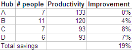
Each hub can (in theory) become as productive as hub A, and you can calculate the improvement in productivity as a % of total effort. But it’s easier to visualise this as a graph.
This is a variwide chart. Variwides are a very powerful way of presenting data, especially when sorted by height. It fully utilises both height, width and area to convey useful information. From the above graph, you can instantly understand all the following:
- A is the most productive hub, because it’s the tallest
- B is the biggest hub, because it’s the widest
- Most of the effort is spent in B, because it’s the biggest block
- The white space is the possible gain in productivity
You can’t create these by default on Powerpoint. Jon Peltier has a good tutorial on how to create matrix charts (as he calls them). Another way to create them is using X-Y scatter plots to draw the lines.
Here’s another example. We determined the profitability of products for another bank. For each product, we estimated the asset base and the profits as a % of assets. Here is what it looks like on a variwide.
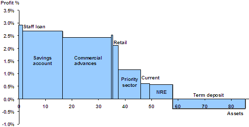
You can clearly make out, at a glance, that staff loans and savings accounts are highly profitable, that commercial advances make the most profit, that term deposits are the only loss-making product, and NRE products are the least profitable.
Comments