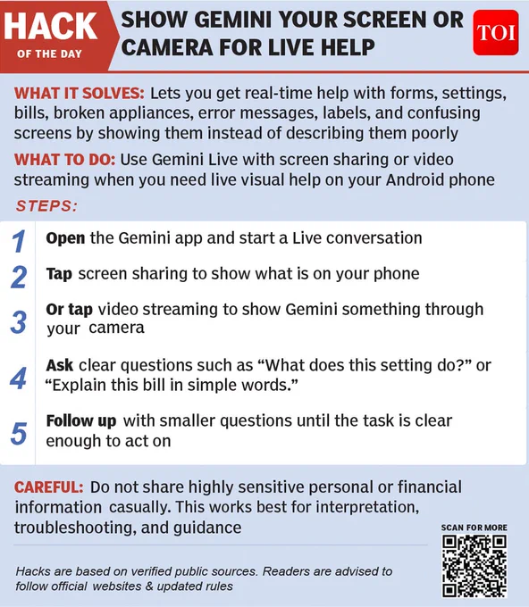
Last Friday, 20 Mar 2026, this “Hack of the Day” was published by The Times of India.
My agents generated it entirely automatically. Here’s how that happened.
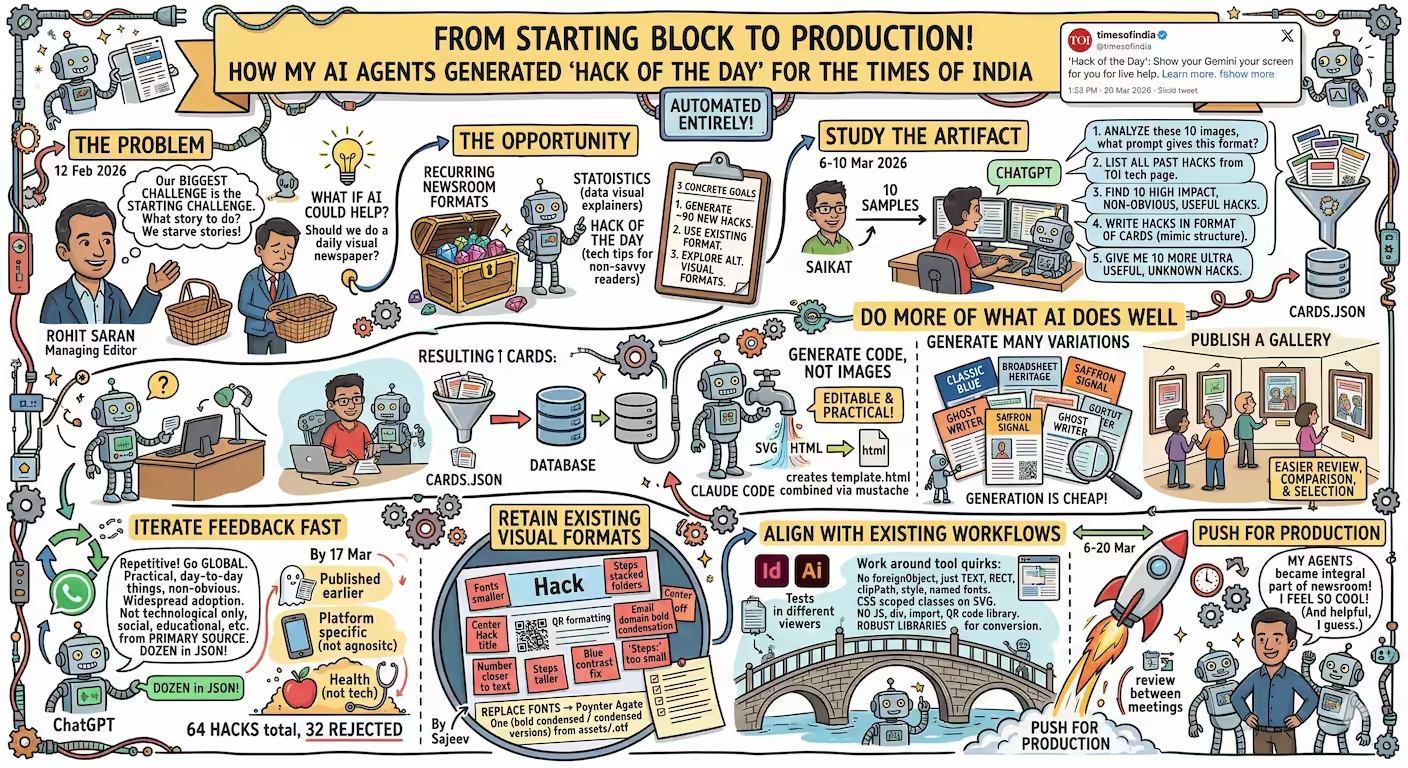
On 12 Feb 2026, I met Rohit Saran, Managing Editor at The Times of India.
“Our biggest challenge is the starting challenge. What story to do?” he said. “We waste a lot of time and we starve stories because of this.”
What if AI could help with that? We talked for nearly two hours - and left asking: “Should we do just a daily visual newspaper?”
Rohit connected Saurabh, Saikat, and Sajeev, so we could explore what’s possible.
FIND PROMISING CANDIDATES.
The Times of India already had recurring formats they wanted to drive with AI.
- Statoistics (data-driven visual explainers of statistics and trends) was one.
- Hack of the Day (small tech tips for non-tech-savvy readers) was another.
We weren’t beginning from scratch. There was rich material and a realization that recurring newsroom formats are ideal for AI because they are structured, frequent, and feedback-rich.
Hack of the Day stood out: small, recurring, text-only, needing little research, with a clear purpose — useful tech tips for everyday readers. Saikat defined 3 concrete goals for this:
- Generate about 90 new hacks to extend the feature for around three more months.
- Generate those in the existing format.
- Explore alternative visual formats for future replacement or redesign.
STUDY THE ARTIFACT.
So, on 6 Mar 2026, Saikat sent me 10 samples of Hack of the Day to understand the format, layout, variety, etc. By 10 Mar 2026, I had a few prototypes ready. I asked ChatGPT a series of questions:
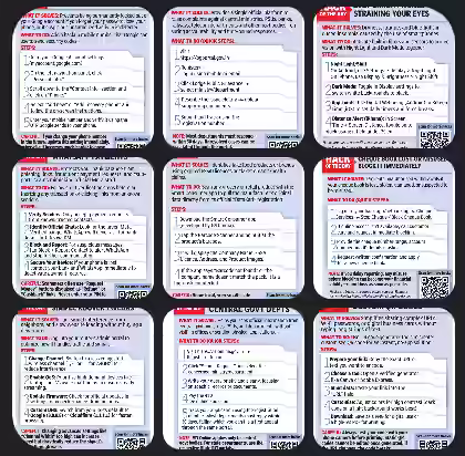
- Analyze these 10 “Hack of the Day” images carried in The Times of India. If I had to ask an intern (or an AI agent) to create several such, then what prompt will give me this kind of content in exactly this format?
- List all past hacks from https://timesofindia.indiatimes.com/technology/hack-of-day - it has 2 pages, read from both
- Find and list 10 high impact non obvious widely useful hacks similar to these
- Write these hacks in the format of the cards below. Mimic the structure, style, and verbosity of the cards. (Schema attached)
- Nice! Continue the search extensively and give me 10 more. Make sure these are ULTRA useful to a LARGE number of people and yet many people are probably not aware of these hacks.
… to create a cards.json.
Then I asked Claude Code to “Create a template.html that can be combined (e.g. via mustache) with a JSON that, when run, produces the EXACT visual output as the cards in *.avif.”
Saikat reviewed these and noted that some had already been done by TOI, but some looked new and usable. So the first batch served as a proof of possibility.
DO MORE OF WHAT AI DOES WELL
To get the output fast and to make iterations easier, I did a few things that are easy for AI and not natural for humans:
- Generate code, not images. The TOI team had experimented with image generation. That didn’t work well - and I know that. I proposed generating HTML/SVG instead. It does that well. It’s editable by humans and AI. That makes the workflow practical.
- Use JSON, not English. I used ChatGPT to research and generate structured JSON, then Claude to render it visually. Each tool did what it does best. Specifically, I had ChatGPT generate structured JSON that can be easily read and programmatically processed by coding agents.
- Generate many variations. Generation is cheap. I had ChatGPT generate dozens of hacks in one go. I had Claude generate design variations like Classic Blue, Broadsheet Heritage, Saffron Signal, etc.
- Publish a gallery. Creating a gallery of generated outputs is a simple enhancement that allows for easier review, comparison, and selection. The Gallery made reviews and feedback much easier.
These make iterations faster, richer, more reliable and reviewable.
ITERATE FEEDBACK FAST
During the session on 10 Mar, I spoke with ChatGPT and told it (verbally) what Saikat said:
Look, all of this is nice, but some of these have already been covered by the Times of India’s previous hack of the days.
Also, I get a feeling that it’s getting a little repetitive. Let’s go a little global, doesn’t have to be only about Indian government sites.
Let’s talk about things that people use on a practical, day-to-day basis and see what is really useful and not always obvious to them, even though there is a widespread adoption of some of these.
It doesn’t have to be technological hacks either. It could be social hacks, educational hacks, cultural hacks.
The point is that it should be from some primary source. Now, keeping this in mind, give me about a dozen of these and give it in the JSON format that you’ve done so far.
Feedback is the critical loop. The system improved not because the model changed, but because the editorial feedback got sharper.
I explicitly asked for voice-note feedback on WhatsApp to speed up the review cycles. Just one line explaining what’s rejected and why. By 17 Mar 2026, we had 64 hacks, of which 32 were rejected for these reasons:
- 15: “Published earlier”
- 1: “Duplicate of a similar one”
- 15: “Hacks must be platform agnostic” (not Android / iPhone specific)
- 1: “Not a tech hack” (e.g. health)
RETAIN EXISTING VISUAL FORMATS
People are used to seeing things in a certain way. That inertia has value (brand recognition, reader familiarity, workflow compatibility, etc.) That was reflected in the granular feedback Sajeev shared about the design (which I translated directly into prompts):
- The fonts are much smaller
- The steps are supposed to look like folders, overlapping / stacked. Right now, they look like rounded cards with a gap between them.
- Hack of the day is not horizontally / vertically centered.
- The QR code formatting is off.
- The name in the email ID should be in bold, and the domain in regular font.
- The number in the steps must be larger, and in a different font - look carefully.
- The text in the steps must be closer to the number - look carefully.
- Vertically center the step elements.
- Replace fonts with the closest Google Fonts.
- The hacks are typically taller. Increase the size of the cards.
- The color contrast (blue on blue) makes a lot of content barely visible. Review the foreground-background color contrast across elements and ensure contrast while preserving aesthetics.
- STEPS: is too small and too close to the “What to do” section
We still haven’t nailed it perfectly. This is a long tail. The big win is getting it to the point where manual edits are minor.
ALIGN WITH EXISTING WORKFLOWS
TOI needed outputs designers could adjust in their workflow. The team uses InDesign / Illustrator, so we needed to:
- Align with tools. I prompted: “I could not load the generated SVGs on Gnome nor on VS Code’s image viewer. But they render on Chrome. Get them to work on these as well. Keep in mind that they’ll finally be opened by Adobe Illustrator and similar tools - so tool compatibility is important. Update SVG templates accordingly and test if you can.”
- Align with fonts. I prompted: “Modify the hackoftheday/ HTML and SVG to use the Poynter Agate One font from assets/*.otf. Use the bold condensed / condensed versions.”
- Work around tool quirks. I prompted: “Modify the SVG rendering to native SVG elements: text and tspan (not foreignObject, div), rect, clipPath, defs > style, named fonts, styles scoped via CSS classes on SVG elements, static pre-positioned elements. No JavaScript, div, @import, QR code library, etc. Use robust libraries for conversion if required.”
PUSH FOR PRODUCTION
New workflows take time to stick. 6 Mar to 20 Mar (two weeks) is probably record time. The actual generation took a few hours. Reviews took a few days. Most of the time was just the gap between meetings, where ideas sink in. The impetus came from the meetings where I kept asking: “What’s stopping us from publishing?” and then fixing that.
On 20 Mar 2026, the first AI-assisted Hack of the Day was published. More followed.
My agents are an integral part of a newsroom.
This is so cool!