Surely we don’t have many activities to centralise? We already have a central hub for processing operations!
We heard that from a fair section of our client organisation. They initially had operations spread across their branches. Some years ago, they had established a central hub and many regional hubs. Yet,
- Only a few prominent operations were centralised. Others were just regionalised.
- Regionalisation was inconsistent. Some branches still did these at their own premises.
- Branches still did the bulk of the work.
We made a list of activities, surveyed all their branches and hubs, and got a good sense of which activities were happening at branches vs regionally vs centrally.
Rather than make a list of these activities (they numbered over 300), we put the variwide chart to an unorthodox use. The chart below shows the activities on the x-axis, and the extent of centralisation on the y-axis.
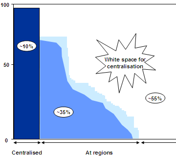
The graph actually consists of thin vertical lines, one for each activity. The height represents the number of branches for which the activity is happening regionally. For the activities on the right, they’re happening at branches. Dark blue lines are happening centrally. Light blue lines are regionalised.
You can see at a glance that about 55% of activities are at branches, 35% are regionalised and 10% are centralised. Clearly there’s a big potential to centralise. Once we showed this slide, most of the objections went away.
Comments