I put together a district map of India in SVG this weekend.
So what?
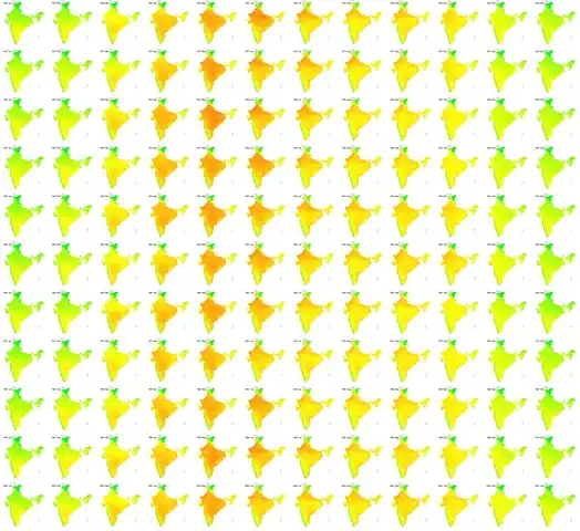
You can now plot data available at a district level on a map, like the temperature in India over the last century (via IndiaWaterPortal). The rows are years (1901, 1911, … 2001) and the columns are months (Jan, Feb, … Dec). Red is hot, green is cold.
(Yeah, the west coast is a great place to live in, but I probably need to look into the rainfall.)
districts.svg has has 640 districts (I’ve no idea what the 641st looks like) and is tagged with the State and District names as titles:
<g title="Madhya Pradesh">
  <path title="Alirajpur" d="..." />
  <path title="Jhabua" d="..." />
  ...
</g>
How?
I made it from the 2011 census map (0.4MB PDF). I opened it in Inkscape, removed the labels, added a layer for the districts, and used the paint bucket to fill each district’s area. I then saved the districts layer, cleaning it up a big. Then I labelled each district with a title. (Seemed like the easiest way to get this done.)
Thanks to @planemad, @gkjohn, @arjunram for inputs. Play around. Feedback welcome.

Comments