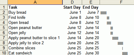
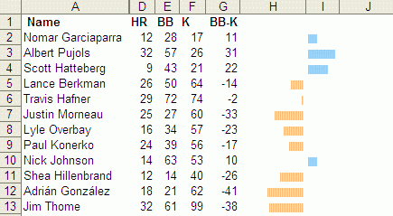
Juice analytics has some Excel graphing tips. You can make charts like below without using charts, using just text.
These are useful because the charts are aligned with the data.
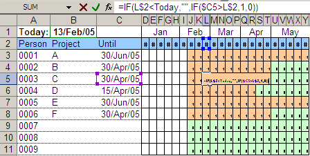
I once used a similar technique to display people’s staffing position. The sheet below lists people, projects they’re on and how long they’ll be on. The coloured cells to the right are a calendar display of the same stuff. Makes it easy to read.
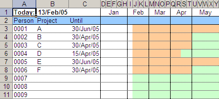
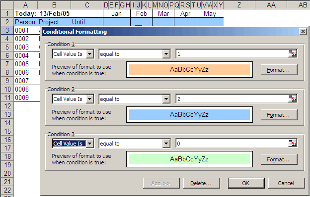
The trick is to place each week for each person as a thin cell, like below. Then the cell is populated with a formula that makes it 0 or 1 depending on whether the person is available that week or not. (The blue row #2 stores the start date of the week, and I compare this with the end date of each person’s project.)
And then, you can turn on conditional formatting.