Watch Hans Rosling's TED Talks on debunking third world myths and new insights on poverty and ask yourself: could I do this with my own data?
Yes. Google has a gadget called MotionChart that lets you do this.
Now, you could put this up on your web page, but that's not quite useful when presenting to a client. (It is shocking, but there are many practical problems getting an Internet connection at a client site. The room doesn't have a connection. The cable isn't long enough. You can't access the LAN. Their proxy requires authentication. The connection is too slow. Whatever.)
So you need this in Excel. Let me explain a variant of the technique I described earlier.
Let's start by creating a simple bubble chart.
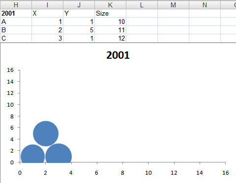
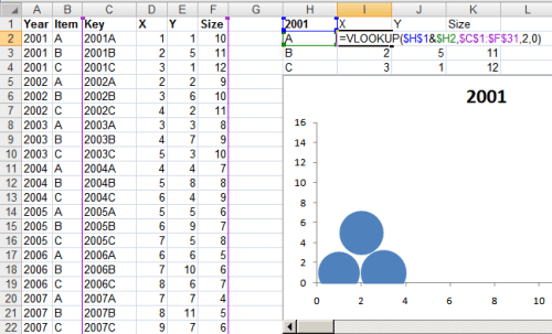
For each item in a bubble chart, you need 3 pieces of data: the X-axis, Y-axis and size. This graph shows three items A, B and C in one year: 2001. To animate this, you need data for more years, so let's create that.
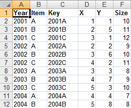
The first 3 rows contain the same data as before, except that I've added a "Year" column and a "Key" column (which is just a concatenation of the Year and the Item). The data now goes on for many more years.
Now we need to create a scroll bar that can be used to change the year. So add a scroll bar below the bubble chart...
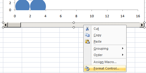
... and right click the scroll bar and go to Format Control. Now, select the cell link to some cell ($H$1 in this case). Now, if you move the scroll bar, the cell value will change.
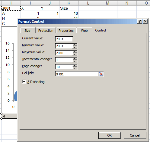
All you need to do is to now change the source data for the chart based on the year. From the table on the left, VLOOKUP the year + item, and put this into the table on the right. When the year in the cell H1 changes, the data updates itself. So now, as you move the scroll bar, cell H1 changes, then so does the data and hence the graph.
This is what the animation looks like.
And here’s the Excel file.
Comments
using the scheme I described. It’s probably better to reduce the data
to fewer dimensions (e.g. in pairs: dimensions (A,B), (A,C), (B,C),
etc.). Sorry, without a sense of what the data is about, I’m not sure
I can think of a good way of doing this.
to 4 dimensions I’ve seen are using Hans Rosling’s charts at gapminder.org.
But you’d need the 4 dimensions to be mappable to X, Y, size and time.
The things that I would like to depict are these.
To model the system A, I have 4 dimensions each with varying weights. The response score for each dimension is expressed as %. In bubble chart terms- Say, one of the dimension is represented as a bubble, then the outer circle diameter denote the Relative weight of the dimension and a circle inside denote the actual score.
Roughly, I visualize to represent the Model as a stack for 4 bubbles (dimmensions)one on top of other. something like a 3D color model
In the example, that you referred.. Size and time are something which is common to X and Y..
Thanks
Ganesh S
x can be year
y growth
Is there any way to automate the scroll bar so that I can click just one button and the graph updates itself automatically?
Thanks
This is very nice, I landed on this page googling for something I wanted for in xl charting.
Can you help ? I am trying to model a “System A”. I have 4 identified dimensions D1, D2, D3, D4 for it, each on a scale of say, 1 to 400.
I wanted to represent them in one composite chart to show, this is how the “System A” looks like. Is there anyway out ?
Thanks