Visualising student performance
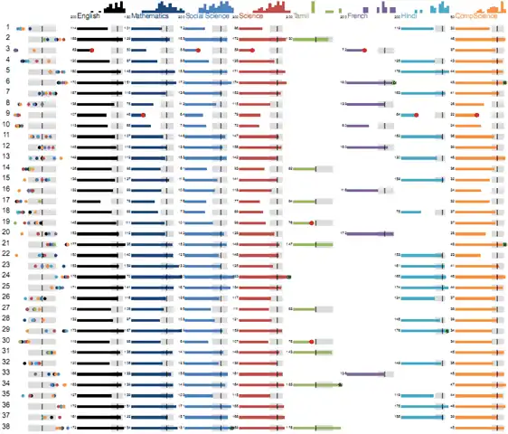
I’ve been helping with visualising student scores for ReportBee, and here’s what we’ve currently come up with. Each row is a student’s performance across subjects. Let’s walk through each element here. The first column shows their relative performance across different subjects. Each dot is their rank in a subject. The dots are colour coded based on the subject (and you can see the colours on the image at the top: English is black, Mathematics is dark blue, etc.) ...