I used to be a data visualization expert. I’m not sure I still am. When Anthropic published an article about how AI is transforming their engineers’ work, I ran this prompt: Suggest how the following engineer productivity patterns can be illustrated using interactive animated charts, graphs, or infographics. Be diverse. Xenographics are welcome. Novel animation* / *interaction styles, artistry, xenographics, and diverse chart types are encouraged. Be intuitive. A single glance should tell them exactly what insight we are trying to convey. ...
December 23, 2025
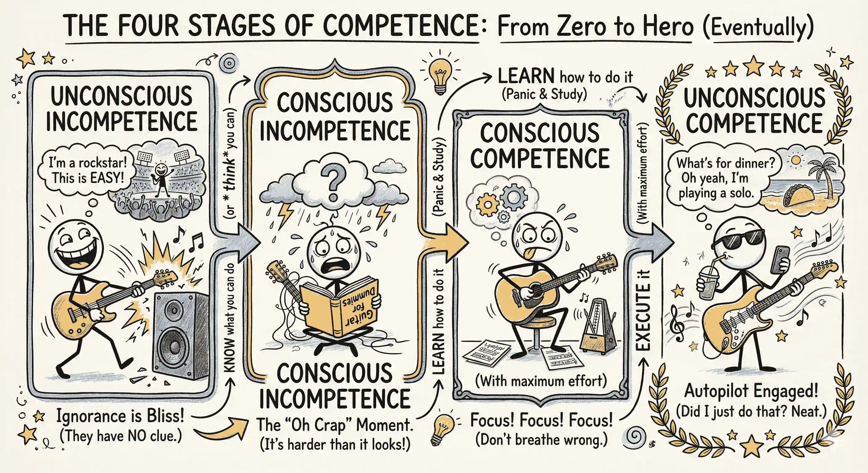
AI agents are messing up software tool learning. Normally, we need to pass stages of competence: KNOW what you can do LEARN how to do it EXECUTE it. Excel: KNOW you can summarize by category, LEARN pivot tables, EXECUTE an Insert → PivotTable → select data range → drag … Photoshop: KNOW you can erase objects, LEARN Content-Aware Fill, EXECUTE Lasso tool → select → Edit → Content-Aware Fill → … ...