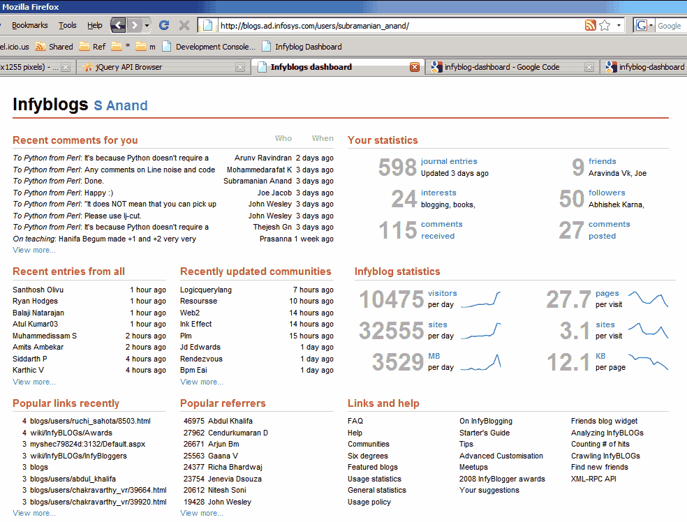
Infyblogs dashboard
I just finished Stephen Few’s book on Information Dashboard Design. It talks about what’s wrong with the dashboards most Business Intelligence vendors (Business Objects, Oracle, Informatica, Cognos, Hyperion, etc.), and brings Tuftian principles of chart design to dashboards. So I took a shot at designing a dashboard based on those principles, and made this dashboard for InfyBLOGS. You can try for yourself. Go to http://www.s-anand.net/reco/ Note: This only works within the Infosys intranet. Right click on the “Infyblog Dashboard” link and click “Add to Favourites…” (Non-IE users – drag and drop it to your links bar) If you get a security alert, say “Yes” to continue Return to InfyBLOGS, make sure you’re logged in (that’s important) and click on the “Infyblog Dashboard” bookmark You’ll see a dashboard for your account, with comments and statistics The rest of this article discusses design principles and the technology behind the implementation. (It’s long. Skim by reading just the bold headlines.) ...