Rule #4: Make your model visually obvious.
After years of creating Excel models with lots of inputs and lots of outputs, I’ve learnt two things.
Usually, only ONE input parameter matters. Think of this as being the constraint in the Theory of Constraints, or the principal component in factor analysis. You want your model to communicate the impact of the ONE parameter, and get a decision based on that. Keep the rest at their best default value.
Usually, only ONE output function matters. This is either a single number, or at most, a visually obvious function.
For example, I was working on creating an offshore test centre. The question was: what test activities should we outsource? I made a huge model evaluating 1,200 activities. A very elegant model. And totally incomprehensible. The issue really was simple. We could not recruit too fast. But at the same time, the more we offshore, the more the cost savings. So I built a summary sheet that showed the impact of one parameter (speed of ramp-up) on one function (offshore profile).
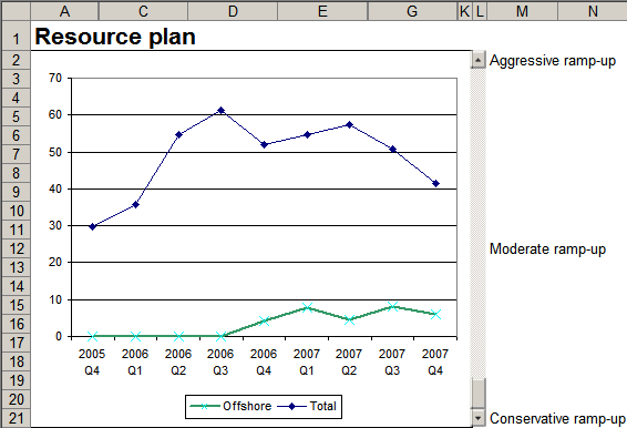
The fixed blue line shows the number of people required. The slider on the right ranges from “conservative ramp-up” to “aggressive ramp-up”. The green line shows how many resources will be offshore. In the conservative ramp-up, the recruitment rate is very manageable, but the saving is negligible, since hardly anyone is offshore. The aggressive ramp-up calls for an unmanageable ramp-up rate.
We showed the management this tradeoff. They said, “We can recruit 30 people next year”. That implied the moderate ramp-up scenario, and a cost saving of 27%. Total time spent in making decision: 2 minutes.
Creating a slider-based model is quite useful. You can download a US Treasury yields example to see how this is done. As you move the slider, the yield curve moves over time, showing how it has fluctuated. The trick is to:
- build the entire model based on a single cell. Cell H1 in this example acts as the index to the dates.
- create a slider. Go to View – Toolbars – Control Toolbox and add a slider.
- and link the slider to the cell. Right-click on the cell in design mode, select View Code, and type Range(“H1”).Value = ScrollBar1.Value in the Scrollbar change event.
A very wise observation – that only one parameter and function finally matters in a complex model. Thanks
Hi, I’m trying to modify the value in cell H1 to reflect new data that I have added to the table. The chart works at first, but as soon as I scroll away from the new dates that I added, they disappear and default back to the 229 that was originally in the cell.
How do I change the value and keep it changed?
Go to design mode first. (On Office 2007, that’s under Developer –
Design mode. On Office 2003, View – Toolbars – Control Toolbox the
design mode icon.)
Right-click the slider, select properties, and change the “Max” field
from 229 to your desired value.